The Wesorick Project | Primary Bedroom Reveal
We’re back at the Wesorick Project, and our team couldn’t be more excited to show you this completed primary bedroom space. (In case you missed it, you can read the main floor reveal from this project here!)
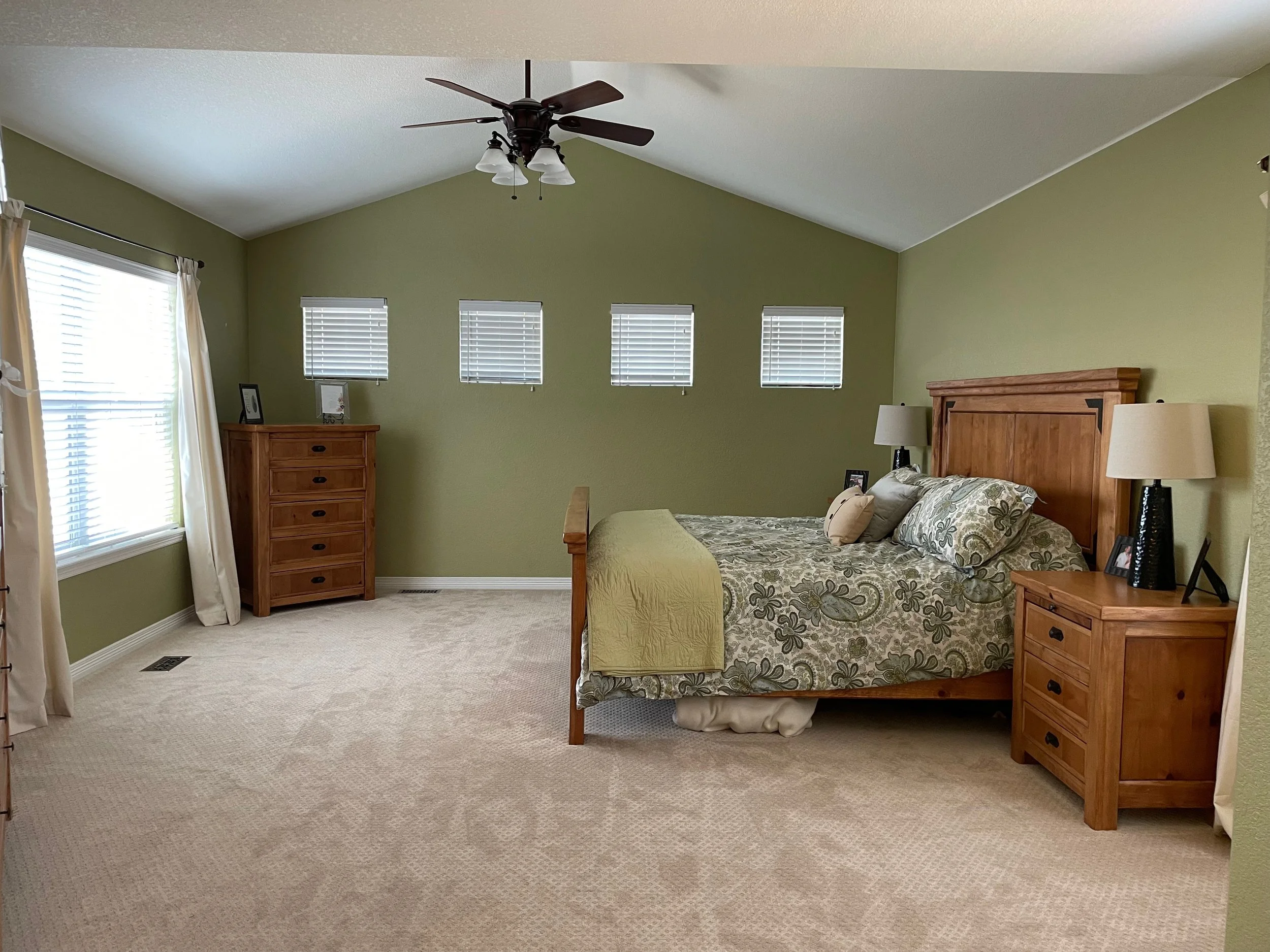
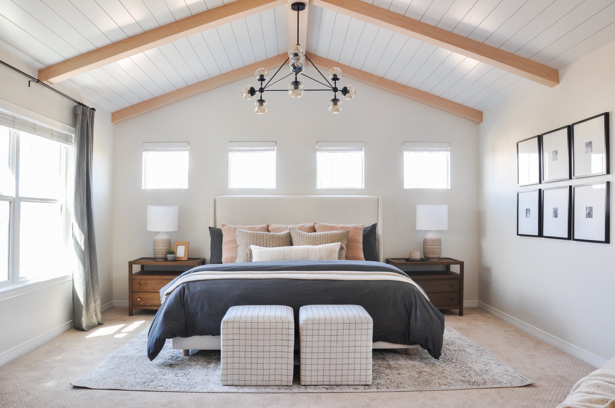
When our clients decided it was time to elevate their builder-grade home’s primary bedroom space, we were happy to start the process with the help of our favorite carpenter — adding bright white shiplap and warm wood beams, to customize this master bedroom and create a unique architectural feature for the space.
To continue to draw the eye upwards, we swapped out the ceiling fan for a beautiful, bold and modern light fixture that contrasted well with the traditional finishes of the home. Our team also reoriented the room, making the king size bed its focal point when walking into the space.
We consolidated most of the dressers and wardrobe furniture that previously filled the room, which made it feel larger and more open without these excess furniture pieces.
The contrast of the neutral upholstered headboard against the wood furniture pieces helped make the space feel warm and inviting. We added lots of layers and pillows to the bed, combining muted colors, patterns and textures to create a cozy look and feel for this suite.
Our client also wanted a small nook to sit and read, so we added a plush chair and accessorized with a throw blanket, patterned pillow and a sleek modern side table — perfect for curling up with a warm drink and a good book.
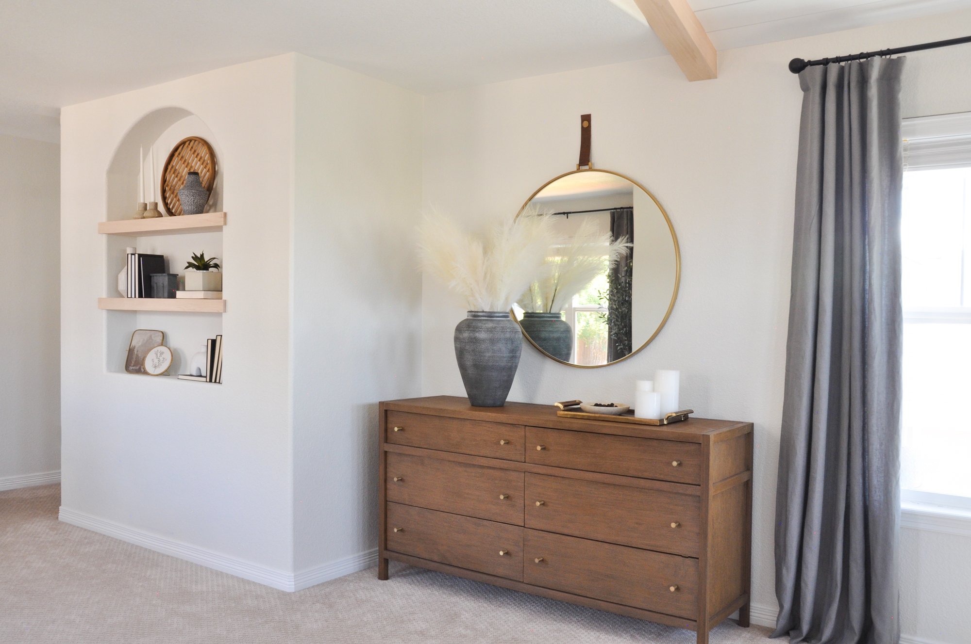
To make the room feel even more spacious, we hung curtains high over the larger windows, which also softened them up a bit. Minimal accessories were added to the dresser top, and a round modern mirror with a leather detail completed the new furniture in the space.
Our carpenter built sleek wood shelving that we added to the room’s arched niche, adding a touch of design interest to an unexpected space. We placed accessories that added cozy and homey touches that contrasted well with the more minimally-styled dresser.
We so enjoyed working with these dream clients again to refresh another space in their beautiful Denver home. Tap below for more photos and before and afters from this transitional primary bedroom suite, and see all the modern and traditional elements combined to create this space.
BEFORE // AFTER
Welcome to Basil + Tate, your full-service interior design team based in sunny Denver, Colorado. We describe our design aesthetic as light-and-bright, coastal, and modern. If you like clean lines and lots of white space, you’re in the right place! Looking for interior design services within the Denver, Colorado area? Let's get in touch.


