The Georgelos Project | Formal Dining Room Reveal
Projects at the Georgelos house are always some of our favorites— and we were so happy to be back working with our clients-turned-friends on their formal dining room space. (Take a peek on their completed family room and master suite here!)
Our styles and vision for their home really align, and these clients have continued to trust our team’s expertise through the process — making them a designer’s dream to work with.
This relatively small dining space took about 8 months from start to finish, due to long furniture lead times, but our clients were willing to wait and get exactly what they wanted — translating into a better end-result, without sacrificing on the design style.
While we had helped our clients tackle some major updates to additional spaces in their home, we hadn't taken on their dining room yet. Previously, this room had outdated furniture and wasn't a space that they wanted to show off. That said, this room is one of the first spaces you see when you walk in the door to their home, so they wanted the refreshed design to elevate the space, matching the the rest of their updated home and creating a place they were proud of and would be happy to host both family and friends.
Before giving this space a major facelift, the room was mainly used for their kids' arts and crafts. As it wasn't a space they were excited to show off, entertaining mostly took place around the kitchen table.
Now that the space has been brought up to par with the rest of their beautiful house, they love to have a separate place to entertain. In a house with small kids, it becomes a really nice separation for adults and children.
Their kiddos now have a place to have their fun around the kitchen table and the adults can have their own space, too. By simply making cosmetic aesthetic changes, it almost feels like they added square footage to their home since this space didn't get much action before.
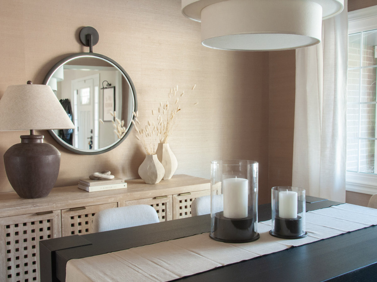
One of our team’s favorite elements of this space is the grasscloth wallpaper. The photos simply do not do it full justice! Walls of any space can often be forgotten about, when in fact they are that one piece that takes a room from just pretty to down right gorgeous.
Your walls definitely have the ability to pack a design punch! Whether that is with wallpaper or some sort of wall treatment (shiplap, board and batten, etc.), those are the details that really make the room. And this dining room was no exception to that rule.
In this case, wallpaper was a more affordable option than hiring a carpenter to add architectural details to the walls, and we love that our clients agreed to going with the grasscloth option. This wallpaper texture adds such warmth to the room, while also maintaining an earthy, organic element that helps make this space flow with the other areas we've designed in their home.
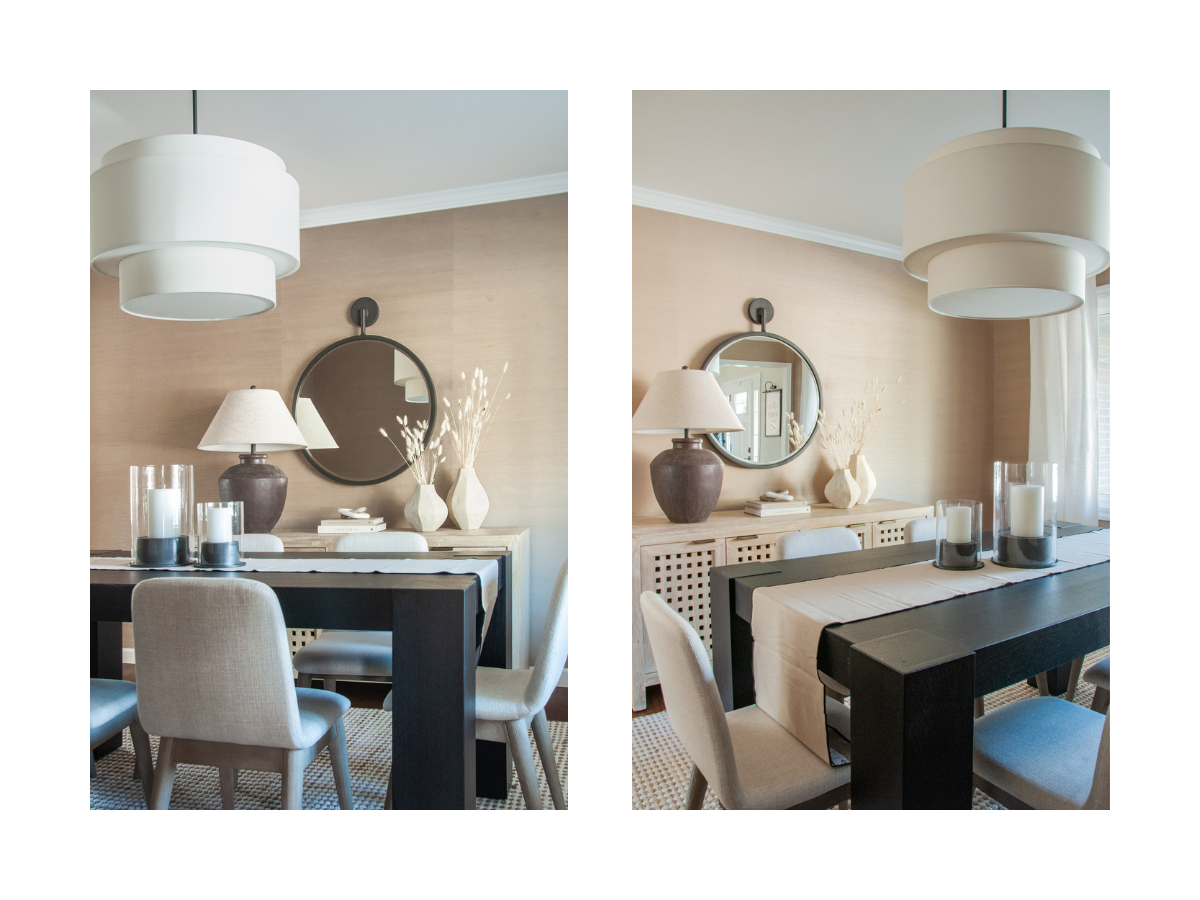
We also love that our clients were willing to use upholstered chairs. Many people shy away from upholstered chairs for fear of staining, but these clients knew that this would be a place mainly used for adults, so that wasn't a huge concern.
The fabric detail of these chairs really help to break up the space between a wood table and a wood sideboard. Aside from the fact that they're generally more comfortable for guests, upholstered chairs also add coziness to the space that hopefully encourages their guests to stick around a bit longer — just one more glass!
Lighting is often the statement piece in a room, and this drum chandelier provided just the statement needed. Similar to the upholstered chairs, the fabric on the fixture added another layer of texture that contrasted well with the textural wallpaper.
We intentionally kept accessories simple and minimal in the space. This isn't a huge room, so we wanted to make sure we didn't put so much furniture in that it felt crowded — but we also needed to maintain some storage space for serving dishes, liquor and other dinner-hosting necessities. The sideboard and mirror combination gave us a spot to create a beautiful vignette — complete with a lamp (we love ambient lighting!), some books, and a few dried stems.
Since we had a fair amount going on the sideboard, we thought it was really important to keep the table centerpiece minimal. One thing to consider when designing the centerpiece for your table is whether or not it will remain on the table while entertaining. If so, it's important that the centerpiece stays low so that nobody is stuck looking around tall vases or through stems to see the person sitting across from them.
Our clients’ living room has a bit more of a coastal vibe with shades of blue and natural wood elements. So we wanted to ensure this formal dining room felt a bit different but still cohesive. To achieve this, we shied away from the blues and focused more on natural earth tones in this room. Now, the space still feels like an extension of the rest of their home because of the natural wood tones and organic textures we used.
The hardest part about this formal dining room project is that it's over. We LOVED working with these clients again, and are so grateful that they have trusted us with their home over the last few years. Tap the button below to see more photos from The Georgelos Project!
Welcome to Basil + Tate, your full-service interior design team based in sunny Denver, Colorado. We describe our design aesthetic as light-and-bright, coastal, and modern. If you like clean lines and lots of white space, you’re in the right place! Looking for interior design services within the Denver, Colorado area? Let's get in touch.


