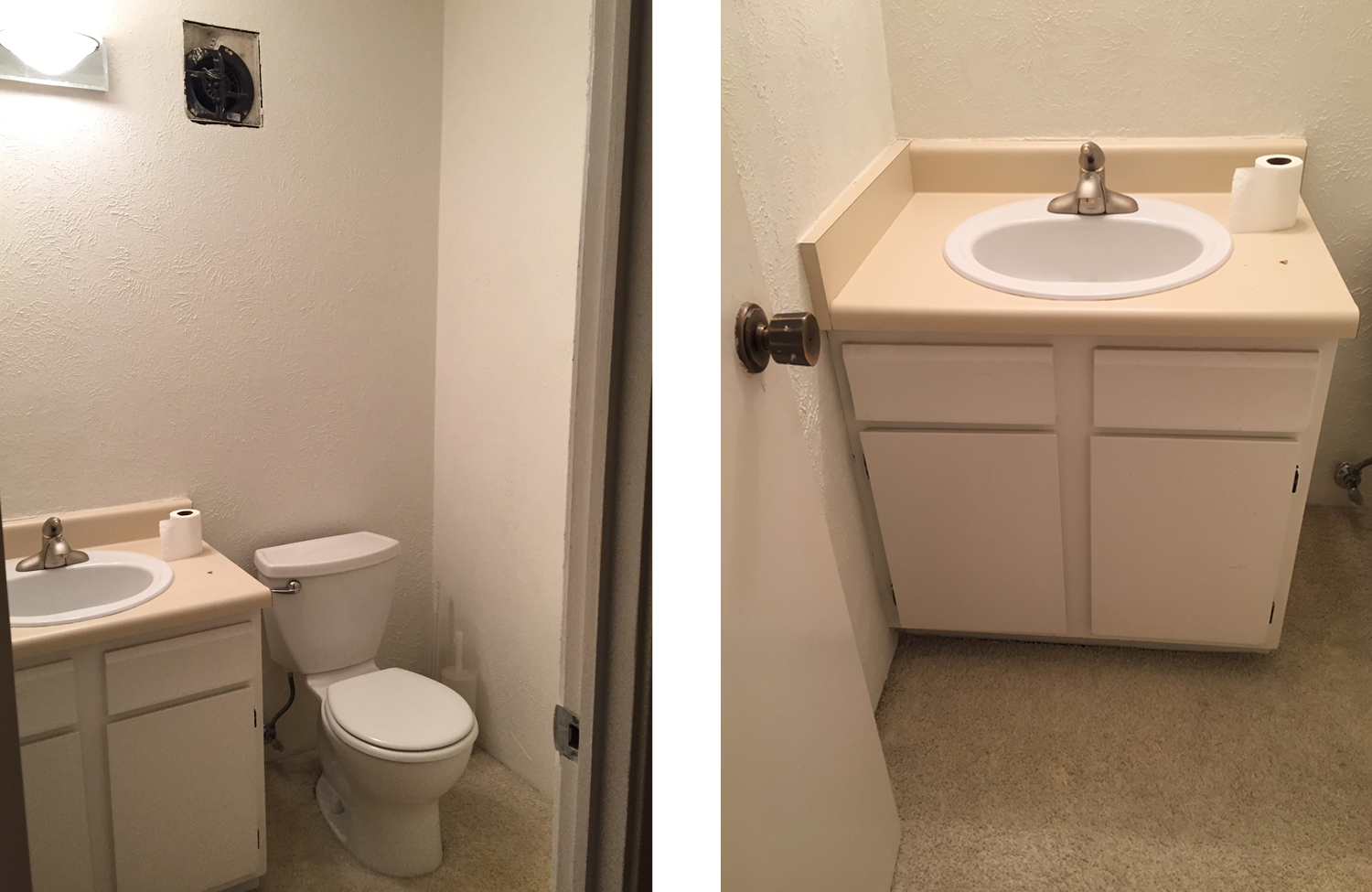
Project Reveal - Powder Room
I need to play catch-up on a couple projects that I completed over the last couple months, so first up is this beautiful powder room. This project was extra special from the beginning because I designed it for my favorite yoga instructor in the history of EVER. Due to this season of my life, I’ve had to move my practice home so I haven’t been able to see much of her, but that made collaborating on this project with her an extra big treat. It was so fun to connect outside the walls of the studio and get the chance to know each other better. She is such an incredible person with so much depth and thoughtfulness, and I wanted her space to reflect that. She had just moved into her new home and the powder room was at the top of her list of rooms that needed some love. You may agree… :)
Most often when I’m creating a design board for a client, I search and search for ideas until I fall head over heels in love with one element and then I design around that piece. In this case, it was the tile for the floor. Once I stumbled across that tile, the rest of the room took shape. As with most powder rooms, there is limited space to add style, so every element has to pack a lot of punch. My client didn’t need much for storage space, so I seized the opportunity to use an open console sink to be the main focal element of the room. Another piece I’d like to point out is the artwork. My client travels the world every year and this was a piece she had picked up on one of her travels. We were able to change the frame and matting to repurpose it for this space. I love how it turned out and that it allowed me to personalize the space for her. Here is the design board that I created to share my vision of the space with her:
We had to wait patiently for her contractor to get started on this project, but once he was able to get in there, the magic happened. A week later, I was able to come in and put the finishing touches on, and my client had a bathroom that was no longer an eyesore.
One other major element of the design was the addition of the board and batten on the walls. Adding interest to the walls is always a bit of an investment, but it never fails to disappoint. It added SO much detail to the room. Seriously… how boring would this room be without it?
And because I always love to see the before and after pics next to each other…
This was Basil + Tate’s first renovation project, and it left me wanting more! I love bringing out the potential of a space… especially one like this that at first glance seems hopeless. This transformation gave me hope for my own master bathroom that is in desperate need of a makeover.
I’m so grateful for incredible clients that give me the opportunity to come into their homes and do what I love to do. I love my job.


