Green Mountain Project - Part I
I am so excited to show you Part I of the Green Mountain Project I have been working on the last couple of months! My client reached out to me late last fall and had just moved into her brand new townhouse. She had a few beautiful pieces she wanted to keep but basically we needed to fill in all the gaps and turn her house into a home. Aside from her being so much fun to work with (seriously… how do I get all the BEST clients?!), it was such a fun job to work through her entire house and make it feel beautiful, comfortable, and complete. I joke with her that I may just move in because I don’t think I’ll ever have a home that is actually complete from top to bottom like hers is now! Ha!
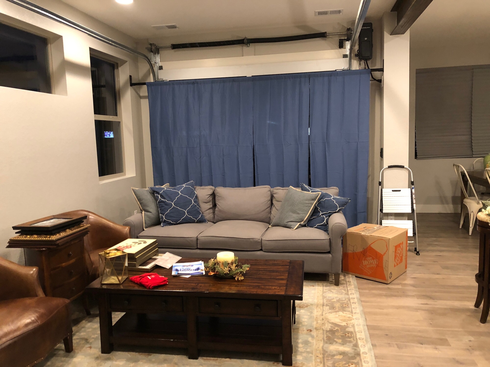
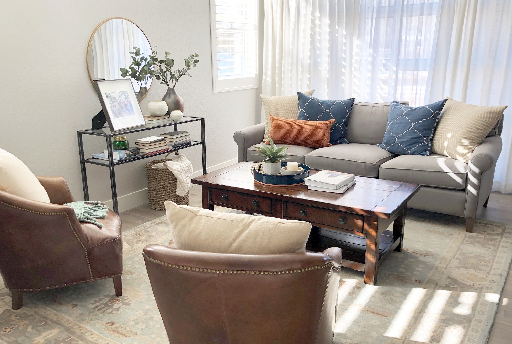
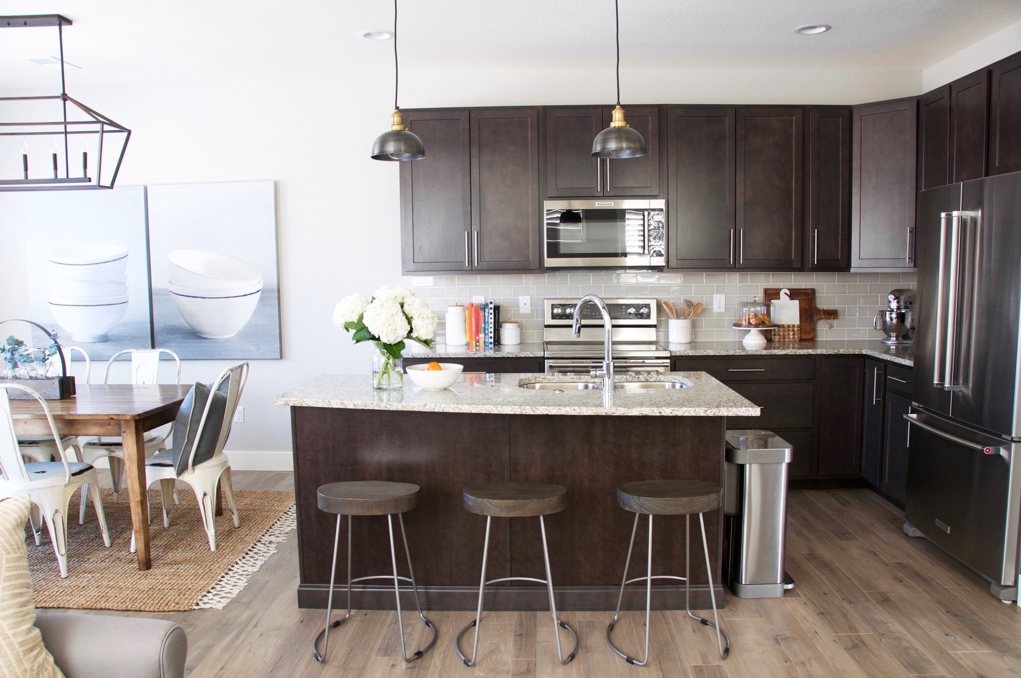
One of things that really drew her to this place was not only the abundance of natural light from its many windows… but also from a garage door in her living room! How cool is that?!?! That’s like an entertainer’s dream to be able to open it up and bring the outdoors in…or the indoors out! As much as she loved that feature, she didn’t want the ‘industrial-ness’ of the garage door and steel beams to drive her decor. She very much wanted a more traditional feel than a modern/industrial vibe. Challenge accepted. I wanted everything to be cohesive so rather than ignoring the steel beams and garage door, I decided to bring more metal into the decor to help tie it all together. Therefore, one of the first changes I made was to the light fixtures. The builder-grade ones that had been installed were giving too much of a modern look, so we replaced them with steel ones with more of a traditional/farmhouse look to them.
Another key piece to her main living area was the arrangement of the furniture. By simply moving the chairs, we were able to create a better flow in the room and create more of a conversational layout. Sometimes those little changes can make a huge impact. Case in point. Click on the arrow to see the original layout of this space.


I’m a believer in the power of accessories. I think they can take a room from cold to cozy. The little vignette I created with the console table and mirror served that purpose in this room. My client has an incredible collection of books, so it was so fun to have a spot to show them off. Between the books and the family picture, we were able to bring that personal touch into her space that truly makes it feel like home.
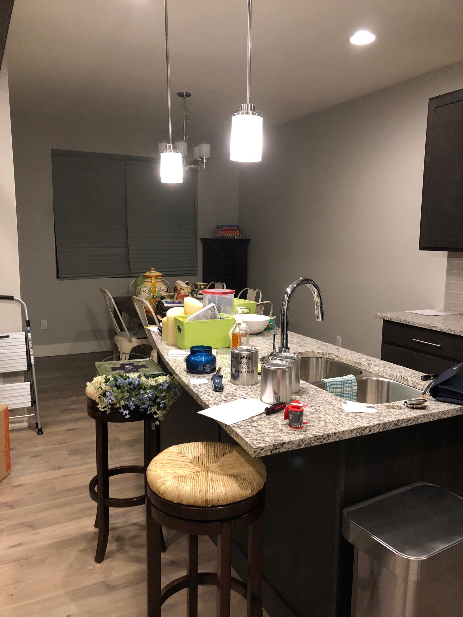
Her dining area quickly became one of my favorite spots in her house when we hung the oversized artwork. I am a huge fan of big art. One of the most common mistakes (in my personal opinion anyway) is using artwork that is too small on a large wall with nothing below it to ‘ground’ it - like a console table, bench, etc. However, when you use oversized artwork it fills enough of the wall that it doesn’t feel like the art is floating in space and therefore you don’t need anything below it. We didn’t have the space to put a piece of furniture in the dining area, so the oversized artwork was a no-brainer. (And those bowls really couldn’t be any cuter!)
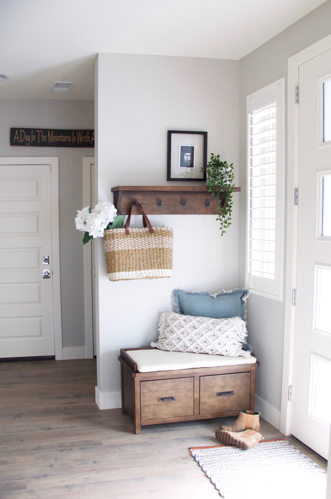
And, although it wasn’t in my client’s original plan, I couldn’t let this entryway go without decorating it! We added a bench and a shelf with hooks. I opted for the shelf/hooks combo rather than just hooks because it gave me yet another spot to add accessories and make the entryway functional and inviting. I’d be lying if I said this lil’ space wasn’t one of my favorite spots in the entire house. :)
The one area I was dreading in this house (just being honest) were the art nooks going up the staircase. I don’t like nooks/cut-outs/whatever you want to call them. They are so limiting. BUT… we found the BEST artwork EVER to fit in these three spaces, and I am in LOVE!!! They are gorgeous pieces that have dried botanicals pressed between glass that give them so much more dimension than art prints. The picture doesn’t even do them justice. They are stunning in person!!
So… that’s Part I. Stay tuned for Part II when I reveal the upstairs - master bedroom, guest bedroom, and gift wrapping station… say what?!?! Yes! Super cute! I can’t wait to show you!
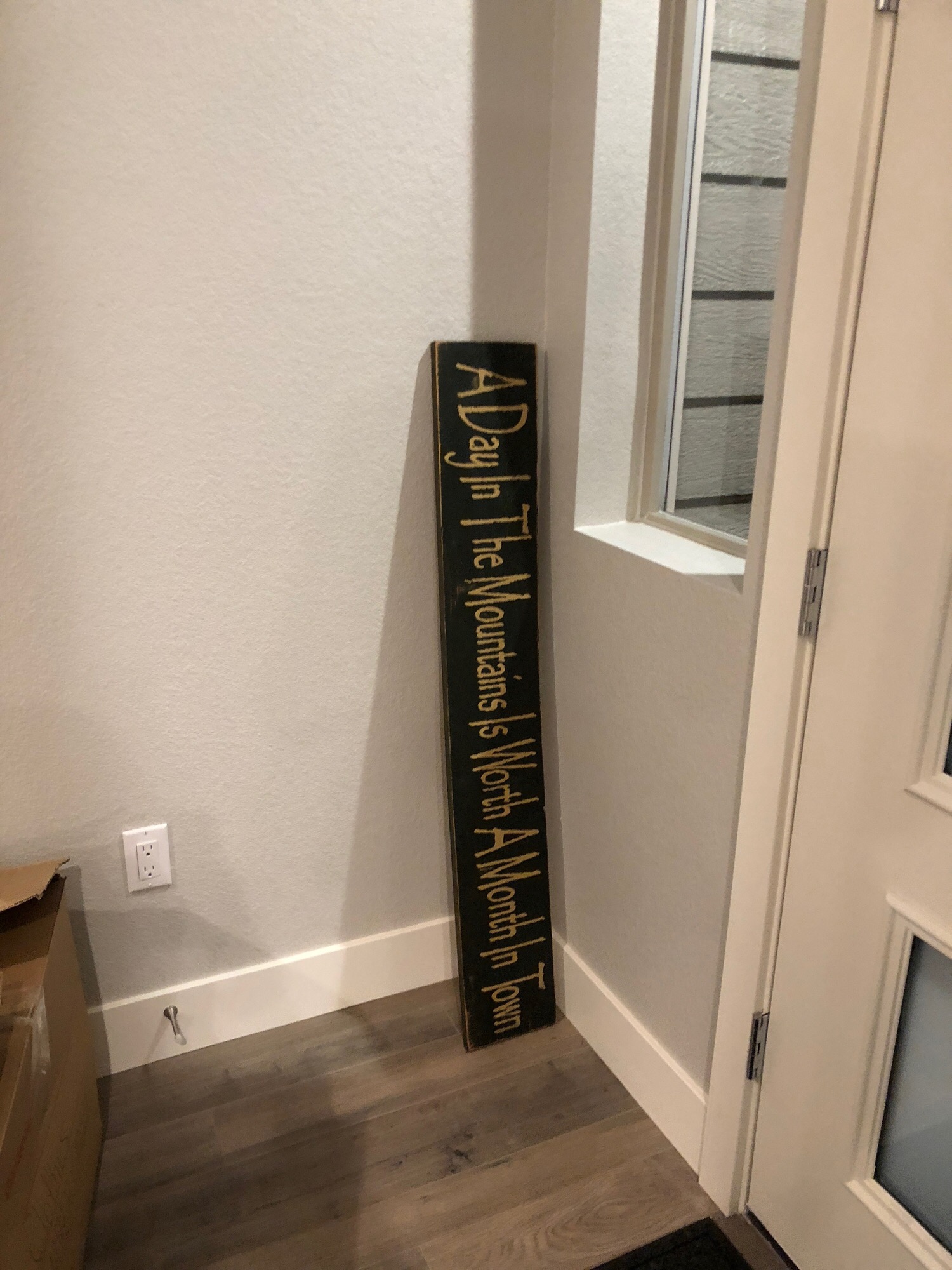
And, like always, we can’t have afters without befores! Ha! Scroll through these pics to see where we started… keeping in mind I took these ‘mugshots’ before my client even had a chance to get unpacked.
