The Kelly Project: Part Two Reveal
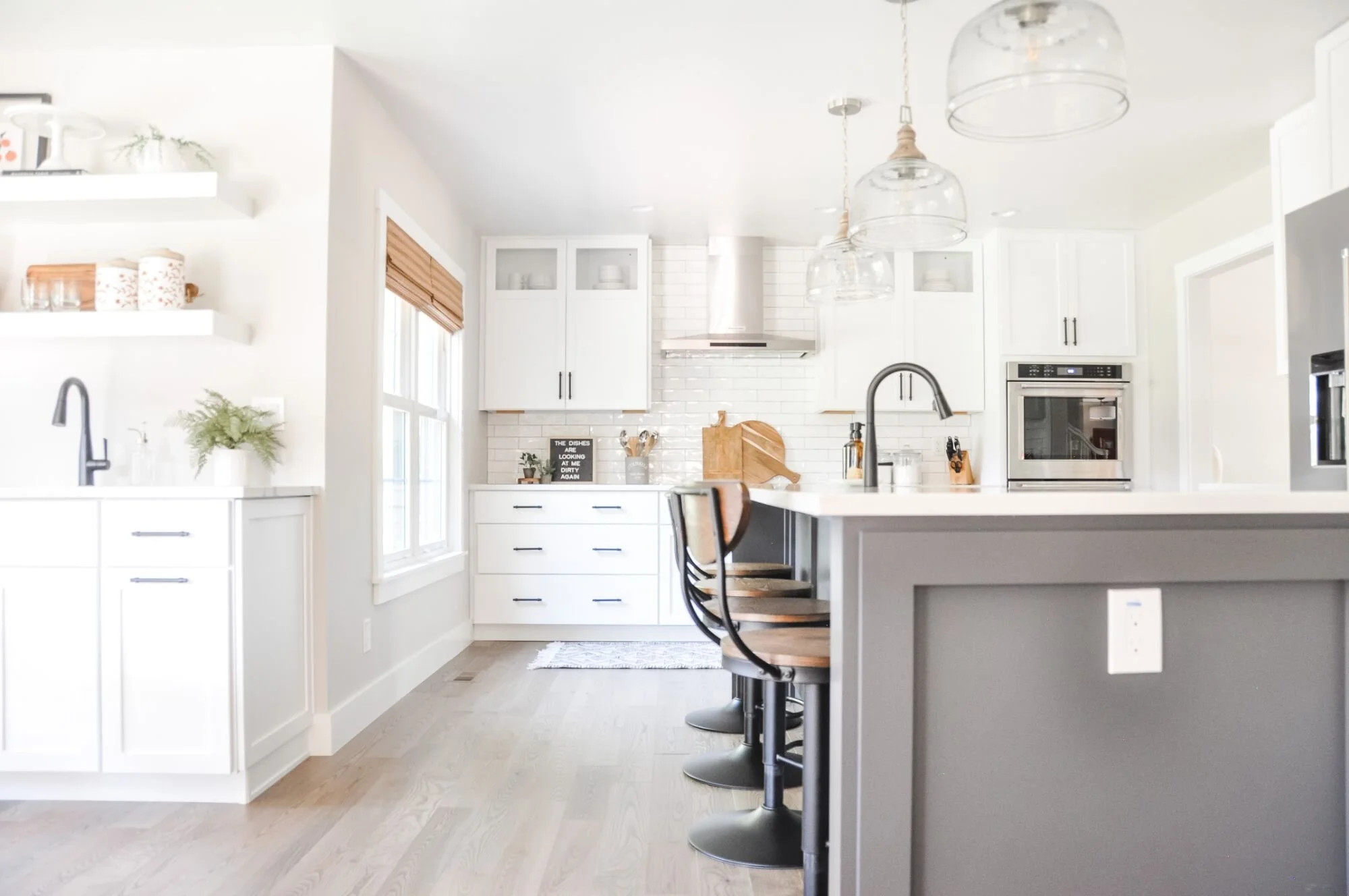
In October, I revealed to you the incredible kitchen remodel of the Kelly Project [CLICK HERE TO READ THE BLOG POST], and I’m here today to show you even more of this beautiful home!
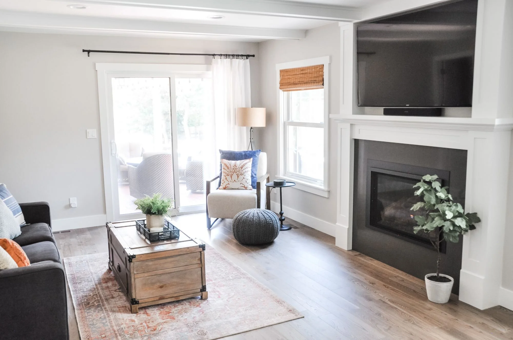
First up is the living room! Our top priority in here was to rid the corner of a TV! The fireplace got a facelift and we were able to put the TV above it making it much more aesthetically pleasing in the room (no more angled media stands, please!). It also allowed us space for extra seating. #win-win This room gets a lot of use and a lot of traffic, so we had to put an extra emphasis on making it practical. We maximized seating and opted to use a trunk as a coffee table for extra storage. Cordless bamboo blinds added warmth and texture to the space, and the curtains helped to soften up the entire room. We wanted to include family pictures on the main floor so we created a gallery wall above the sofa that makes a really big statement. I love this focal point in the room. It could have something to do with the fact that I adore each of the faces in those pics. :)
The powder room got a major makeover as well. Powder rooms are difficult to photograph, but here is a little sneak peek. Check out that gorgeous floor!
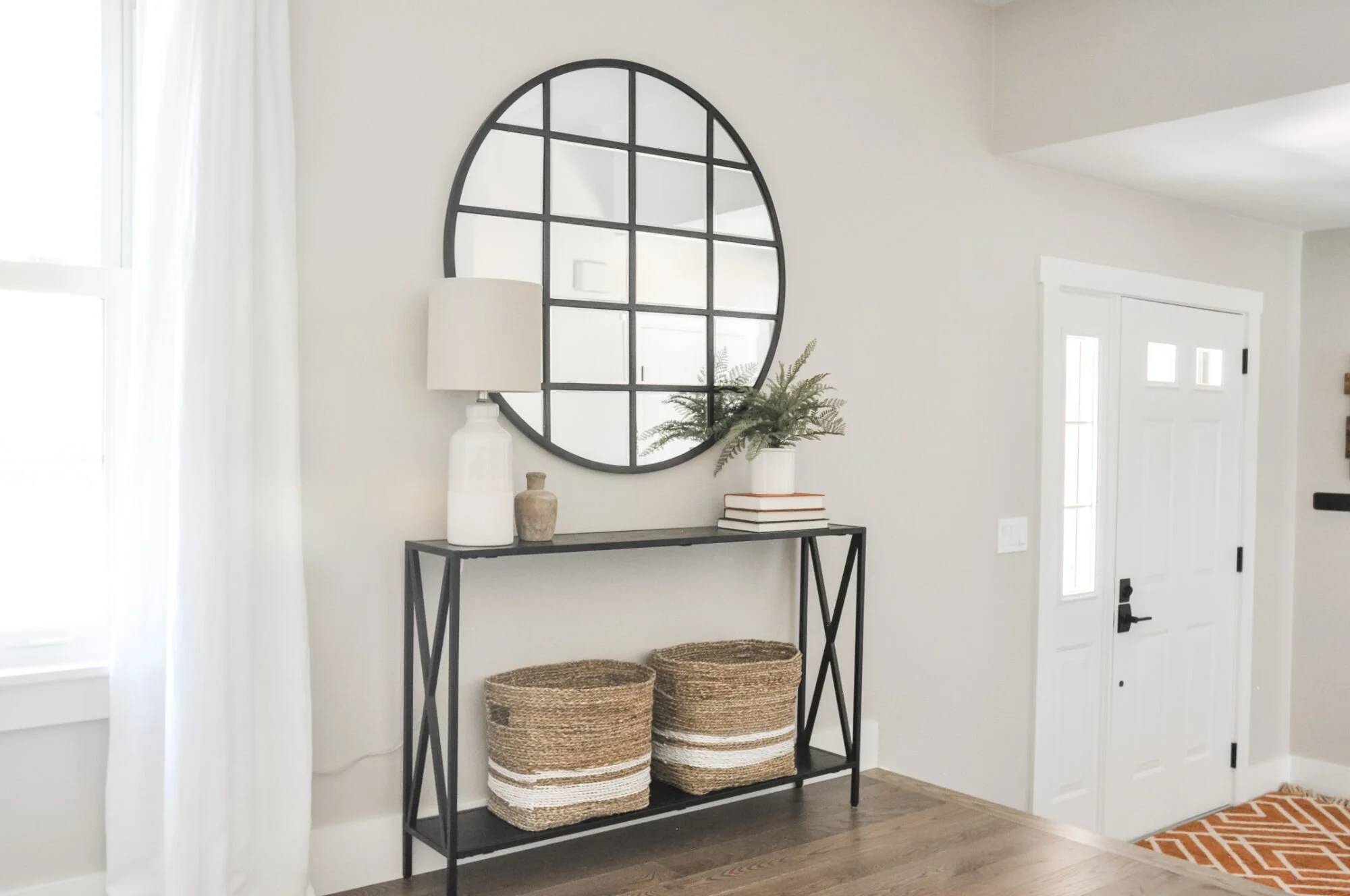
The entryway got its moment, too. We dressed it up with a simple console table and mirror that both pack a lot of style into an area that everyone who comes through the front door gets to see and enjoy. Baskets near the front door are always a great place to stash #allthethings.
And last, but not least… is one of my favorite spots in their house - the cubbies! My client’s father is a master carpenter and did an impeccable job on these! My clients now have a crazy cute drop zone where they each have their own designated area to put their things.
That wraps up another edition of the Kelly Project Reveal. I couldn’t feel luckier to have been a part of this renovation. What a transformation this house underwent! The proof is in the pictures…
BEFORE:
BEFORE:
BEFORE:
AFTER:
AFTER:
AFTER:


