The Bachicha Project Reveal
Well, this is embarrassing. We completed this modern farmhouse refresh over a year ago, and I am just now getting around to posting it… *facepalm* This past year has been Basil + Tate’s busiest yet, and the blog had to take a back seat for a bit. That doesn’t make me any less excited to share this project reveal with you though!
The Bachicha Project Reveal, a modern coastal farmhouse refresh designed by Basil + Tate.
These clients came to us like many of ours do… they had lived in their house for several years and were ready for a change, but not ready to move. One of my favorite things to do with projects like these is bring in a carpenter to work some magic. I love what new furniture and accessories can do, but custom carpentry can truly make it feel like a whole new house.
The family room with its modern farmhouse shiplap feature wall, minimal open shelving, and coastal design elements give this refreshed living space a light, bright, and airy feel.
The TV wall in the living room became our first priority because it had the potential to become the focal point of the main floor. Instead of sourcing another media stand and replicating their current set-up, we gathered inspiration and drew up sketches of what that wall could be - shiplap, benches, and shelves - oh my! Our clients loved the ideas and hired the carpenters to make it happen. We are still swooning over how it turned out and love that it feels more unique than a typical TV/fireplace wall. The single open shelves on each side allowed us to keep the accessories to a minimum, while giving the shiplap and benches room to shine. Storage was a necessity in this room, so we were able to work in four large baskets to house all of the toys and keep them easily accessible.
We replaced the sofa with a large blue sectional that adequately filled the space in that room. New occasional tables and accent chairs helped to pull in some natural wood elements (my fave!) to warm up the room and bring in some interesting details.
An inviting, coastal-blue sectional fills out the space, while natural wood elements warm up the room — making it an inviting area for the family to comfortably enjoy.
The carpentry magic didn’t stop in the living room! We also added board and batten to a large wall that spans the length of the entryway, the piano room, and the dining room. It was like adding architectural detail to three spaces for the price of one since it could be seen from all three rooms. We made the entryway more functional by adding a bench and a small table, making it feel even more personal by adding pictures of their beautiful family.
This light and airy coastal farmhouse design included a custom board and batten feature in the entryway to showcase the client’s family photos — creating a classic display with a minimal, modern touch.
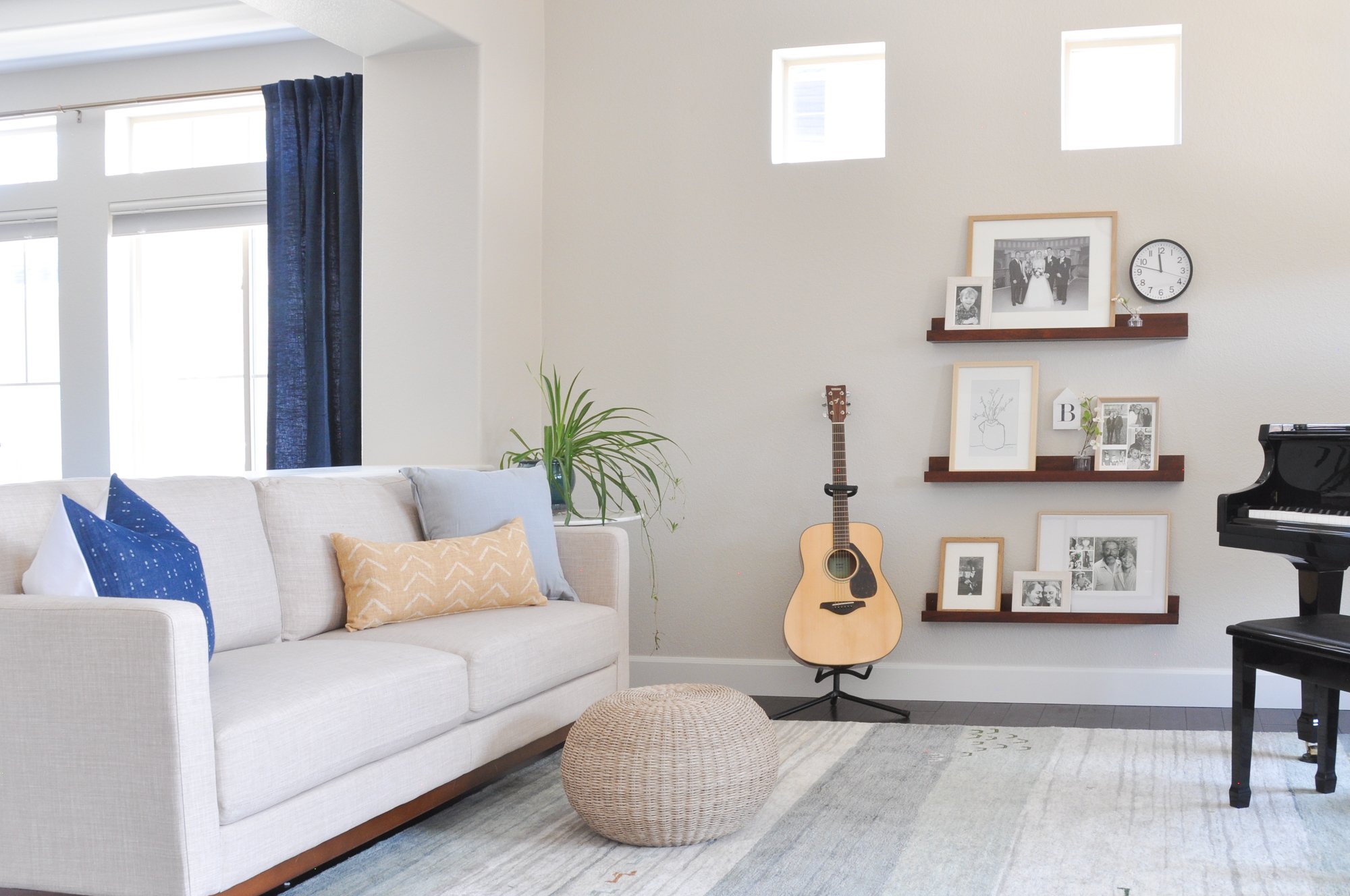
Having family photos displayed was really important to them, so we took the opportunity to add some more pictures in the music room. We used picture ledges to display a mix of family photos, art, and decorative elements to make the shelves feel a little less predictable. A new sofa and rug helped to modernize this room and made it easier for the fam to gather ‘round and make music together. :) Kumbayah!
The coastal blue accents and natural wood elements create an inviting hangout space to enjoy good music and great company in this modern, light, and airy family room.
The last area we tackled on the main floor was the dining room. We opted to keep their buffet and dining table, but swapped out the chairs to give it an entirely new look. The new art became the inspiration for the color palette in this room. My personal favorite element in this space is the drapes. I love the pop of color and how they softened up the entire room. Drapes are good at that. ;)
This classic coastal dining room design by Basil + Tate features modern touches and shades of blue paired with wood accents and neutral tones.
So, that is the story of this home’s beautiful modern farmhouse makeover. A year later and the reveal images still make me smile. And so do these clients. We are lucky to work with such good ones.
Bachicha Project Before and Afters
BEFORE: This outdated and dark space was in dire need of a refresh.
AFTER: Interior designer Basil + Tate of Denver, Colorado brought this space into the light, creating a modern coastal design that was just what this room needed. With a mix of classic, farmhouse, and modern elements, this living space was transformed.
BEFORE: This home’s entryway lacked design aesthetic and felt dark, cluttered, and uninviting.
AFTER: Denver-based designer Basil + Tate transformed this space from dark and cluttered to light, bright, and clean. The board and batten highlights the beautifully arranged family portrait gallery, creating a warm and inviting entryway with classic and minimal design elements in this coastal modern farmhouse refresh.
“Coastal Farmhouse Refresh”
See the Bachicha Project’s main floor reveal, featured in Denver Life’s March 2023 issue. Tap here to view.


