The Palin Project - Master Bedroom Reveal
I love this job. Getting to look at pretty spaces and beautiful furnishings all day is a dream. When that gets mixed with super fun clients, I start feeling guilty calling it a job at all. This project was one of those ‘jobs’, and I knew it would be right from the start because these lovely people are repeat clients that I adored working with on their first round of room makeovers. [Click HERE to see the other spaces I did in their home.]
This master bedroom isn’t huge, so we had to be very intentional about what we selected. We had to pack a lot of style into this space. So, that’s exactly what we did.
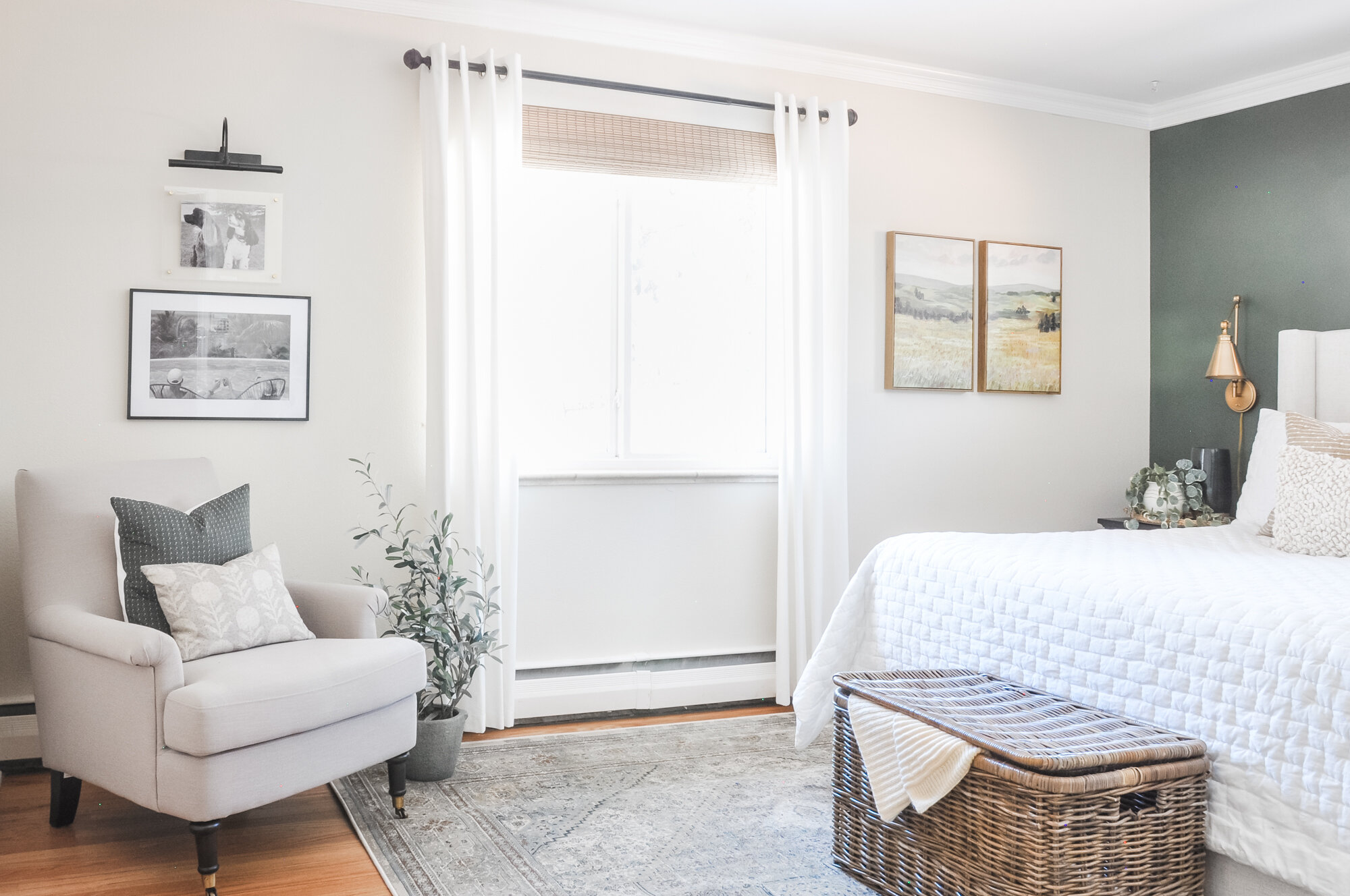
My last reveal was all about the power of architectural details in a room. [Click HERE to read!] Perhaps this post should be all about the power of paint! My clients didn’t want to repaint their entire bedroom, so we compromised with one accent wall. The dark, rich tones of Benjamin Moore’s Vintage Vogue made the entire room come to life. Mixing that gorgeous green with layers of light neutrals gave the room an earthy, organic feel that helped this room flow with the rest of their home.
No space ever seems to come without a decorating challenge. In this room, it was the [dreaded] television… ugh. I really didn’t want to keep it in its existing spot, so I proposed getting a new Samsung frame TV. If you aren’t familiar with them, it’s a slim TV that you can purchase a simple frame (available in three finishes) to go around the edge to make it look like a picture frame. Upload some digital art, and it looks like a beautiful piece of framed art! We mounted it with a swivel bracket so that my clients can pull the television out when they want to watch it, and get it out of the way when they’re not. Problem solved!
[SIDE NOTE: We have never had a TV in our own bedroom because I don’t like the looks of them. However, I may or may not have become Netflix’s newest, biggest fan over the last few months… and now I have an entirely new appreciation for TVs in bedrooms. BRING THEM ON!! Haha! We may just have one in our own room by the end of the month.]
After we tackled that challenge, we were able to move forward with the rest of the design. We updated their furniture with new nightstands and a dresser. We softened the room with an upholstered bed, a simple white quilted coverlet and some accent pillows with lots of texture.
By moving the TV, we were able to find space to create a ‘chair moment.’ We added some interest by mixing patterns on a couple of pretty throw pillows. I always try to add a couple of personal photos to a master bedroom, so we hung a couple on the wall and topped them with an art light.
Accessories are always the cherry on top of a great design. We used woven wood shades, a lidded wicker basket, and accessories with organic textures to keep the room feeling ‘earthy.’ Oh… and some greenery. Always greenery. It magically breathes life into a room - even when it’s fake!
That’s a wrap on this room! Another functional, beautiful space in the home of a wonderful couple! Be sure to check out the before and after pics below!
CHECK OUT THE BEFORE AND AFTER PICS OF THIS SPACE!
(Notice where the TV was… and where it is now. #win)


