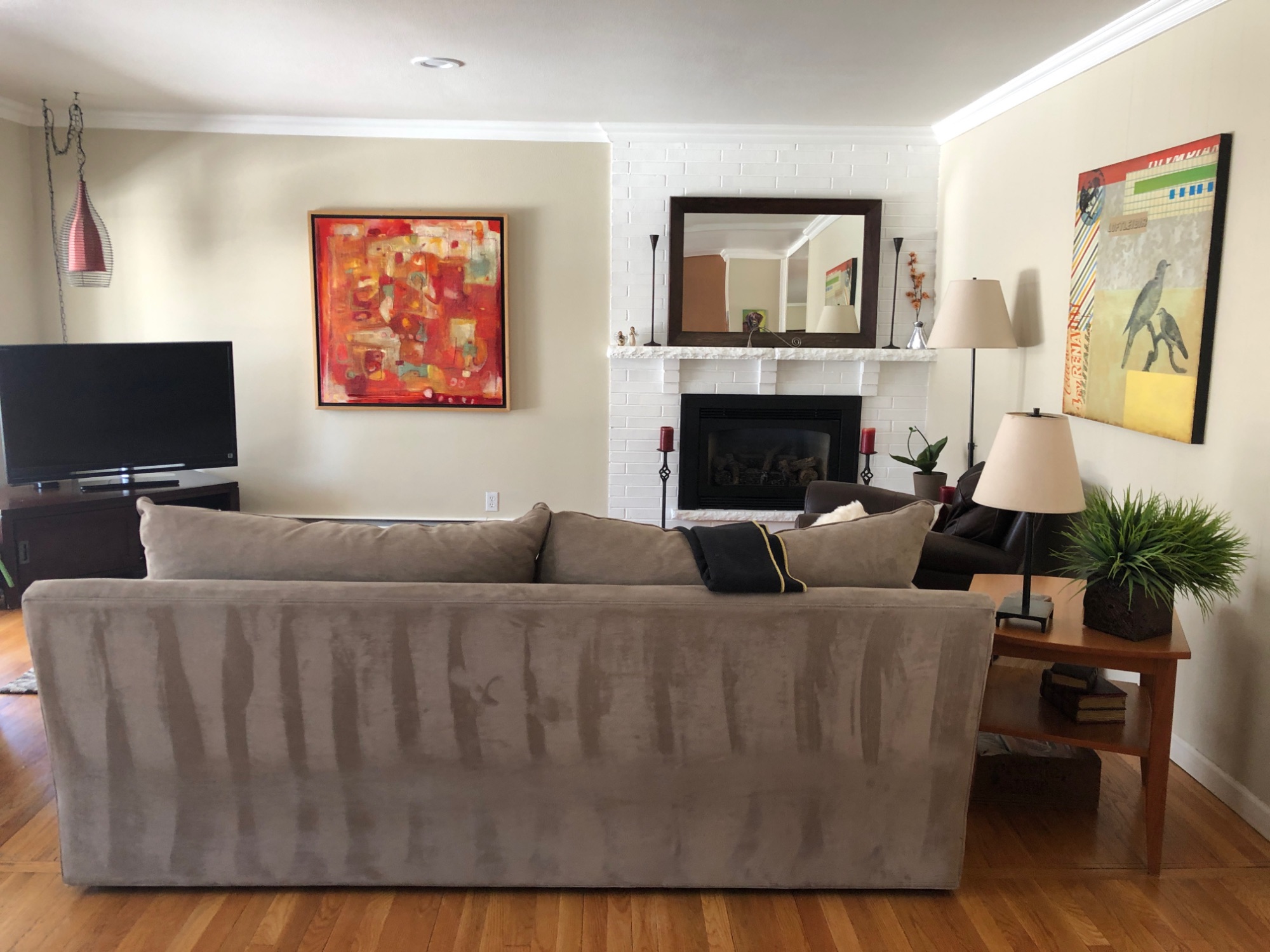
One of my winter projects was giving the two main living areas of the Palin house a makeover. My clients had a couple pieces in each room that they wanted to keep, but they were willing to mix, match, and add some new to create two fresh spaces. We tackled both projects simultaneously since we were borrowing from pieces from each room. It’s hard to pick which space underwent the biggest makeover - so you’ll have to decide for yourself.
First up is their family room. Perhaps the best change we made in this room was to switch the flow and direction of the room completely. This was a classic case of simply needing some fresh eyes on the space. So many of us get comfortable and complacent with our furniture layout that it never really occurs to us to switch it up. As soon as I saw this poor TV stuck (diagonally! GASP!) in the corner, I knew there had to be a better solution. We moved it across the room and turned everything around. That meant we could move the sofa and completely open up this once closed-off space. Game. Changer. Check out the before and afters by clicking the arrow.


We moved the sofa that was in that room to their living room and purchased a new, beautiful sofa with a chaise lounge that worked really well with their cool cowhide ottoman. Other than the mantle, we were left with very little space to accessorize (which I always believe, when done correctly, makes a world of difference!) so I suggested we put in a sofa table. This turned out to be my favorite part of the room. I love that we were able to add some larger statement pieces so that it didn’t simply feel like clutter… and floral stems are always magical.
The serene landscape artwork drove the green color palette, and I’m so glad it did. Green has always been my favorite color, but I don’t think I’ve ever used it as the main color in a room. (Note to self: do more often.) Some throw pillows and curtains helped to soften this space and now it’s a cozy - but really stylish space for my clients to cuddle up with their pups.
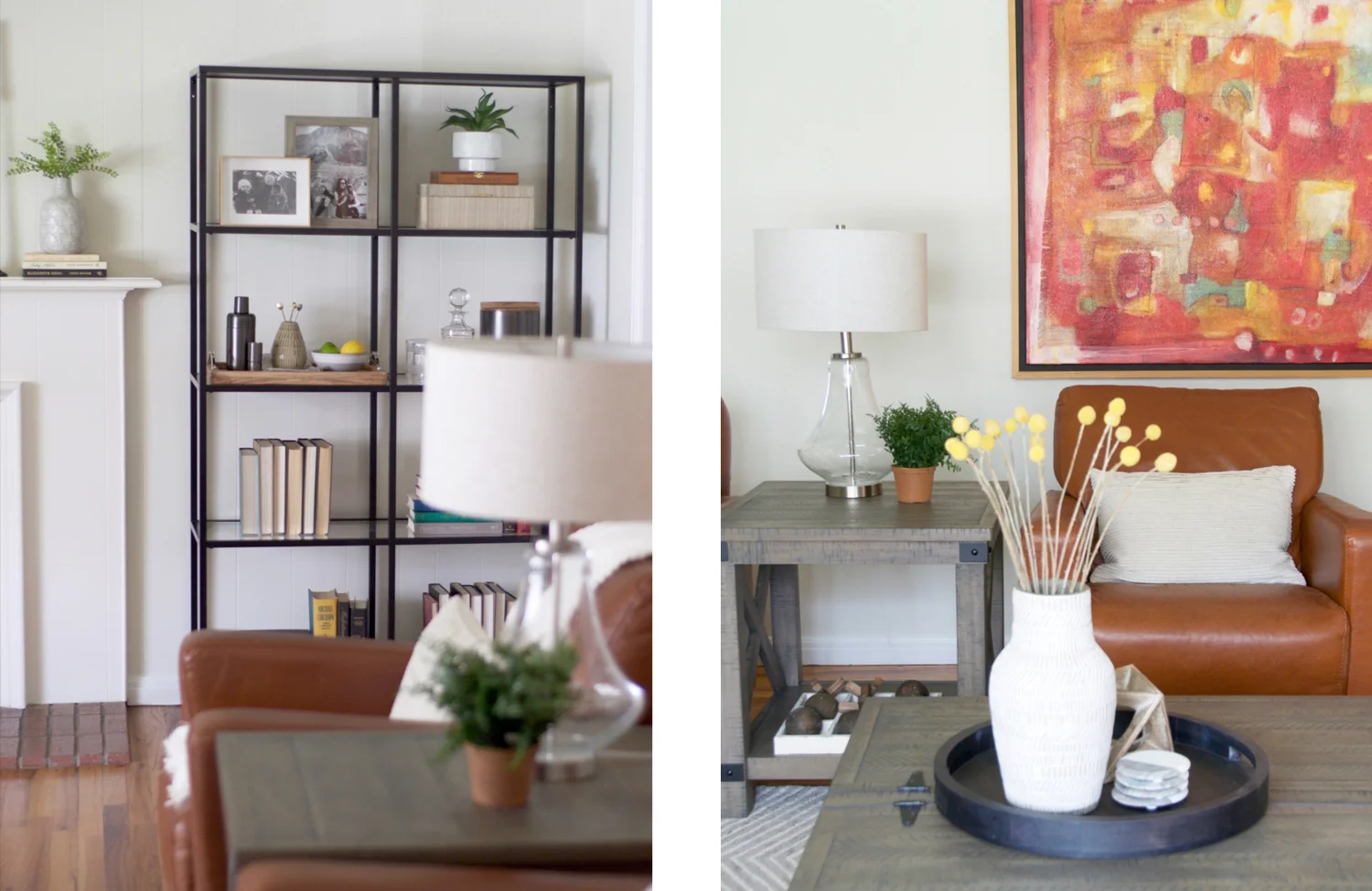
The living room got its makeover, too. My clients are big entertainers (rub off on me, please!) and had some big wishes for this space. They wanted it to seat at least six adults, have a place for mixing cocktails, and we still needed to incorporate some of their favorite artwork that we didn’t end up using in the living room. Therefore, the two pieces of artwork served as the inspiration for this room. They had two leather chairs (that we took from other rooms in the house) that complemented the artwork really well and helped drive our floorplan. We ended up with a sofa and four chairs which would’ve been plenty of seating, but we added a bench to help balance the space. So… seating for six? Nailed it… plus some! Incorporate existing artwork? Done! (Be sure to click the arrows to see what this space looked like before!)


The last thing on the wish list was to have an area to mix drinks. I toyed with the idea of using a bar cart, but ultimately ended up using shelving to do the trick. The tall shelves helped to make the fireplace wall the focal point of the room. They also gave us a place to personalize the room with family pictures and books. Most importantly though, they gave us a place to show off their barware. Fashionable and functionable? Check! This room has become the perfect room for entertaining… or so I’ve been told. :)
What is my one wish for each space that I design? To have clients that feel like friends. Check and double check…. with exclamation points!! These two were so much fun to work with, we didn’t hit any major hiccups, my clients have two beautiful rooms, and my fingers are crossed that we get to work together again! #kumbaya :)


