I apologize... I’ve been hiding this gem of a room from you for a couple of months! But it’s here now, and I can’t wait to show it to you!
This home office was such a fun project! My client reached out to me after she moved into her new digs hoping to transform the home office into a place just for her. She works from home so it couldn’t just be cute, it had to be super functional. She needed a) a larger work space, b) no cords showing, c) file storage, and d) a comfy place to sit when she needed a break from her desk. Challenge accepted.
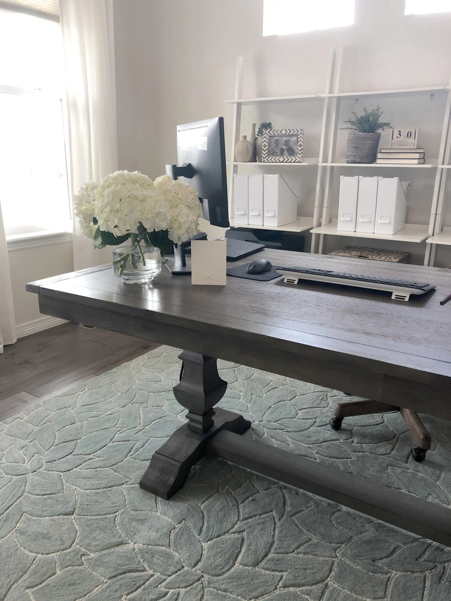
Nobody likes cords showing, and they’re inevitable in a room full of technology so that became our first challenge to tackle. This is the very reason that most people shove their desk up against the wall, but I could hardly stomach the thought of wasting this beautiful space by leaving the middle of the room empty. Pinterest to the rescue. We found a creative solution to hide the cords - even with the desk in the middle of the room! We were able to use an under-the-table wire basket to house the cords and run the couple that we did have down the leg of the table secured by a zip tie. Then we cut a small hole in the rug by the leg of the table to run the cords underneath the rug and back to the wall. Genius. Seriously. It is like magic! That one little trick was the answer to all of my design prayers - no desk pushed up against the wall and a dining table to serve as a large desk with extra work space! I had to take pics before we had the technology set up, so my client sent a few of her own to see what it looks like with a monitor and how well the cords are hidden. Click on the arrows below to scroll through the pics of the desk with cords.


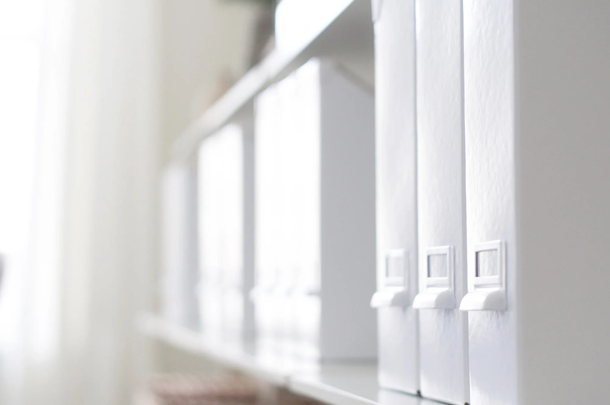
Four bookshelves against the back wall served several purposes in the room. Most importantly (for my client) we were able to get four drawers for file storage at the bottom of the shelves, and most importantly (for me!) we had a beautiful area to accessorize. I may be preaching to the choir, but I’ll say it again, accessories are everything… when done well! I could have easily filled up each of these shelves with small accessories, but I like a cleaner look than that. Instead, I opted to color block the shelves so they wouldn’t feel so busy. I also love the power of repetition in design - and this place was perfect for that. One row was filled with wicker baskets that brought a nice, earthy feel to the room. The next row I used magazine files on repeat. I love the clean, crisp feel of those - and they obviously double as storage as well. To mix it up, I saved the next row for accessories. I kept a pretty neutral color palette with woods, blacks, and some pops of greenery. I love what these shelves did for this space!
The last area we needed to tackle was a small seating area. I opted for a settee for this room because the look and size worked perfectly in the space we had to work with. The tufted back of the settee was a big selling point because it added so much texture versus a smooth, solid loveseat. I topped off the space with a cute bulletin board and some accessories to make this an inviting lil’ seating area - or a spot for my client’s kids to crash and ask a thousand questions while she is trying to work. Or is that just my kids?!?
After we nailed down all of the major elements of the room, it was time to fill in the rest. This oversized wood art turned out so pretty! My client was able to pick out one of her favorite quotes - and she picked SUCH a good one! Curtains softened up the room, and I added some real plants to breathe some life into the space - which is really important when it’s a room you spend so much time in.
And can we just pause for a minute and DROOL over that ceiling?!?!?! I LOVE what architectural elements (blog!) do for a room, and this space is proof! It totally took this room to the next level! I was so pumped when my client and her hubby said they were on board with doing this to the ceiling, and I couldn’t love it more! It makes the room!
So, bottom line… I have serious home office envy… and some serious gratitude for an amazing client who trusted my crazy ideas so that we could create a space like this together! Cheers to cute work spaces!
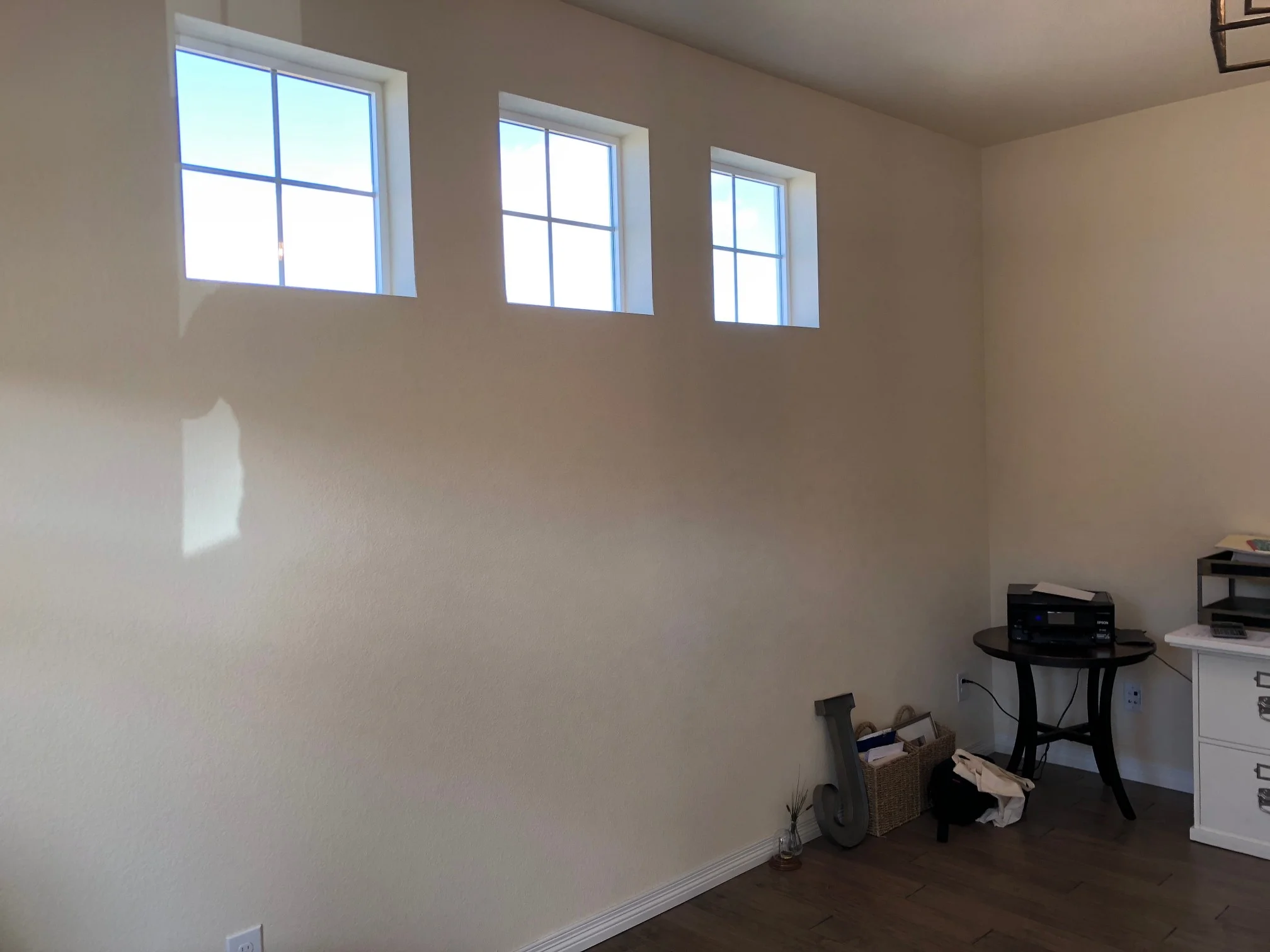
Click the arrows to see the before and afters of this space!


