DESIGN FILES: Kitchen Spaces
Kitchens are my favorite room in a home… hands down. I love everything they can encompass - good food, family time, beauty, and function. So, it’s no wonder they are my favorite pics to look at as I scroll through my social media feeds. Not only are they the heart of the home, they also set the tone for a home as well. Today I’m sharing some of my favorite kitchens - the ones that stop me in my scroll and leave me inspired.
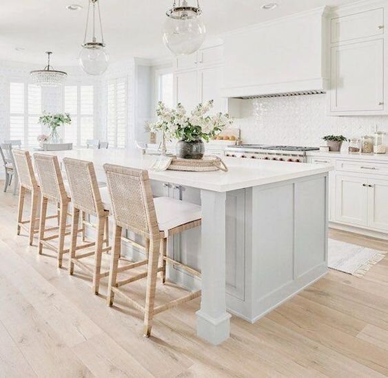
COUNTER STOOL REPETITION
I love doing round-ups like these because it makes it easier to see trends in elements that I’m really drawn towards. One design element that always catches my eye is the repetition of counter stools along a large island. When designing a kitchen with this layout, I always think of what I like to refer to as ‘the money shot’ - the one angle that shows off the kitchen and ‘frames’ the repetitive stools in a photograph. Here are a few of my favorite examples:
SOURCE: Studio McGee
SOURCE: Bria Hammel Interiors
SOURCE: Serena & Lily
SOURCE: Studio McGee
LIGHTING
Lighting is a no-brainer. It’s either everything - or nothing (okay… maybe not ‘nothing’!)… but deciding which one of those it will be is crucial. When designing a space, it is so important to decide which elements of the room will be the statement pieces. Those are the pieces that really stand out and define the space. I try to pick 2-3 pieces per room that I consider statement pieces and then I choose the other pieces accordingly. I want all of the other pieces to compliment the statement pieces - not steal your attention away from them. That being said, light fixtures are often one of the statement pieces I choose for a room a) because there are SO many gorgeous ones out there, and b) your eyes are naturally drawn to them because they’re lighting up the room. Here are some kitchens where I think the lighting choices made a perfect statement for the space.
SOURCE: Magnolia
SOURCE: Bria Hammel Interiors
SOURCE: Unknown… please help!
SOURCE: Studio McGee… again!
NATURAL ELEMENTS + TEXTURES
One last element that I love in just about every room… not just kitchens… is a natural element/texture to contrast all of the smooth manufactured lines of the cabinetry and appliances. I love the texture that brick adds to a space as well as natural wood pieces - beams, handmade wood furniture, etc. Many of the kitchens I’ve accessorized for clients are not in the construction or remodel phase, so I still try to add these same natural elements and textures with accessories as well. The organic look and feel of antique wood cutting boards, handmade ceramic vases, branches, flowers, and wicker furniture can all help to soften up a kitchen that is usually straight lines from floor to ceiling.
SOURCE: Cutting Edge Homes
SOURCE: Unknown… please help!
SOURCE: Tina Rich Design
Oh, man… I could talk kitchens for daaaaays. I LOVE them. This may have to be the first in a series of kitchen round-ups because it nearly killed me to narrow it down to just these few beauties. If you love kitchens as much as I do, be sure to follow along on Pinterest [click here] because I’m constantly adding to my files.
SOURCE: Finding Lovely


