Inspired: Transitional Style Design Inspiration
Way back at the beginning of time — or at least the beginning of Basil + Tate’s blog — we wrote a post explaining what transitional design is. (You can check it out here — our first blog post ever!) Over the years, this has been one of our most viewed blog posts, so we thought it was probably time to do a little update on the topic. Over those same years, we’ve had the pleasure of designing a handful of homes that really fit this transitional aesthetic.
Transitional design, by definition, is combining traditional and modern design. It’s like when you’re at a restaurant and you reeeaaaally want two different entrees… and your spouse can see the agony in your eyes… and they know that the surest way to your heart is through your stomach… so they put their wants aside and order one of the entrees you reallllly want and offer to share it with you, so you can have the best of both worlds. And then it just happens to turn out that the combination of the two dishes was life-changing… and you both end up living happily ever after. I digress… I’m really hungry. And I have an incredible husband who puts my food wishes before his. BUT this is what happens with transitional design. You take some traditional elements and mix them with some modern pieces — and VOILA — you have a transitional room that is better than you could have imagined. Life-changing. :)
And just in case my food metaphor didn’t resonate with you… let me use pictures to help drive home the difference.
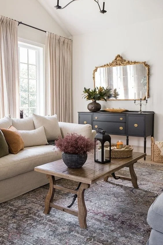
When I think of traditional design, I think of darker, richer colors, furniture pieces that have some curvature, more ornate detailing on things like baseboards, crown molding, mirrors, etc. I also envision Persian and oriental rugs — ones that have a lot going on. The picture below by one of my favorite designers, Jenna Sue, is a great example of each of theses elements — minus the detailed baseboards and crown moldings. She does a beautiful job of making traditional still feel like it belongs in this century.
Image via Jenna Sue Design
Here is another example of what I think traditional looks like — to the extreeeeme. (No thank you. Not for me.) But still has a lot of those same elements.
Image via Ballard Designs
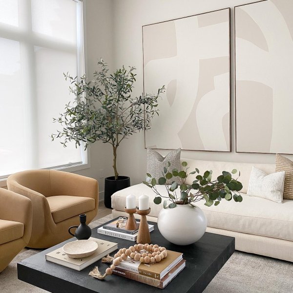
In contrast, this is what modern looks like…
Image via Nuela Designs
Lots of clean lines and geometric shapes. This coffee table has a fair amount of accessories, but typically modern design is a bit more minimalist. A neutral color palette is also super common.
One more example for good measure…
Image via Etsy
And now… when we take a little of what we love from each, we get TRANSITIONAL DESIGN!
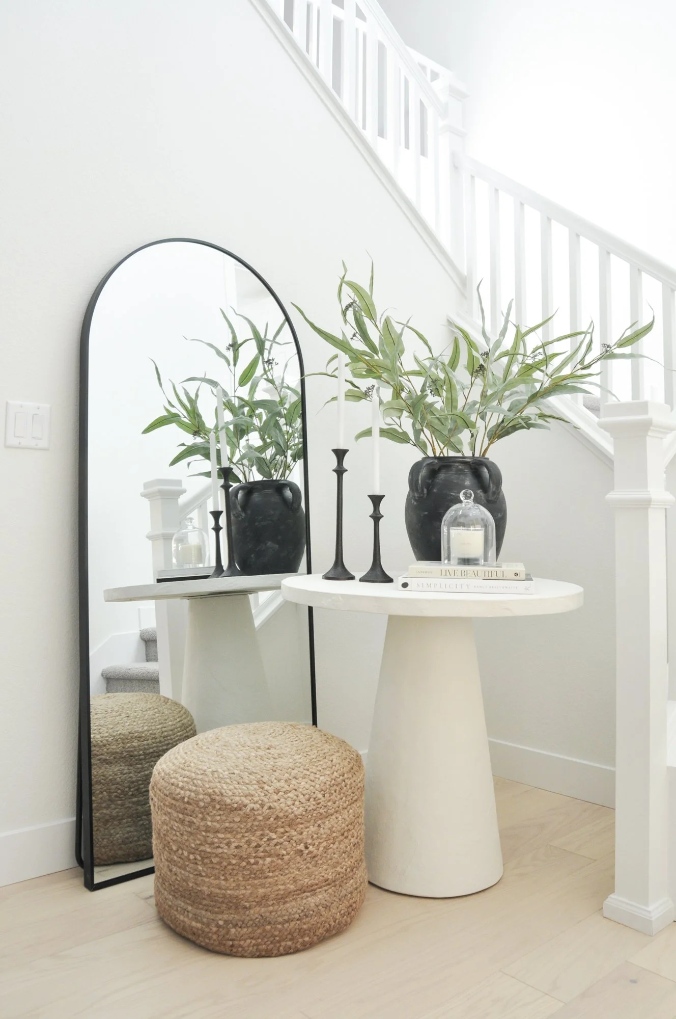
Here is an example of that juxtaposition in our Riddell project. (See more here!) The new build had more traditional architecture with the style of the hand railings, but we mixed in some clean lines with a modern table and accessorized with candlestick holders and a vase that are a bit more traditional. Now it’s transitional!
Image via Basil + Tate
The primary bedroom of our Wesorick Project showcases transitional style as well. We used a bit more color and a rug with a busy pattern as a nod to traditional design, and then we used furniture with clean lines and simple patterns. We topped it all off with a gorgeous chandelier that is about as modern as it gets.
Image via Basil + Tate
We also juxtaposed the two styles with our accessories — clean modern lines on the decorative object and a frame with more traditional, detailed art.
Image via Basil + Tate
If you’ve made it this far, consider yourself enlightened on the topic of design styles. And if you happen to love this look, reach out to us. We love transitional design, and we would love to help you design your home. Check out our interior design services here, if you’re interested!
Until next time,
Welcome to Basil + Tate, your full-service interior design team based in sunny Denver, Colorado. We describe our design aesthetic as light-and-bright, transitional, and modern. If you like clean lines and lots of white space, you’re in the right place! Looking for interior design services within the Denver, Colorado area? Let's get in touch.


