The Valgoi Project 2.0
Those of you who have been following along for some time, may know that this is the second home(!) we have completed with our clients-turned-friends, the Valgoi family. We’ve been working on this home renovation project for a couple of years now, and we’re excited to finally show it off!
When our clients bought the home, it was really dated with a lot of traditional finishes that made everything look dark, despite the beautiful windows and natural light they brought in.
During our renovation design process, we decided to maximize this natural light moving forward — watch the video below and scroll through this post to see the final reveal photos, as we walk through the totally transformed spaces in the Valgoi Project 2.0!
Kitchen & Dining Nook
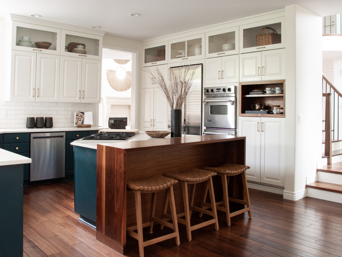
This kitchen is an extreme makeover —
just wait until you see the before and afters! The kitchen cabinets had a country feel with glaze-coating, so we wanted to lighten everything up. Our client also loves color, so we incorporated a moody color into the cabinets, by adding dark lowers and white uppers that definitely work together in this space.
Another detail we designed, as we reconfigured the cabinetry, was a wood accented niche to display our client’s tea brewing items. This space creates a perfect showcase, while giving us a spot to add some accessories in an unexpected area of the kitchen. We love a custom touch!
Speaking of custom carpentry, we also added a walnut counter top — making the kitchen island longer with space to accommodate counter stools.
We worked with our carpenter to design a custom piece that extended the original counter area, allowing for the space we needed and just the right height. Now our client’s kiddos can sit at the bar area to eat! Our team is so happy with how this creative addition to the kitchen turned out.
Finally, near the kitchen’s breakfast nook we created a dry bar area — converting what was formerly an unused desk space into a beverage refrigerator and countertop for a coffee machine.
We were able to carry in the same beautiful, bold cabinet color from the lowers in the kitchen, adding a little shiplap for texture on the wall above.
Lucky for us, our client is the queen of vintage finds and helped source a beautiful piece of art that adds just a little bit of history to the room — giving everyone something to talk about at the breakfast table.
Formal Dining Room
The formal dining room featured a few furnishings from the Valgoi Project 1.0—
and we were so happy to repurpose some of the furniture we had selected for their previous home’s dining area. (Tap to see the Valgoi Project 1.0 here!) We brought over the table, chairs and sideboard to this space — and what we love most is how versatile these pieces are.
Their previous home was more of an eclectic coastal vibe, but these timeless furniture pieces transitioned seamlessly into this home’s more lived-in, collected, layered spaces by complementing the deeper hues with neutral tones and natural textures — creating a whole new look.
We love how the sideboard table turned out, and the chairs have beautiful rattan to bring in natural textures. Here we kept accessories simple and minimal, with candlesticks placed in the center of the table, so as not to overpower the sideboard art where we also kept decor minimal. This really helped to showcase the beautiful textural artwork on the wall.
Another favorite element of this formal dining room is the Loloi area rug we sourced from the Amber Lewis collection. Not only is it beautiful, but it’s the softest rug we’ve ever purchased. (Seriously!) We love the colors that this area rug added with its busy pattern that paired perfectly with a simple geometric design. Adding a bit of vintage and a bit of modern really tied this whole dining room together.
Family Room
The first change we made in the family room area —
was painting the brick on the fireplace. It was a pretty red brick, but it just wasn’t working for this space. We painted it a bright white to lighten things up, and we love how it gave some texture to the room without adding color.
One of the big things we focused on in this room during the design process was the layout of the space. We wanted this family living area to be functional for our clients, but we also wanted it to be a beautiful, inviting space for everyone to congregate.
To keep things pretty, but also make it possible to kick back, relax and watch TV— we opted for our favorite Samsung TV, The Frame. (#NotSponsored!) We love how this TV looks like art when turned off and blends in perfectly with the gallery wall our team created for this space. All it takes is the touch of a button and you can watch your favorite show, while still maintaining the ~ aesthetic ~ and as designers, we are here for it!
Lastly in this layered family room, we created custom shelving to replace an old, outdated built-in. Here we used the same walnut wood from the kitchen, incorporating it into the living area to modernize the space, and we love how it turned out.
Formal Living Room
One of the biggest challenges in this formal living room was its super high ceilings—
there was great lighting and beautiful height, but that can make designing tricky when furnishing a space. Our job as designers is to make sure pieces fit the scale of a room, so our clients don’t end up with dollhouse furniture in a large formal great room, such as this. Thankfully, our sourcing was a success if we do say so!
Additionally, sourcing artwork was a main focus for this space. We added a set of three grassy wall hangings above the fireplace that really help draw the eye up and emphasize the wonderful height and size of this formal living room.
The second key piece of art was the canvas above the sofa. Here we wanted to keep it simple and minimal to contrast with the gallery wall in the family living space. We sourced the perfect piece from Studio McGee (our fave!) that worked beautifully and added just the neutral pop we were looking for with a touch of texture to complement elements of the room.
Saving the best for last: this beautiful olive green sofa! This furniture piece was easily our favorite pick of the entire room (maybe the whole house?) and one of our very first decisions in this home renovation that absolutely inspired the rest of the formal living room space. We’re in love!
Home Office
The home office was one of the biggest transformations of this home—
and when you see the before and afters, I think you’ll agree! All of the previous millwork and cabinetry was a very light color and needed to be updated to give the space some life.
We wanted to go deeper and moodier with our paint color selection, and the natural light in this room totally made that possible. This blue-green paint color turned out absolutely gorgeous!
Thanks to our client’s amazing talent at securing vintage finds, this home office now features a beautiful mid-century modern desk at the center of the room. The bookcase built-ins were adorned with carefully curated and artfully arranged knick-knacks, sourced from Denver area antique shops to create a wonderful mix of old and new that tells a story and brings this space together.
Welcome home, Valgoi family (again!)
And that is a wrap on the Valgoi Project 2.0!
This project has been an absolute blast, and we feel so fortunate to have been back to work with our clients on their second home renovation project. We truly love our clients and feel so lucky when we get to work with them twice!
Until next time,
Welcome to Basil + Tate, your full-service interior design team based in sunny Denver, Colorado. We describe our design aesthetic as light-and-bright, transitional, and modern. If you like clean lines mixed with earthy colors and textures, you’re in the right place! Looking for interior design services within the Denver, Colorado area? Let's get in touch.


