The Riley Project
And we’re baaack— Coming to you in 2024 with our first new project reveal! We completed the Riley Project a couple of months ago, as we renovated this entire Denver area home from top to bottom— including the kitchen with breakfast nook, formal dining room, living room, primary bedroom, primary bathroom, home office, and laundry room.
No surface was left untouched, as we moved and reconfigured walls in the master bedroom area. In all the other rooms and spaces, we replaced everything from flooring and trim work to the entire kitchen.
So come with us, and we’ll show you around! Watch the video below and scroll through this post to see the final reveal photos, as we walk through each of the fully remodeled spaces in the Riley Project.
Kitchen & Breakfast Nook
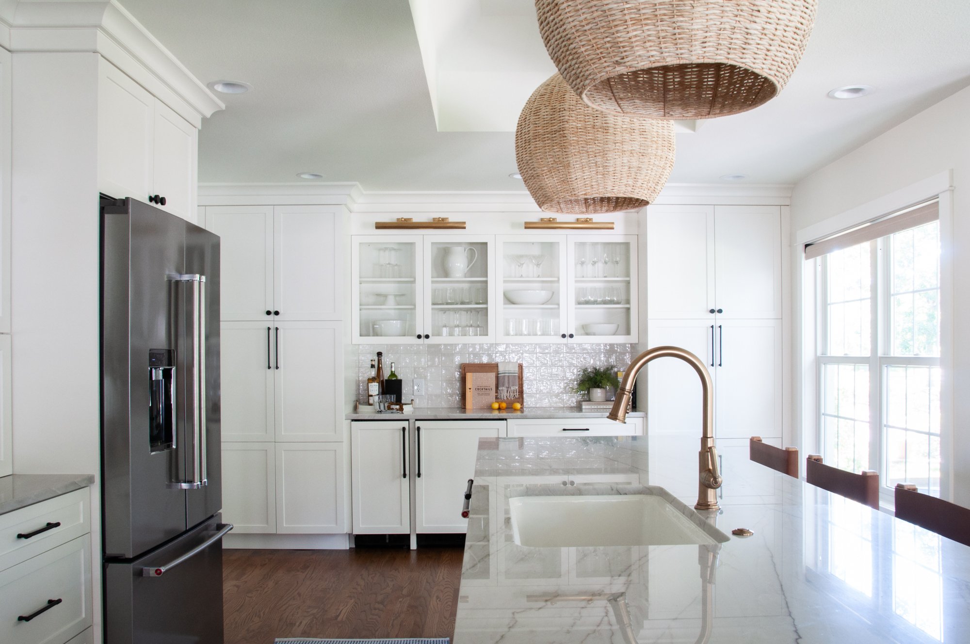
Let’s kick things off in the kitchen—
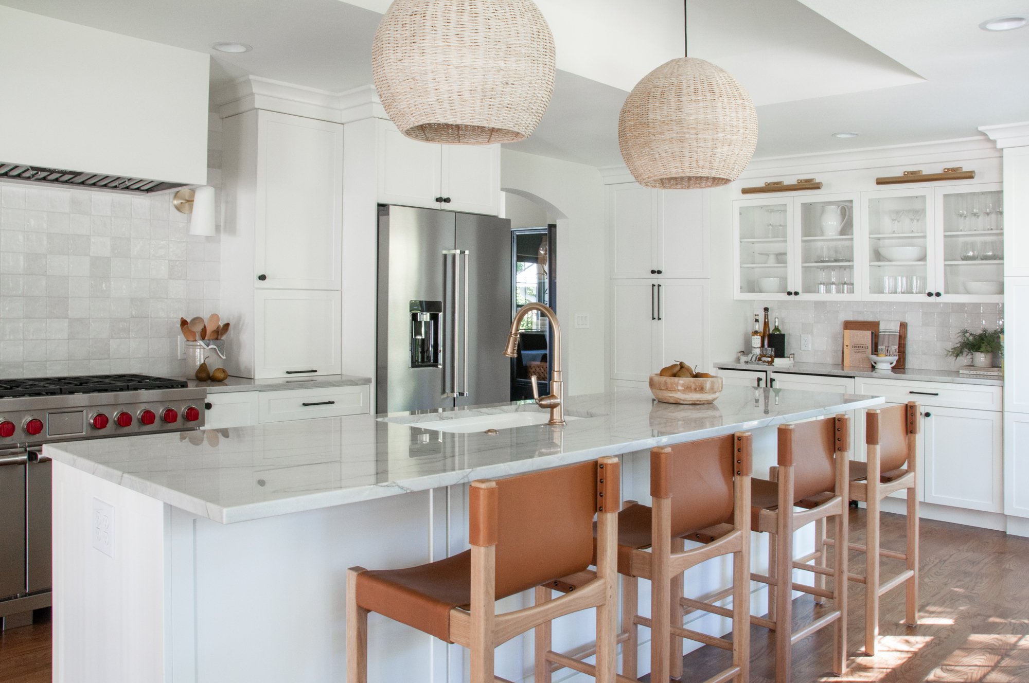
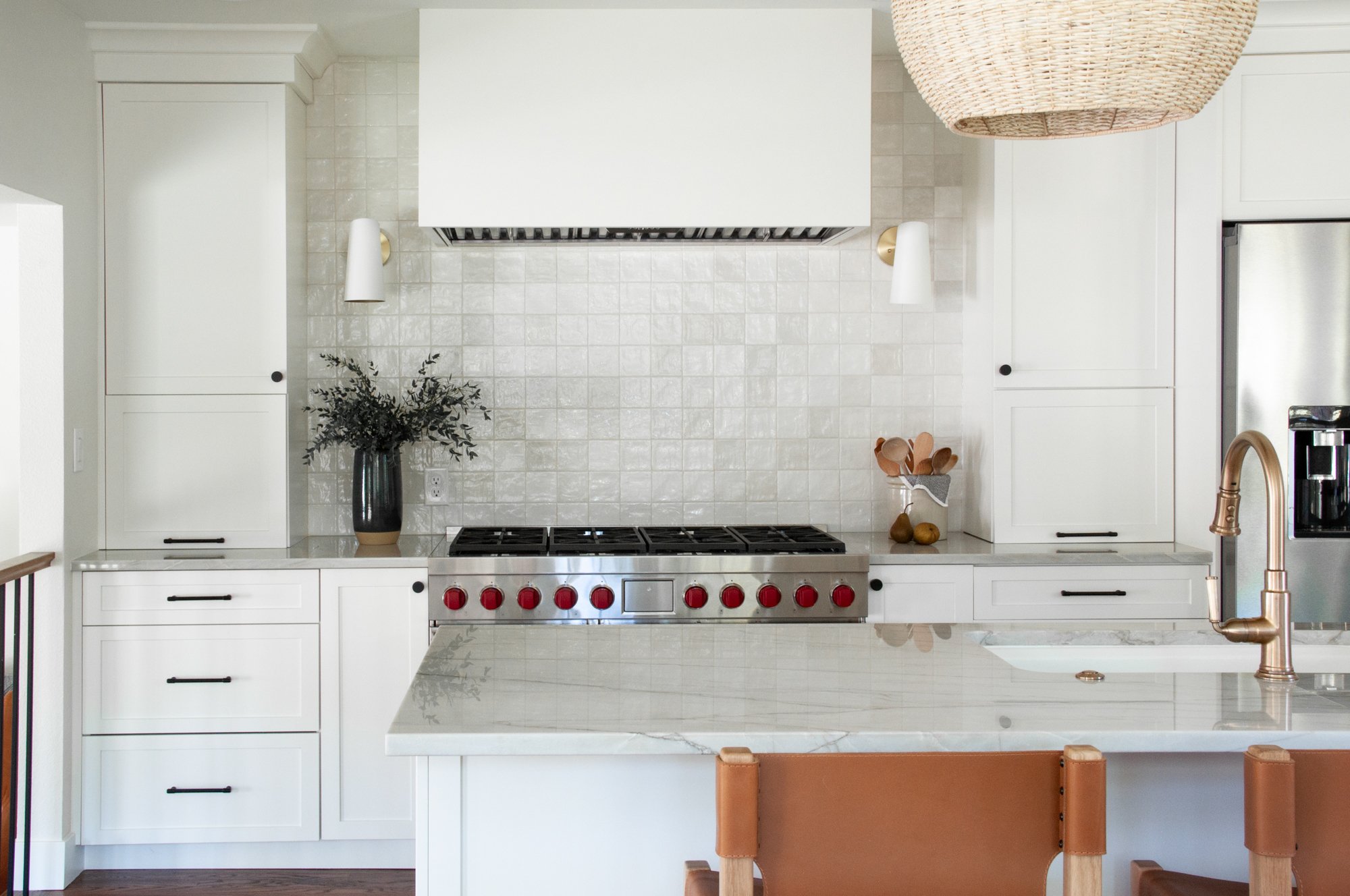
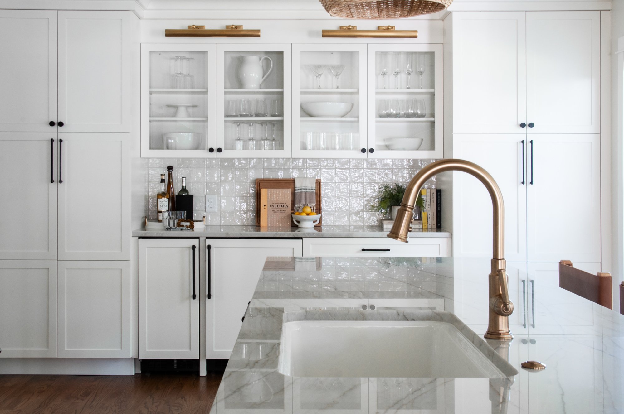
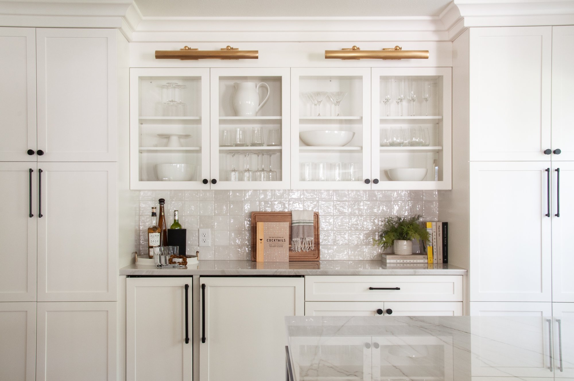
We did an entire gut job of this kitchen, replacing everything from the cabinetry and the countertops, to the backsplash, lighting and appliances. We covered. it. all.
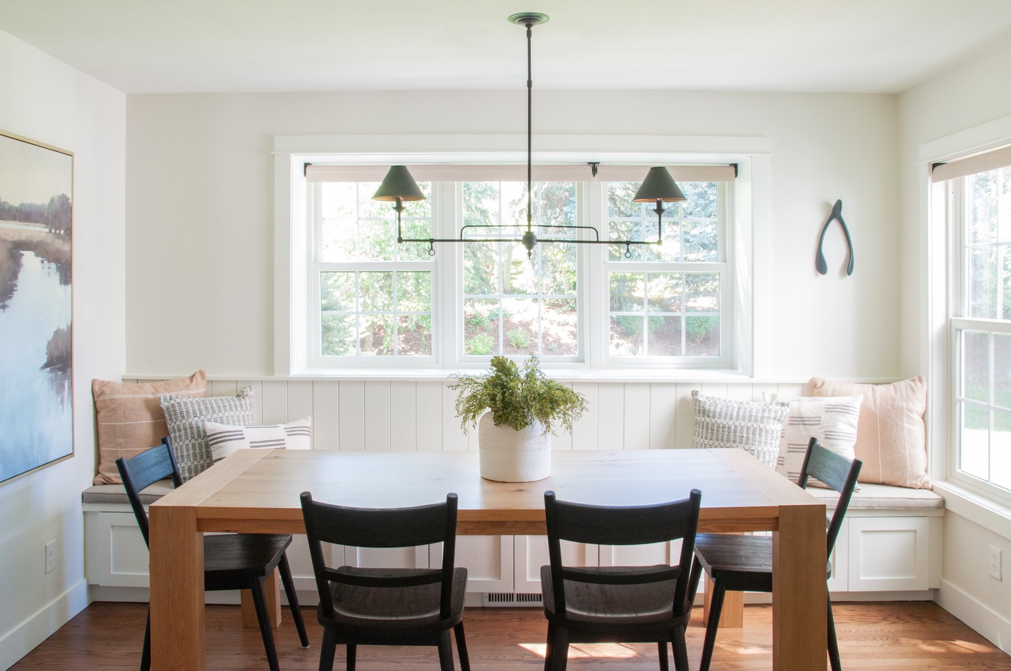
Our team also expanded our client’s kitchen island and breakfast nook eating areas to accommodate a large family. We loved seeing this space come together as we made it family friendly, while still keeping it pretty. Form truly meets function in this space!
Formal Dining Room
We made a huge change in the dining room—
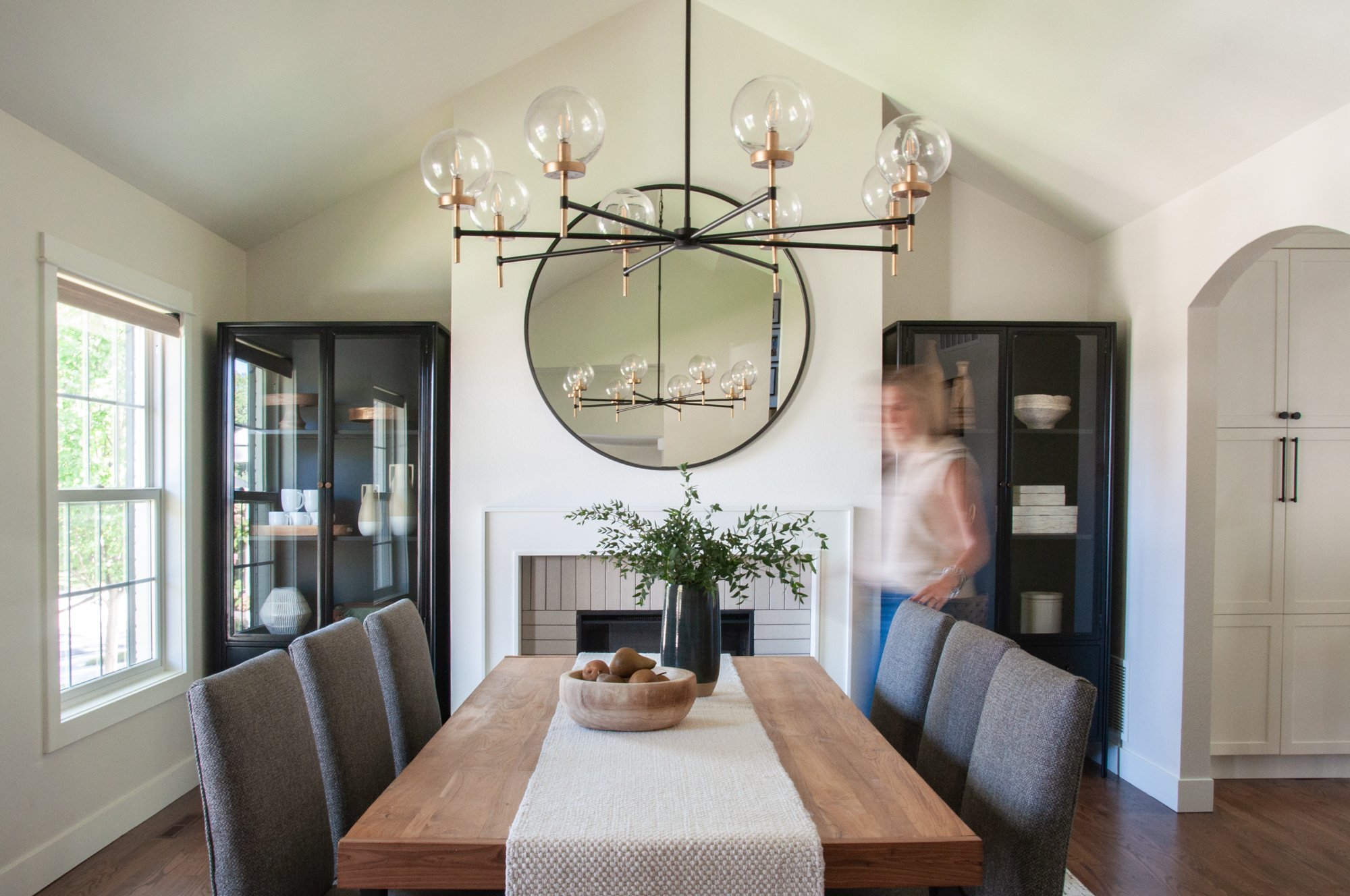
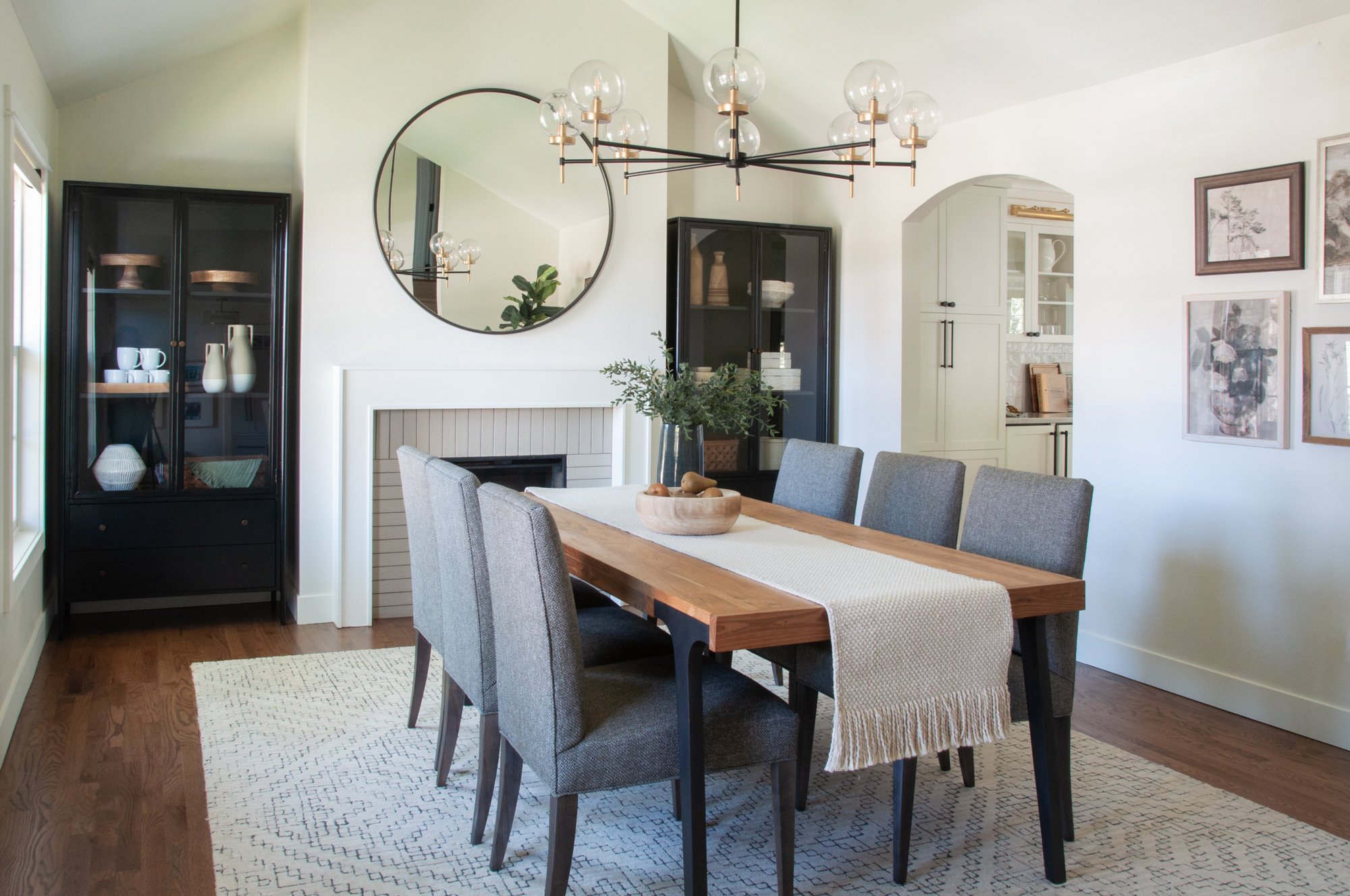
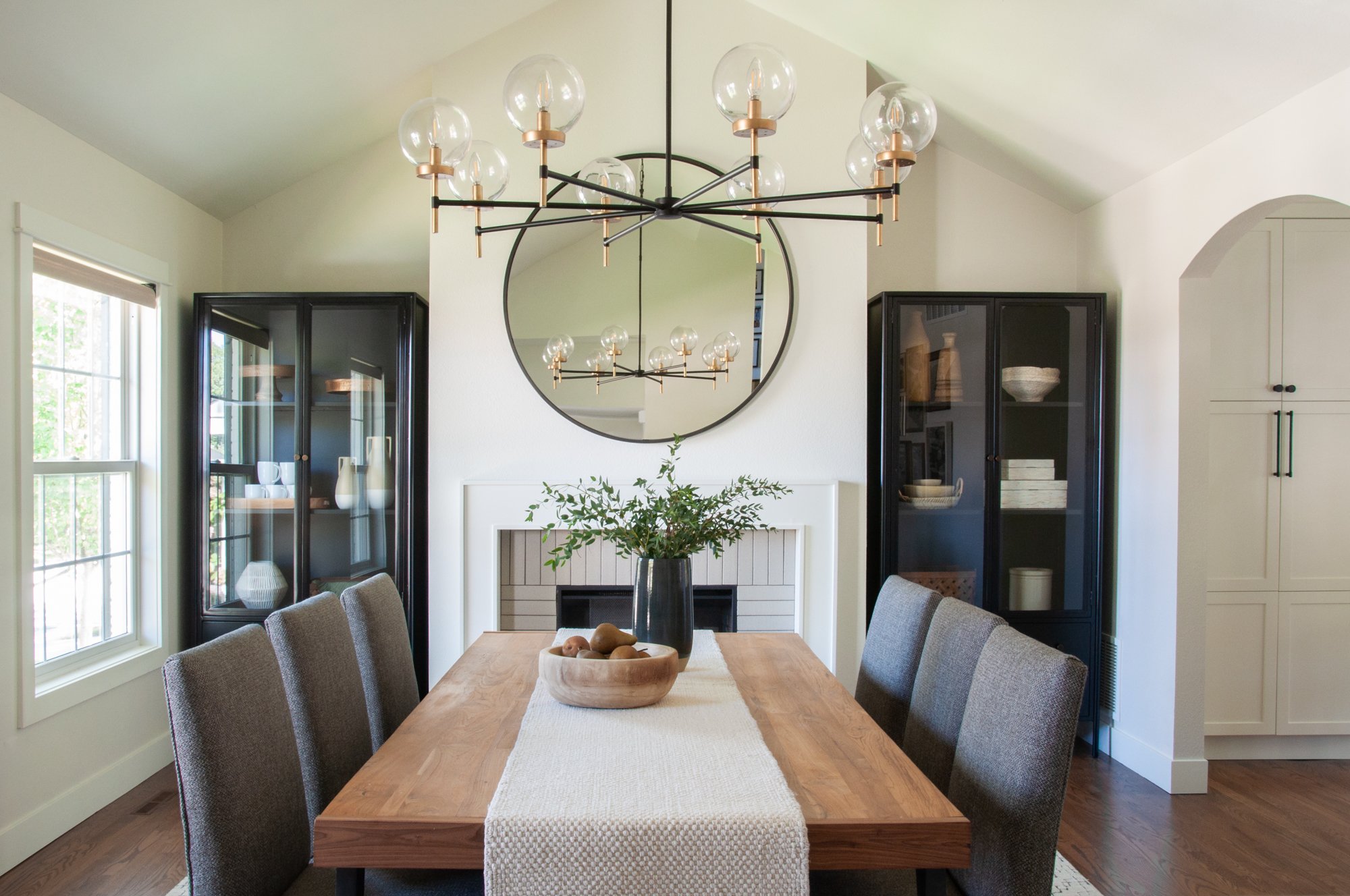
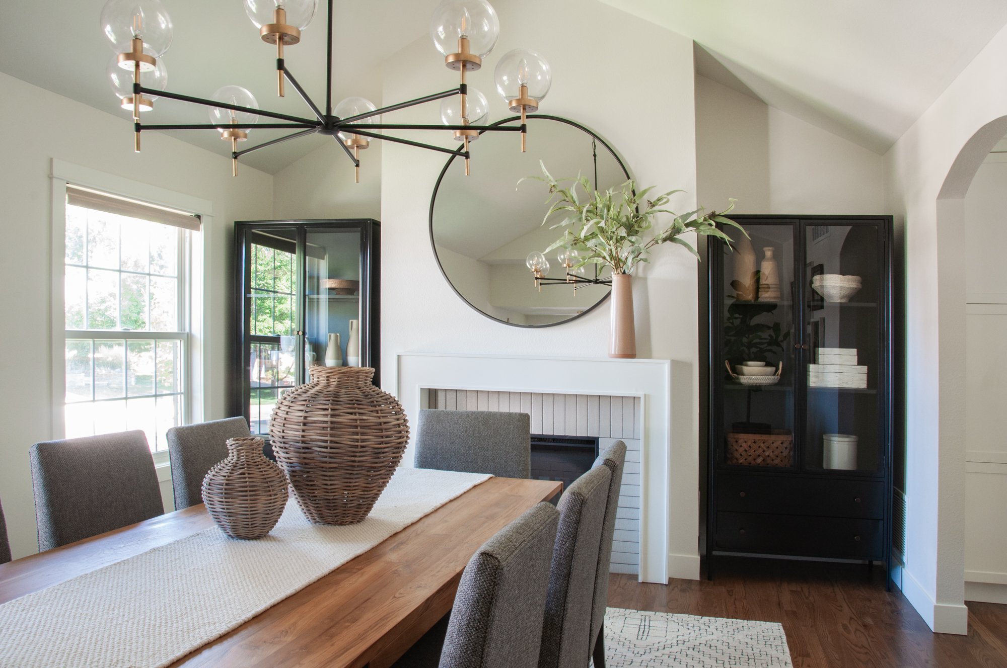
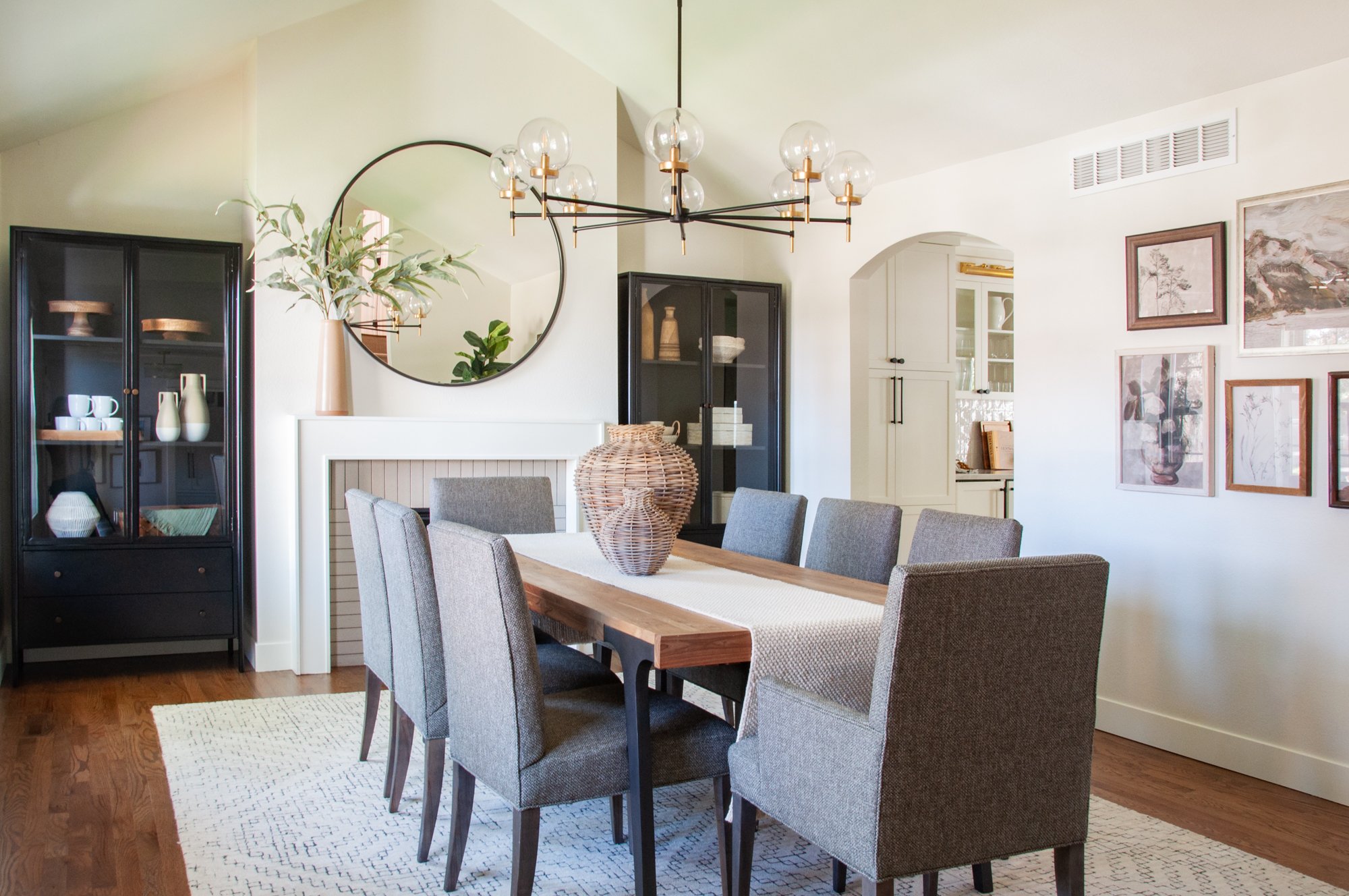
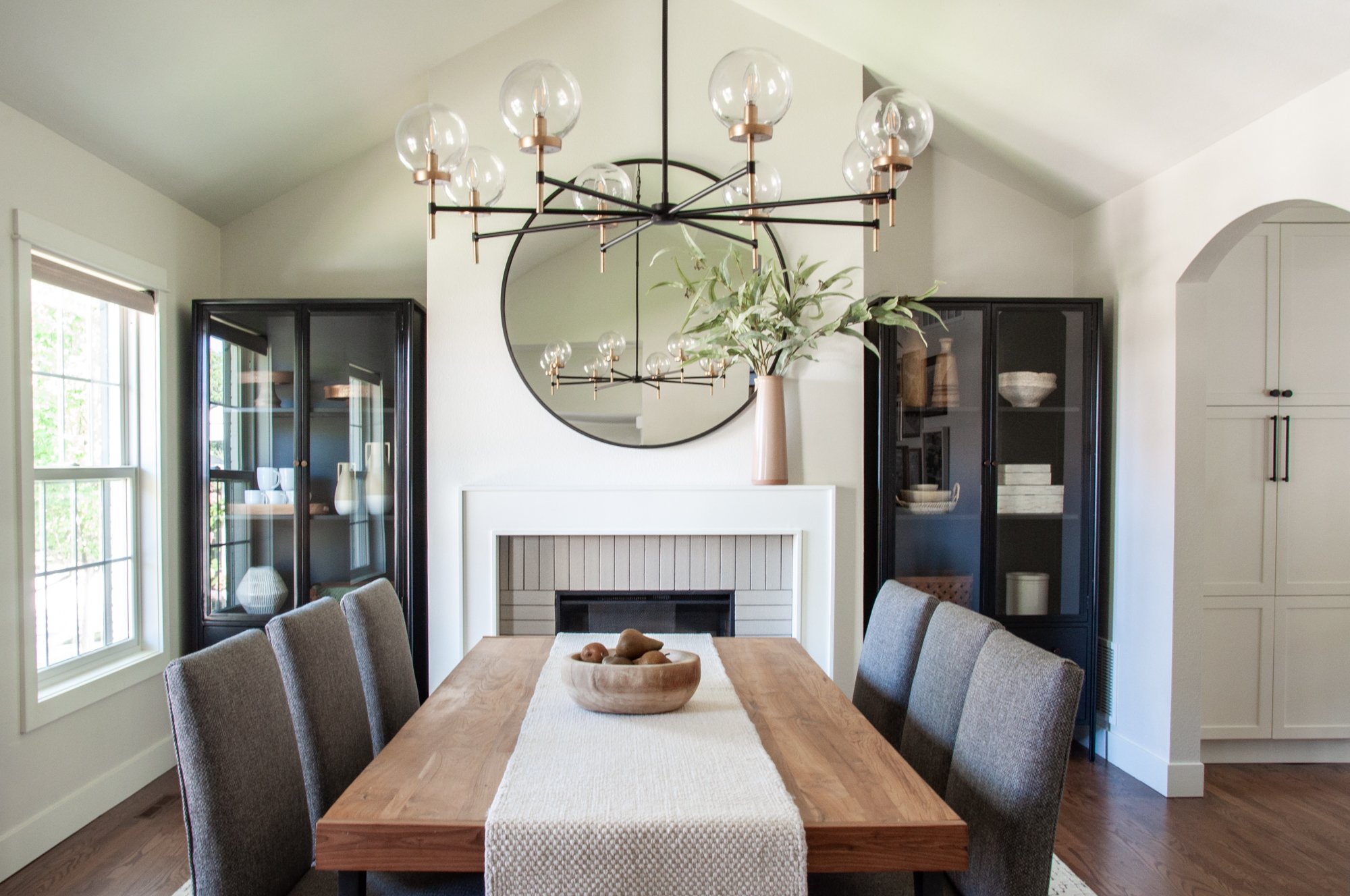
This room used to be the formal living room space and we wanted to convert it into a formal dining room, but it actually felt a bit too big at first. To create a more warm, intimate environment, we framed in a fireplace with space for display cases and that instantly made the space feel cozier.
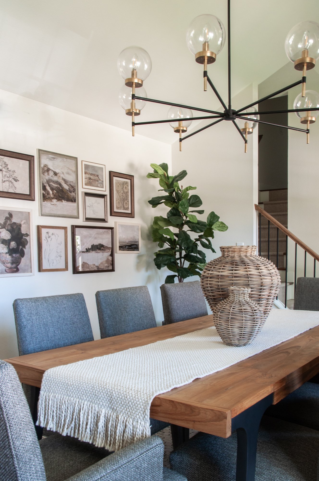
This amazing modern chandelier was a complete game changer in here, along with the beautiful vaulted ceilings, it was the perfect statement piece. Another favorite highlight in this formal dining room is the vintage-coastal gallery wall we created for our clients. We wanted to create a coastal feel, but without the beach-house-vacation-home vibes, and this toned-down artwork did just the trick by bringing in earthy elements that also warm up the space.
Living Room
We started with some pops of color—
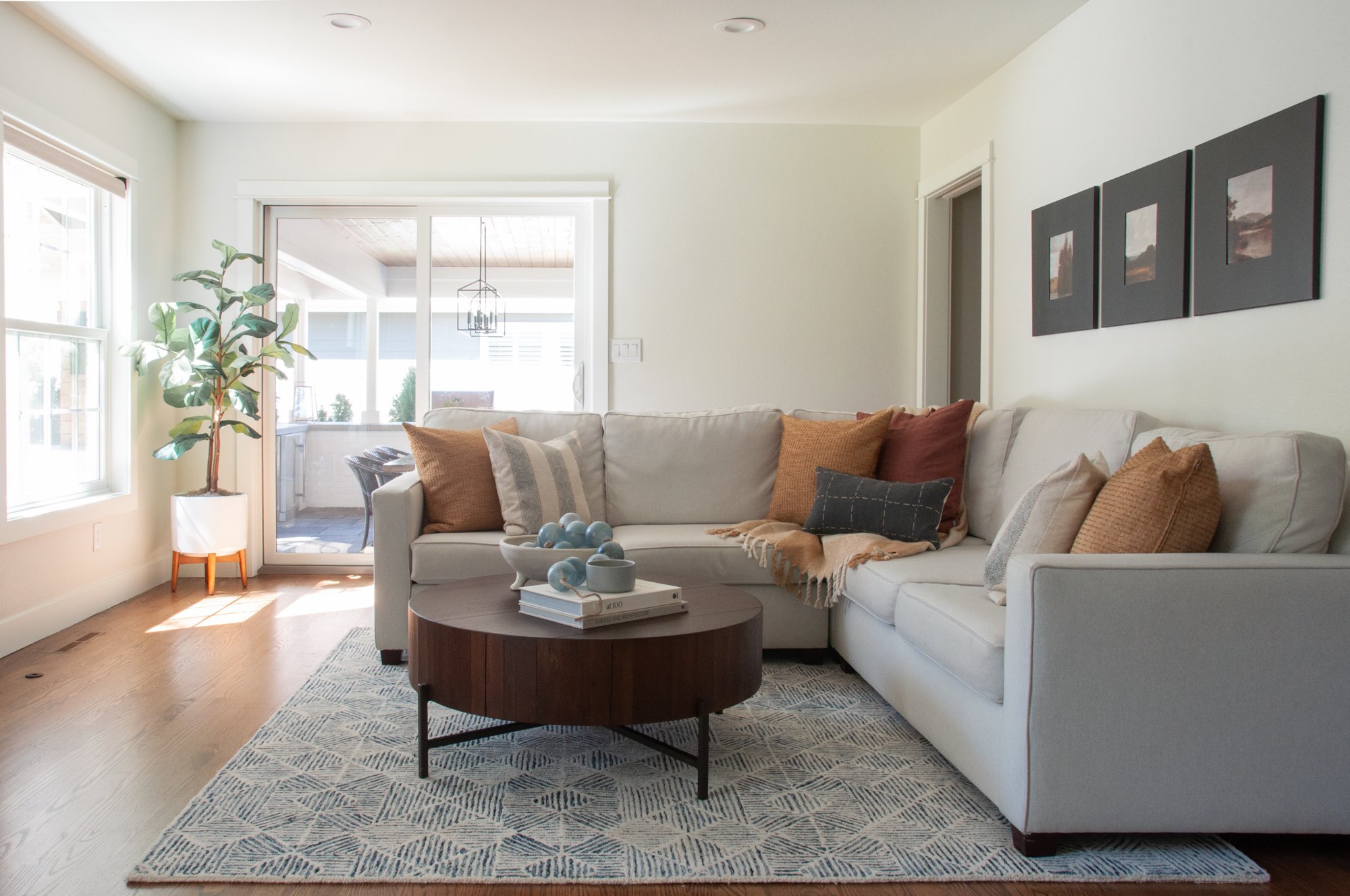
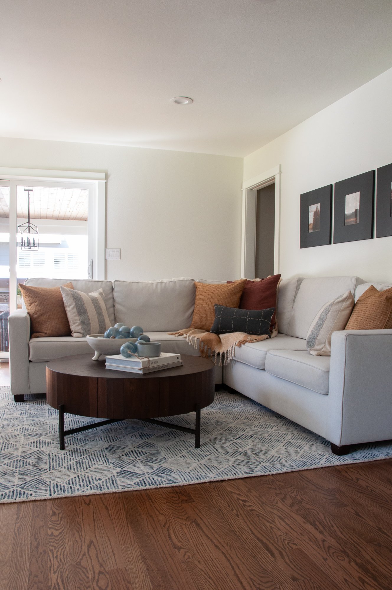
We started this space by finding inspiration in the artwork you’ll see hung on the wall above the sectional. Our team loved these rich, warm earth tones in the art, so we carried that into the throw pillows as well for a few more pops of color.
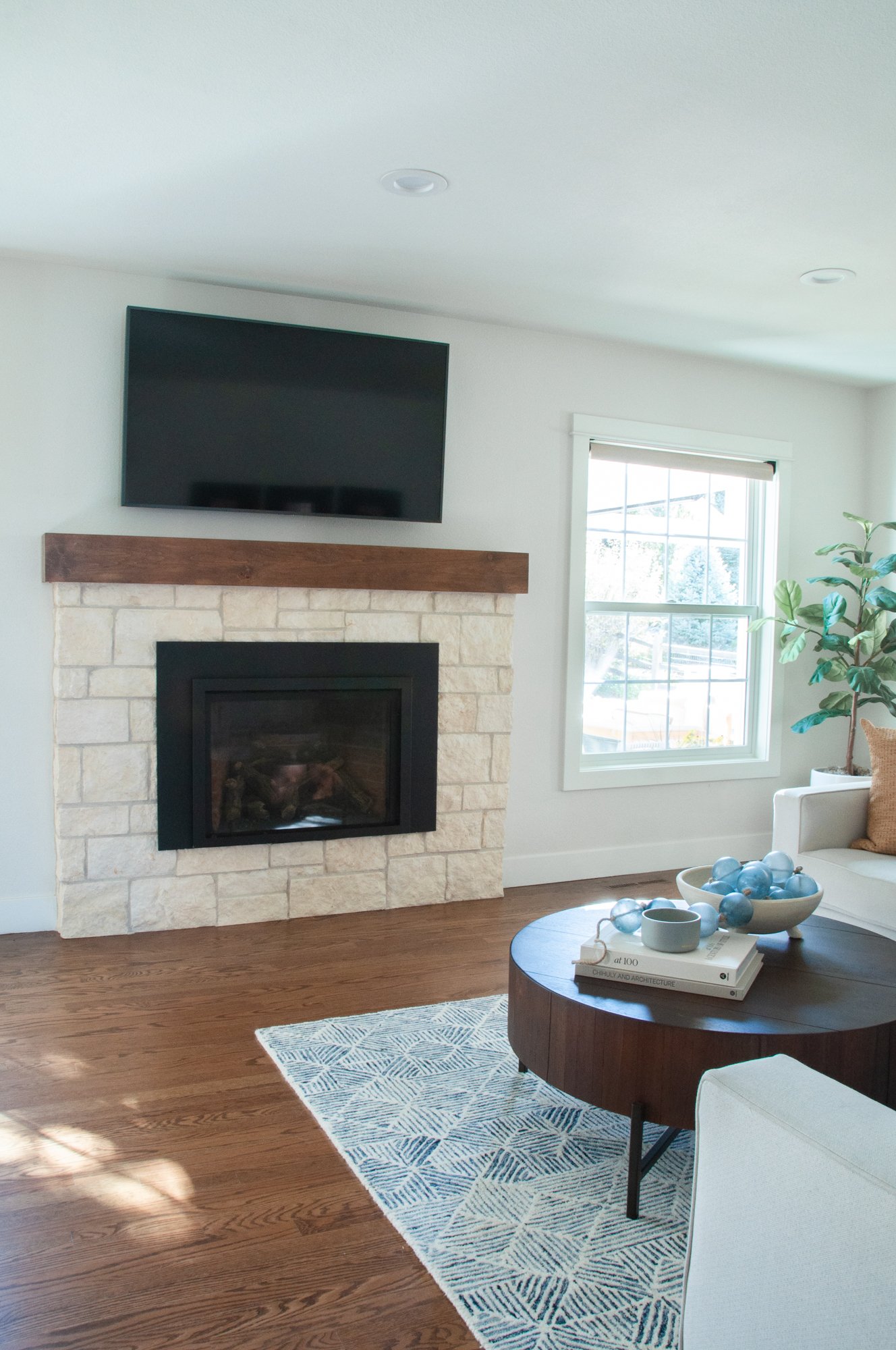
The biggest facelift we executed in this living room was the fireplace makeover. The previous space was very dated with 1980s-looking brick. We opted to remove some of the brick and reface the rest with stone to create the look of an entirely new fireplace, which turned out absolutely gorgeous.
Primary Bedroom & Bathroom
The primary suite was where most of the construction took place—
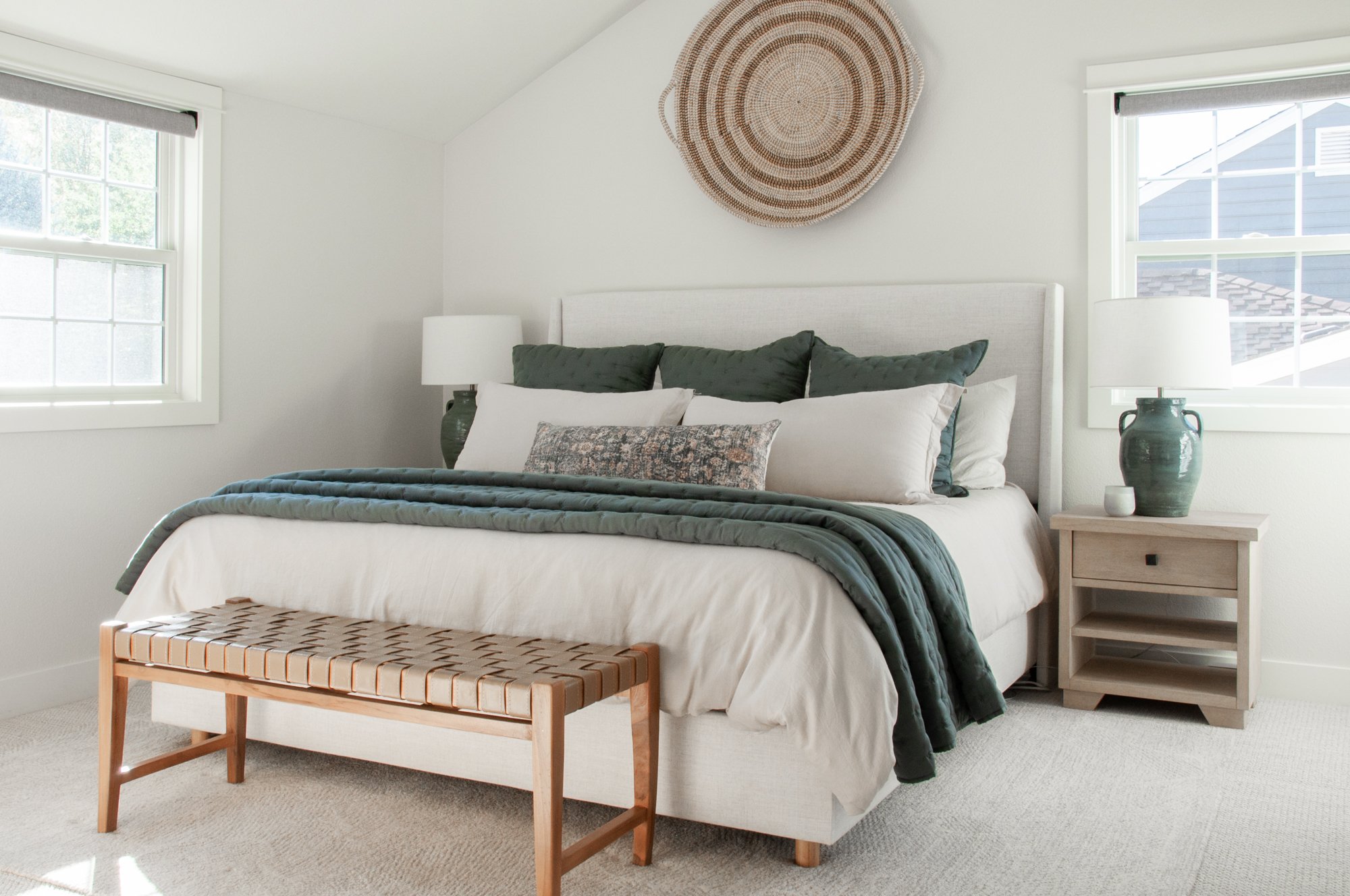
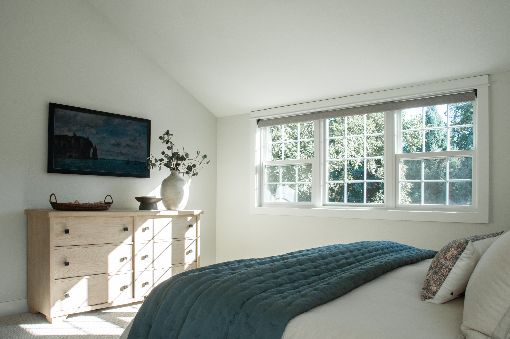
Between the primary bedroom and bathroom, these were the spaces where we took down walls and converted a bedroom into the primary bath area to create a full primary suite that was more suited to our client’s needs. We also vaulted the ceilings in both the bedroom and bathroom, which makes such a difference architecturally, taking things from builder grade to a much more custom home look.
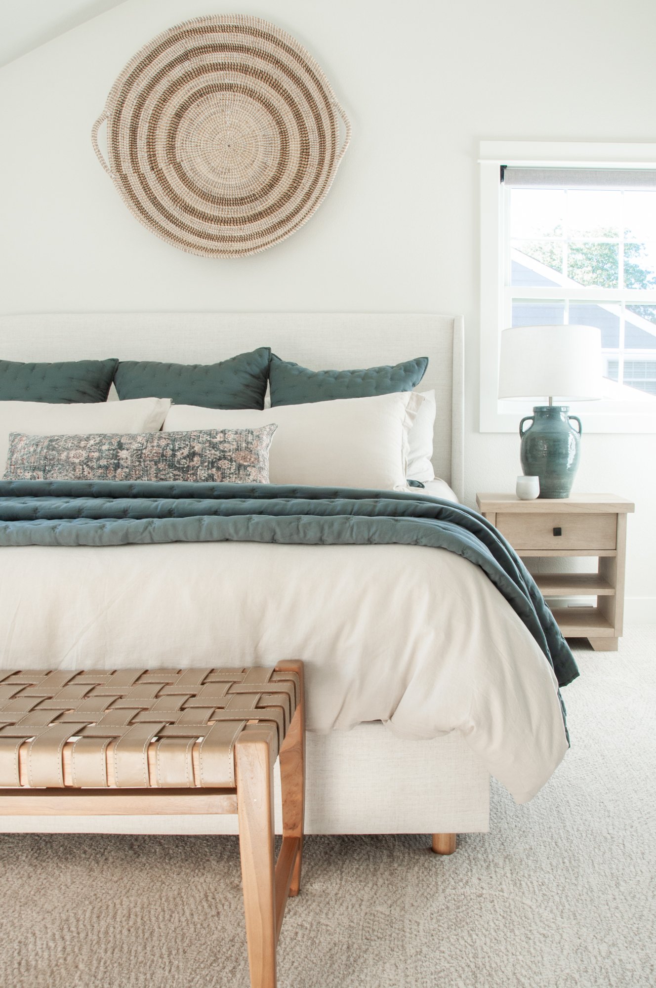
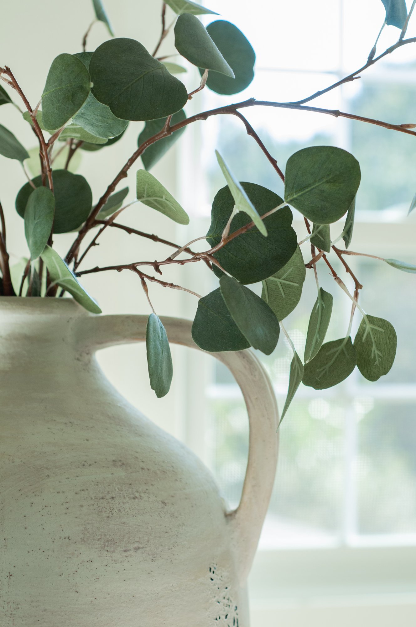
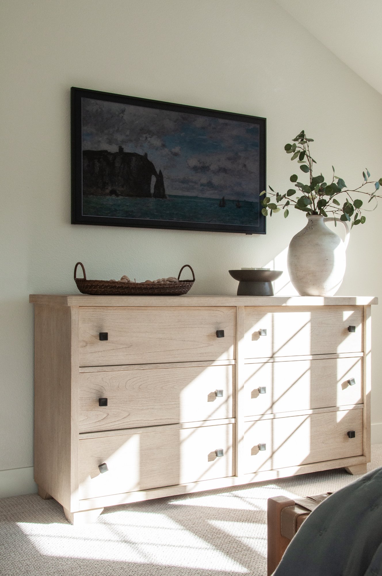
Our design team was so happy to start with a blank slate in both spaces. This allowed us to bring in new furnishings and accessories to continue an earthy, muted coastal vibe with white oak furnishings, neutral tones and a few pops of vintage-y blues to warm up the primary bedroom space.

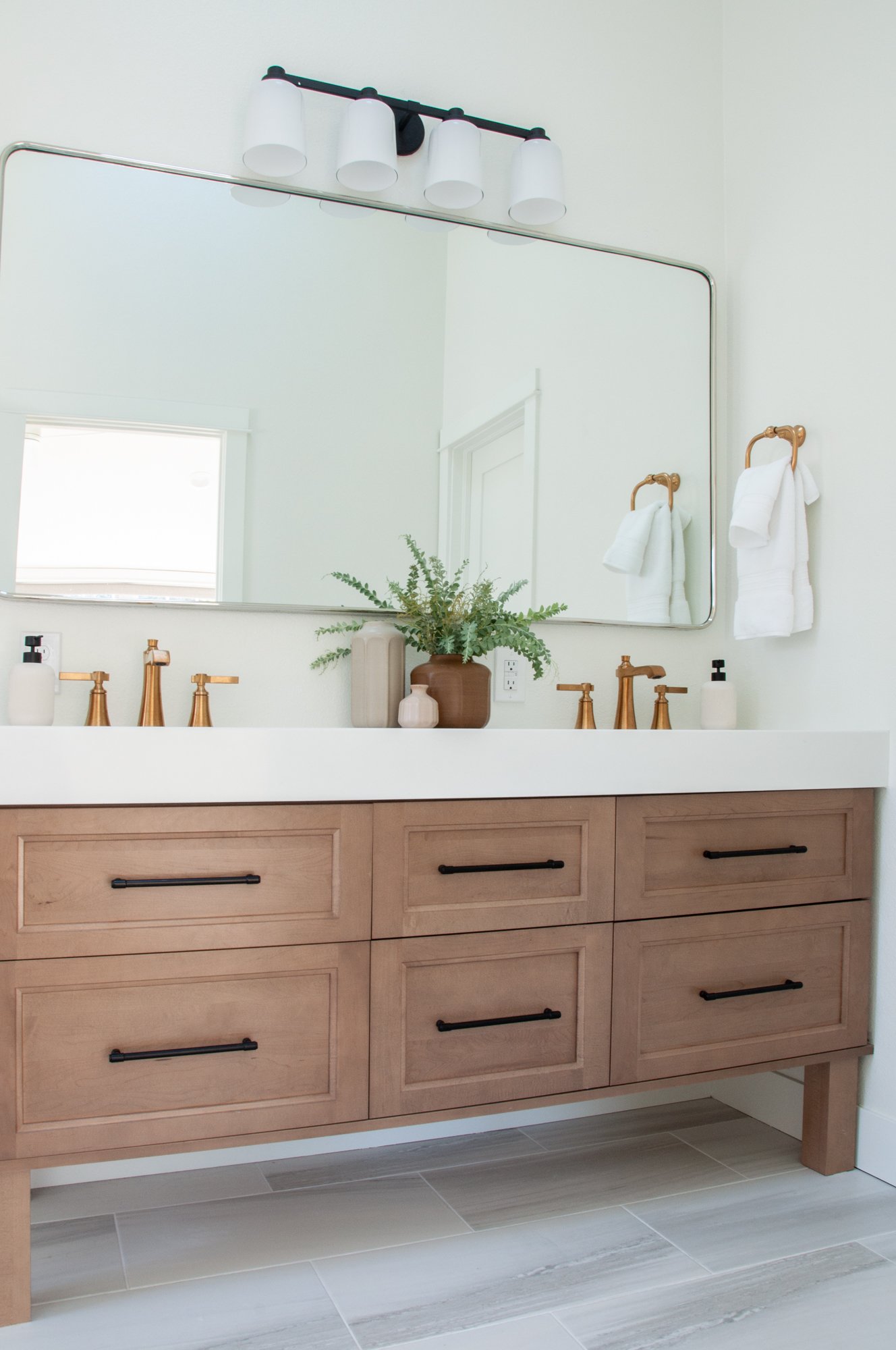
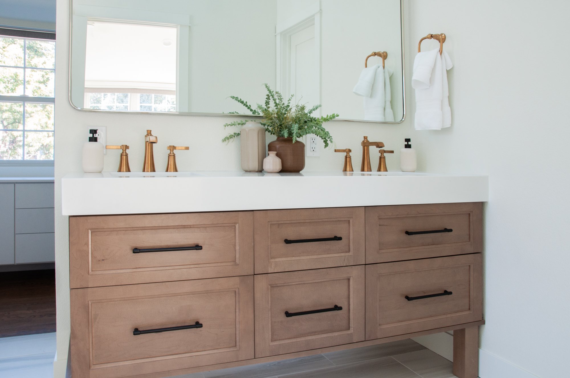
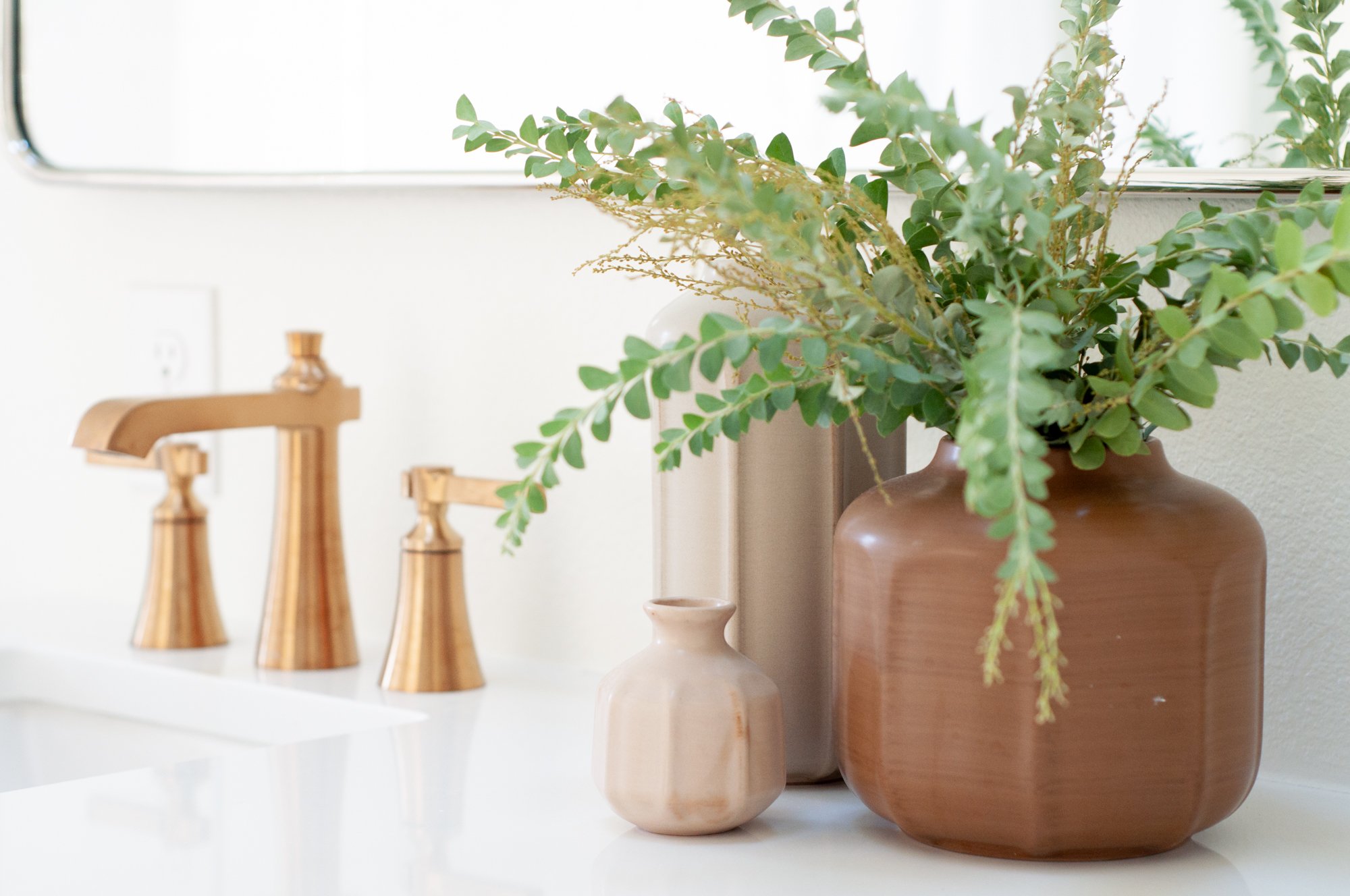
In the primary bathroom, we vaulted the ceilings again and it made a huge difference — this bathroom now feels ginormous and so luxurious. While we weren’t left with a ton of extra counter space, we really wanted to include double sinks and three rows of drawers in the vanity. We love the symmetry that is achieved through these drawers and the thicker countertop was a beautiful splurge. For the fixtures, we selected a patina brass that is just fabulous.
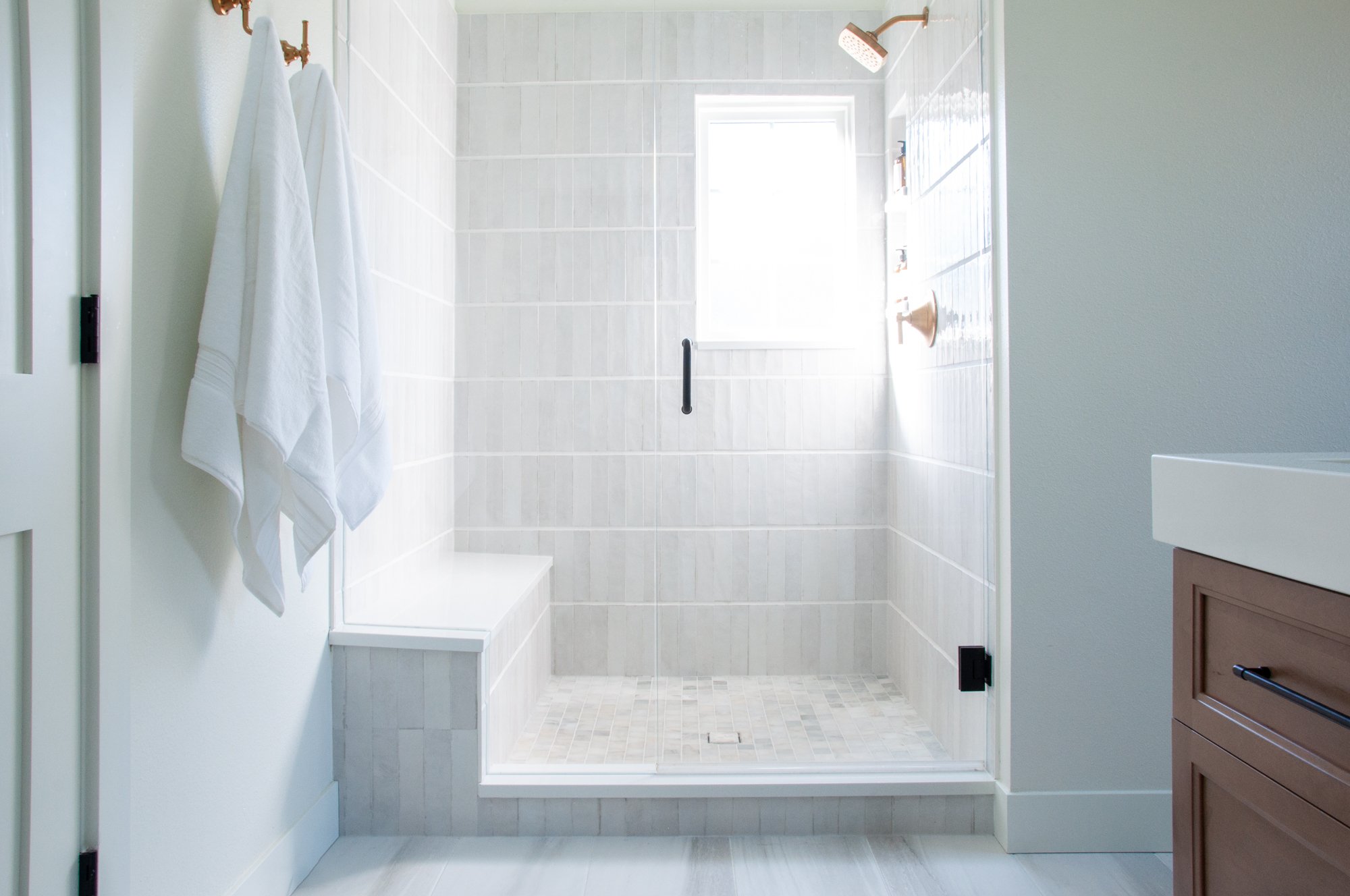
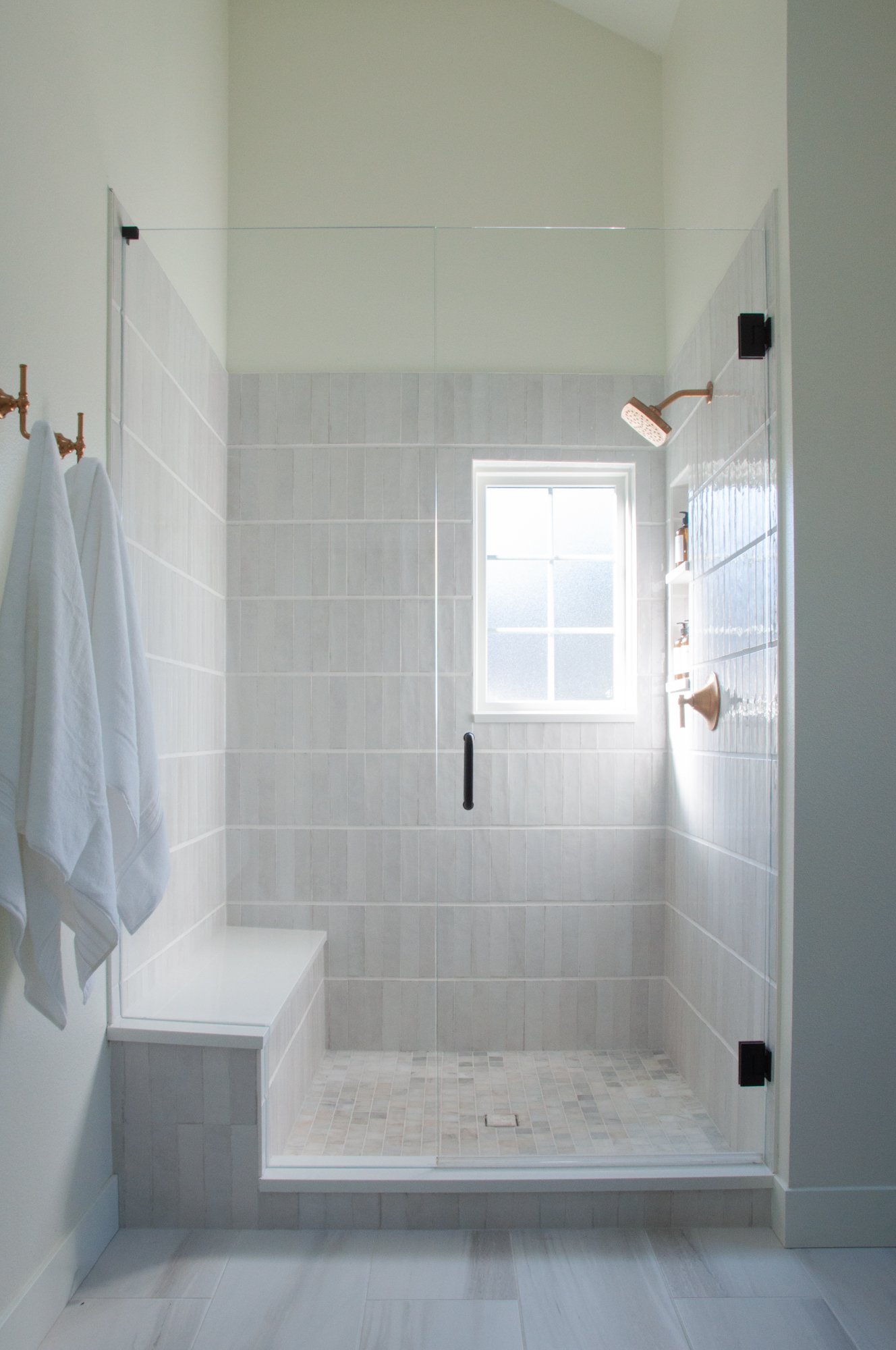
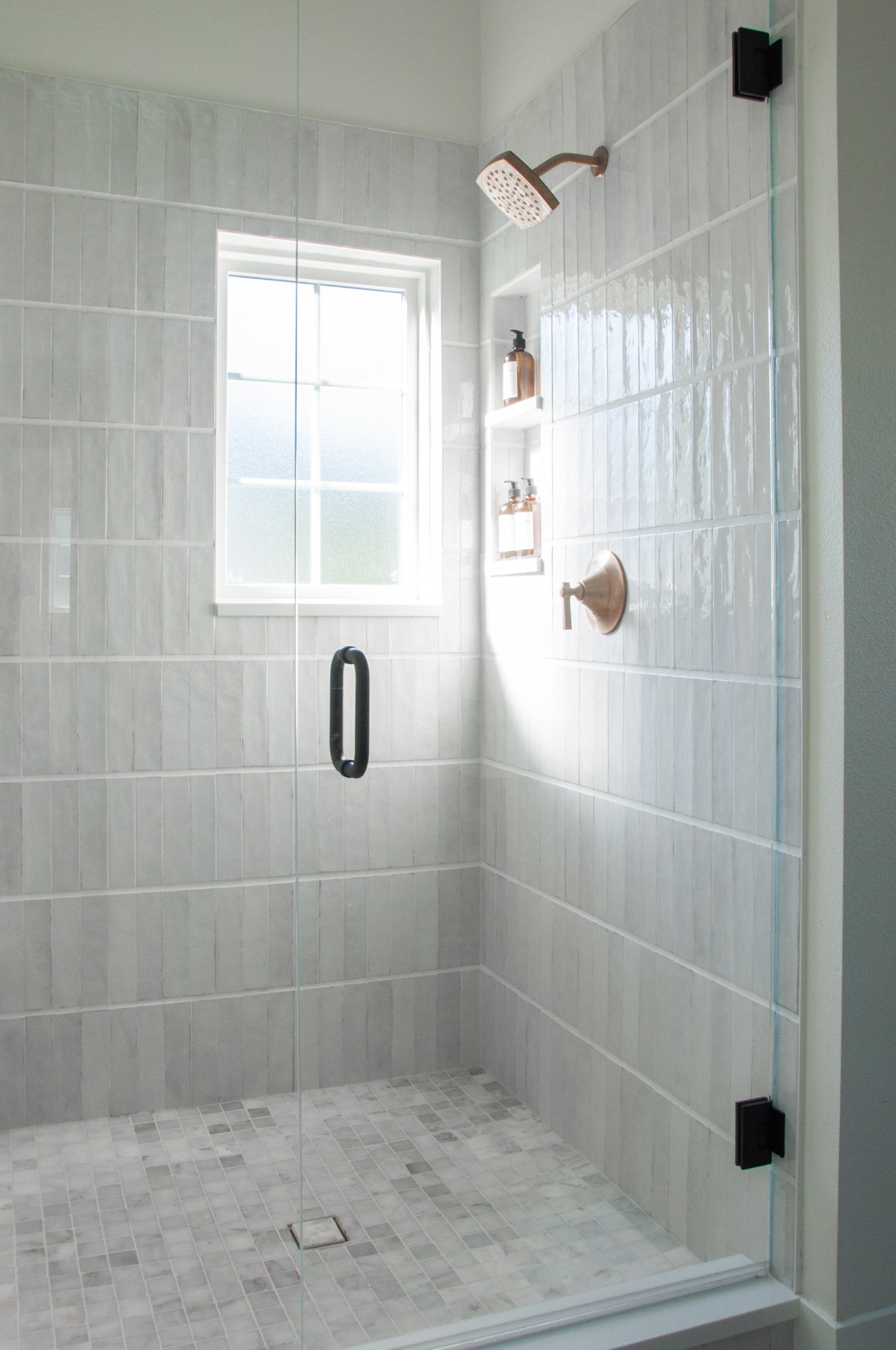
This amazing primary suite shower turned out better than we had even hoped, and it’s all about the tile work. The tile itself is beautiful, but the way we laid the tile and the grout pattern around it really elevates the look of the entire bathroom. Our team designed a pattern that varied the grout lines with a very thick horizontal line and kept the vertical lines thin to create an eye-catching pattern of stripes for this luxury look.
Home Office
The home office was one of the biggest transformations of this home—
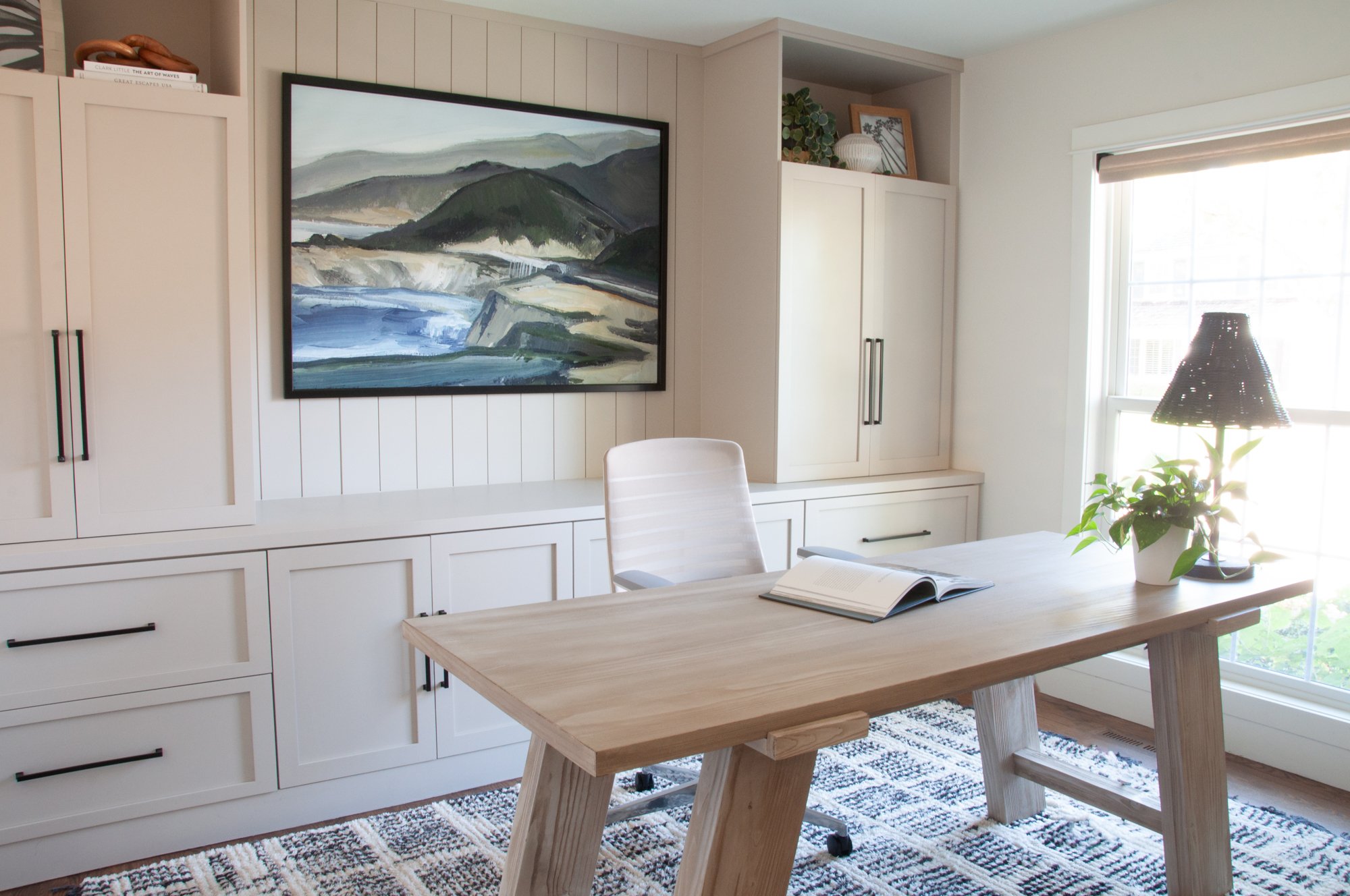
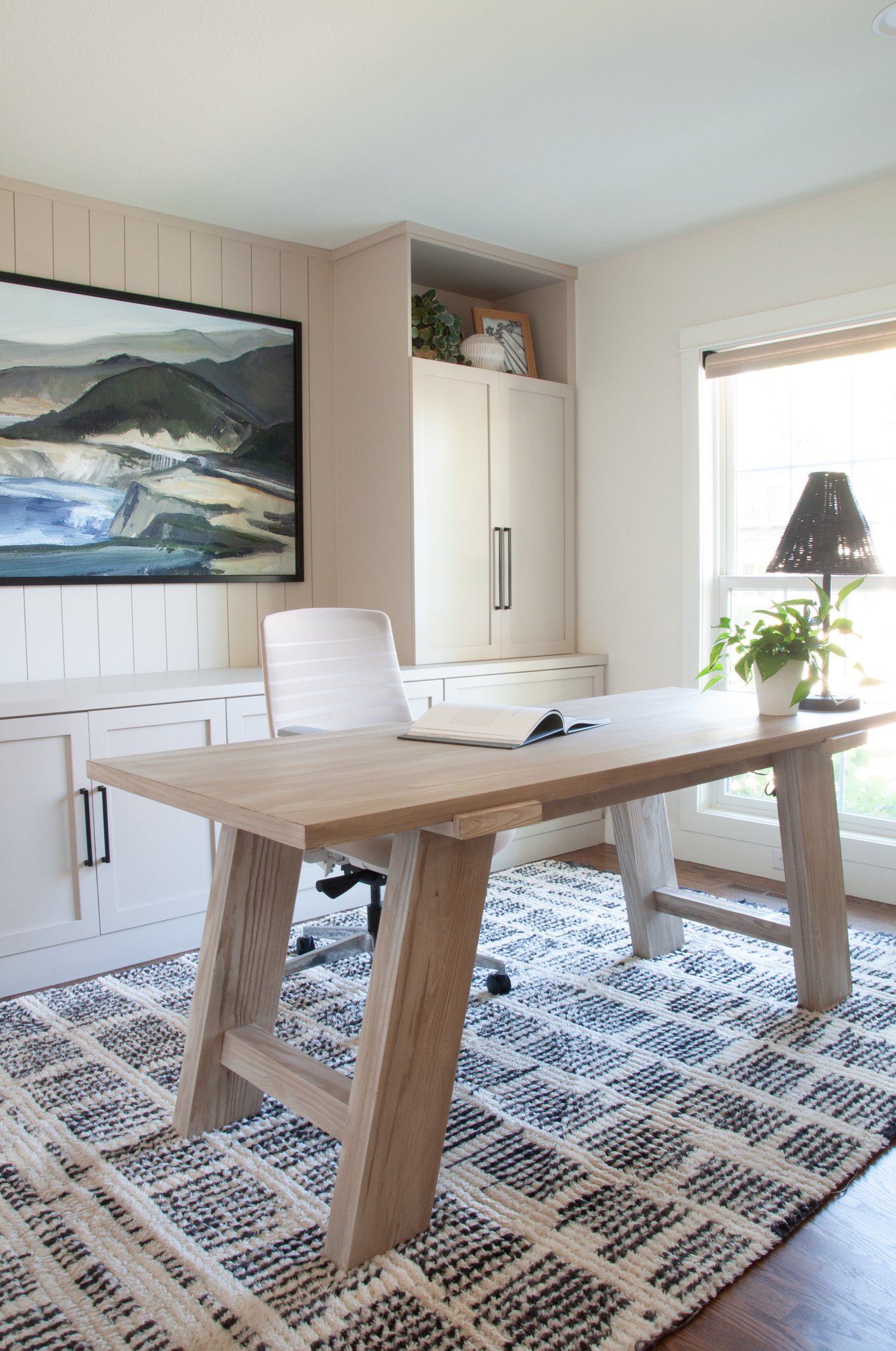
In our client’s home office we were able to design and build these custom built-ins, and they are everything! We simply love how they turned out. It was very important to us and our clients to include a lot of closed storage space and have room for the clutter that can come in an office.
We opted for a small dining room table as a desk, to give our clients plenty of surface area for working since all of the storage is now behind them. Finally, we left a space in the middle of the custom cabinetry wall to feature a beautiful piece of artwork as the main focal point of this room.
Laundry Room
We wanted to keep it beautiful, but functional—
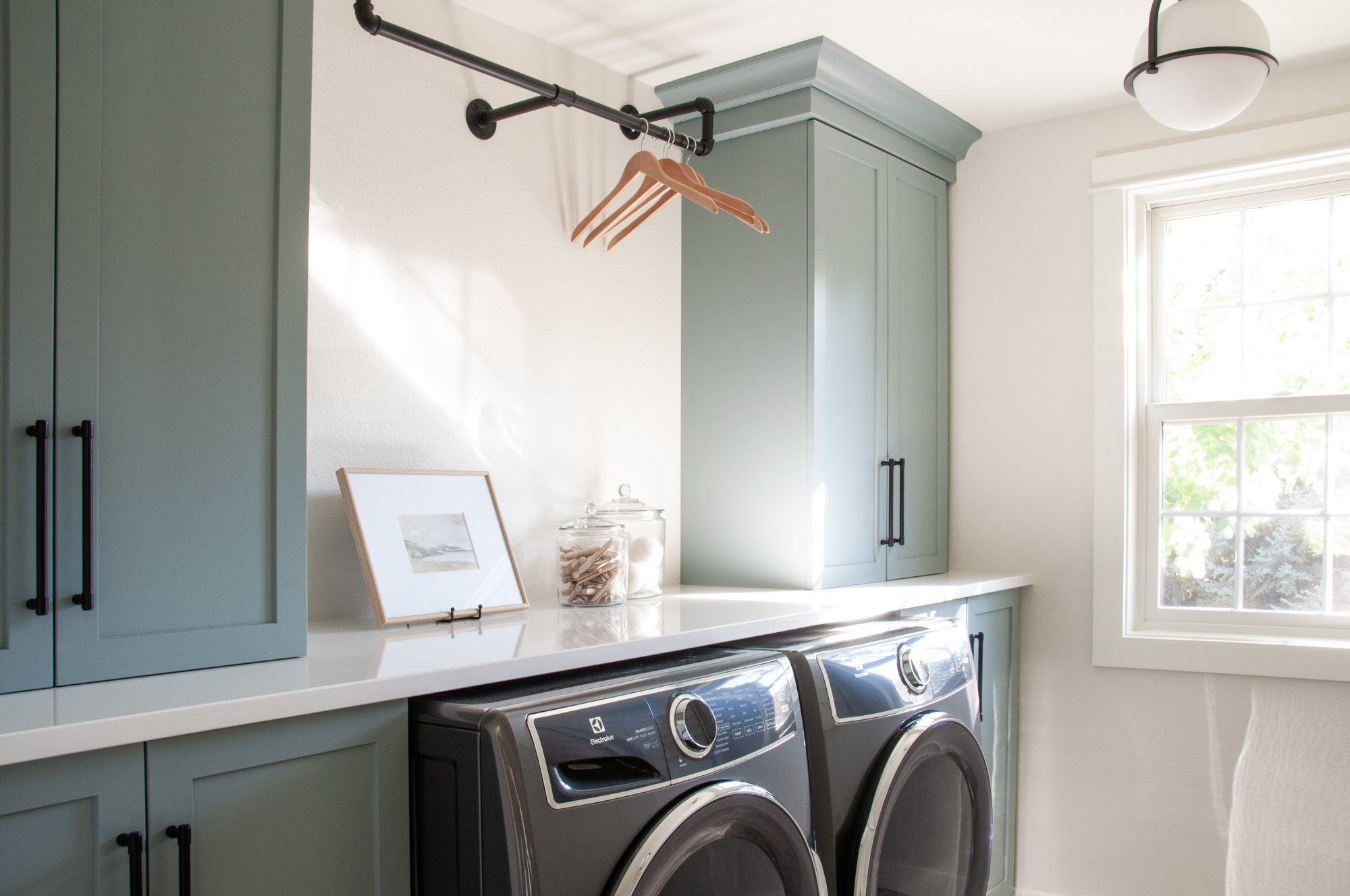
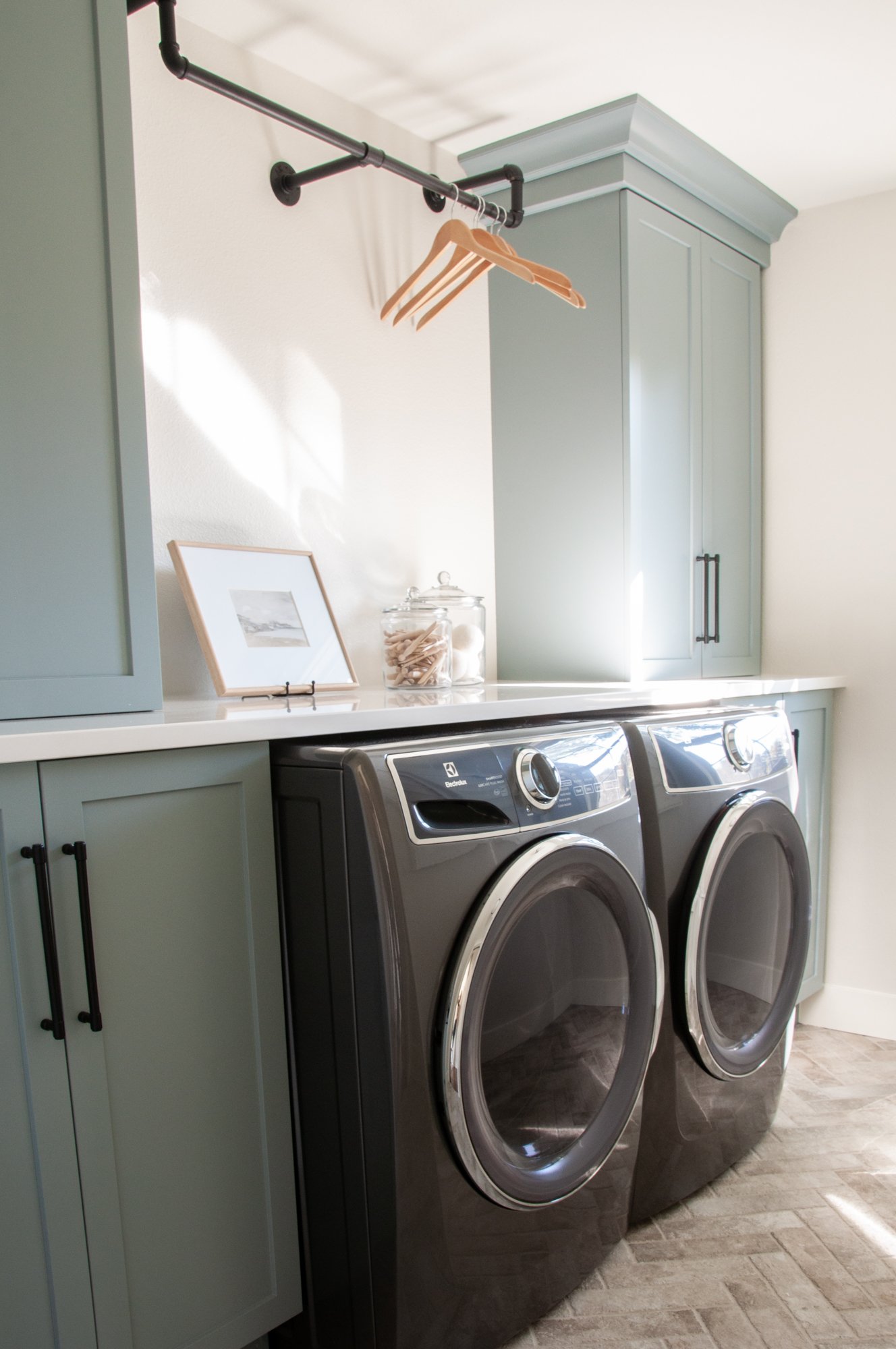
We decided to center the washer and dryer in the laundry room so that we could flank it with floor-to-ceiling cabinetry. One of our favorite things to do in laundry spaces like this, is to create two different depths with the base cabinets being deeper than the upper cabinets — and to place the uppers sitting on top of the countertop. This allows for so much more cabinetry space, while still keeping usable counter space. We really maximized the storage space here!
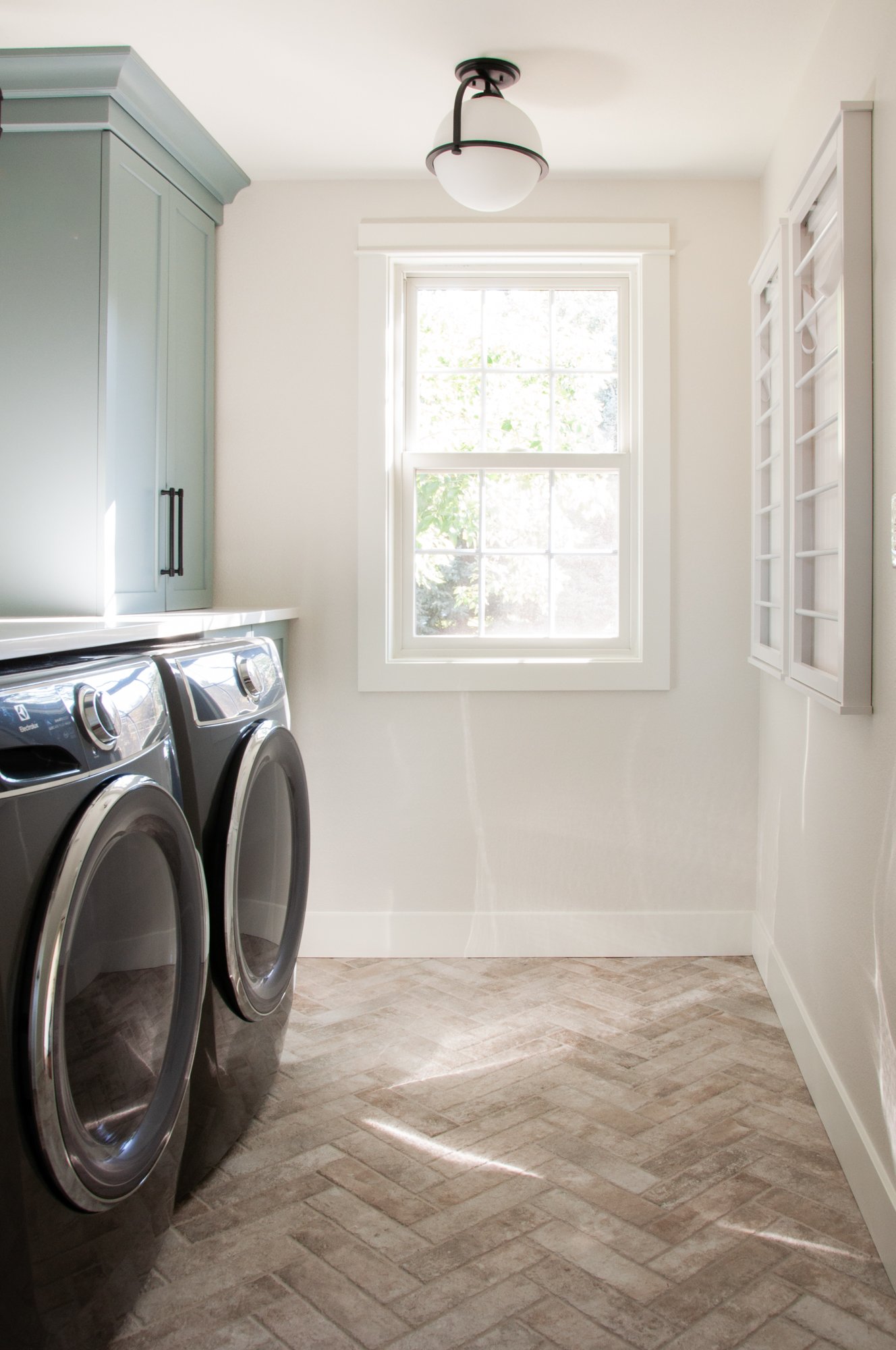
Another one of our favorite things in this room is the modern clothing rod placed between cabinets to hang and air dry laundry. Our clients also needed extra space for hang-drying, so we added a couple of wall-mounted drying racks that easily fold up when not in use, providing three times the drying space.
Last but not least, we created a herringbone pattern with brick on the floor, and we love the texture that it pulls into the space. It plays really well with the gray-blue finish of the cabinetry and we just love how it pulls everything together in this laundry room.
And that’s a wrap!
We loved completing this project & we loved working with our clients—
This Denver area home came together beautifully for the most wonderful clients, and we are so excited to welcome them back into their now fully renovated home!
See more photos of this renovation project and its complete transformation into an earthy, coastal and modern family home in our portfolio.
Welcome to Basil + Tate, your full-service interior design team based in sunny Denver, Colorado. We describe our design aesthetic as light-and-bright, transitional, and modern. If you like clean lines mixed with earthy colors and textures, you’re in the right place! Looking for interior design services within the Denver, Colorado area? Let's get in touch.
