The Ball Project
Hellooo, and welcome to the Ball Project! We’ve been dying to show off this work-in-progress for over a year — and we are finally ready to show you around this fully renovated Denver area home.
Watch the video below and scroll through this post to see the final reveal photos, as we walk through the completely transformed spaces at the Ball Project.
Entryway & Formal Living Room
The entryway—
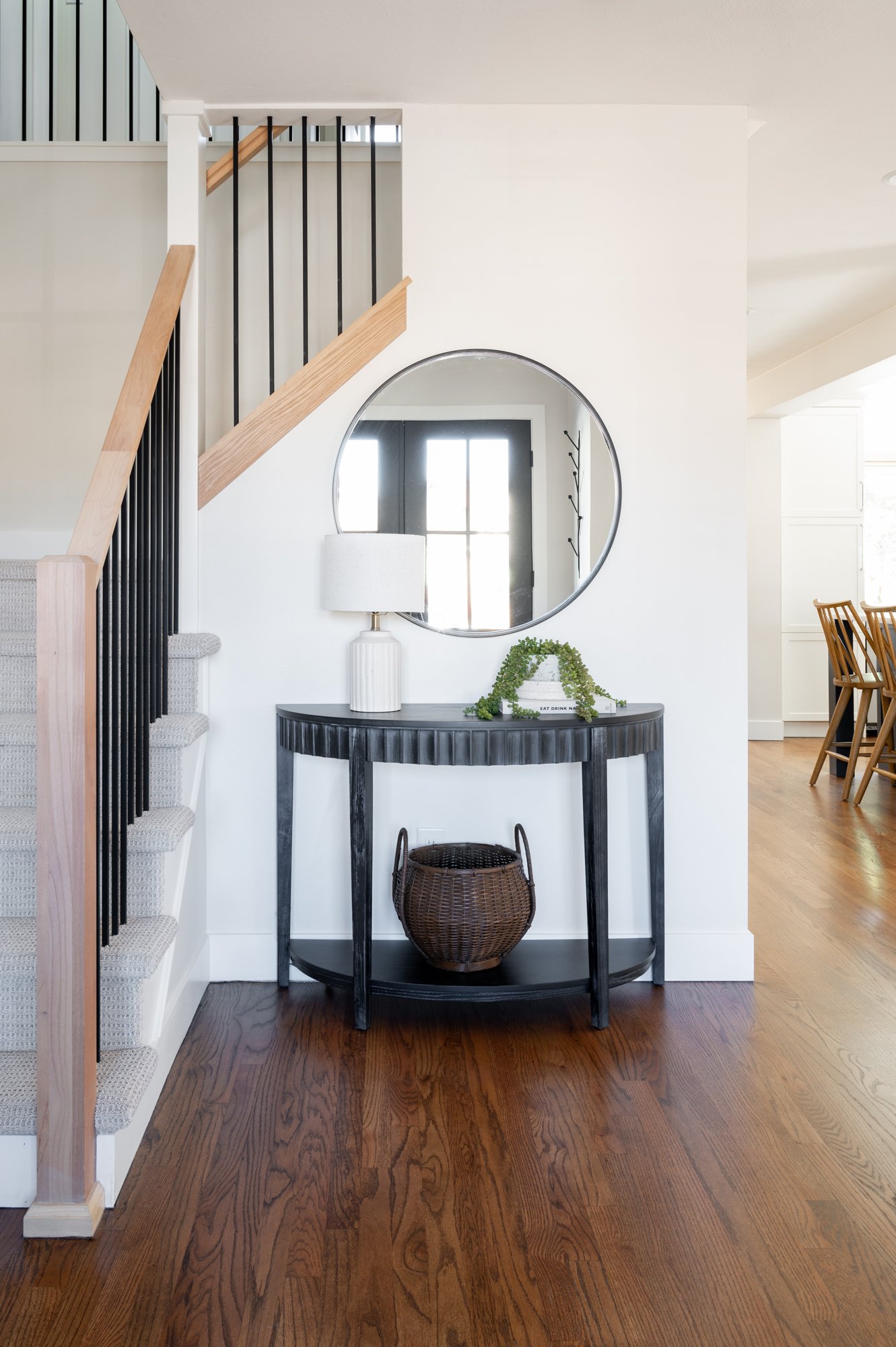
The biggest change in the entryway was the outdated front doors, which we replaced with these large beautiful glass-paned double doors that we are all loving right now. It helped open up the entire area, which now feels so different. We gave our clients a little entryway moment refresh with a new mirror and added coat racks. The finishing touch was a new rug to provide a pop of color that gives a preview of what’s to come in the rest of the house.
The Formal Living Room—
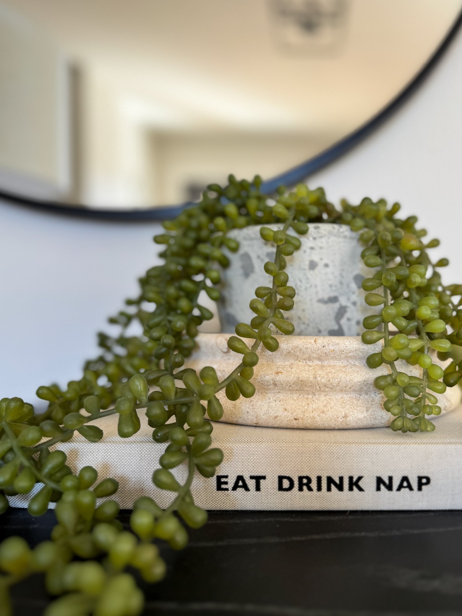
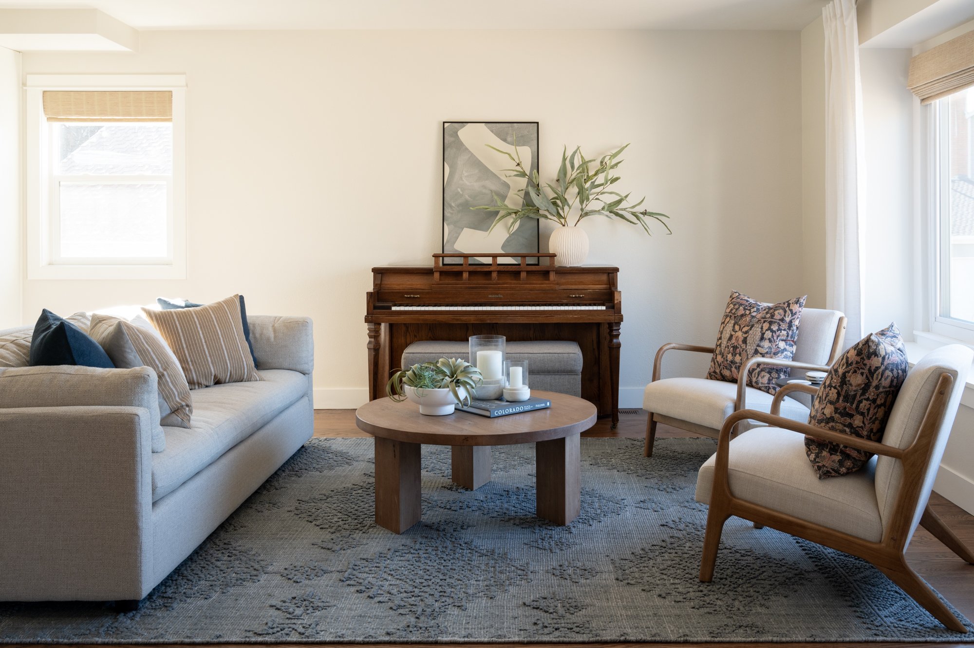
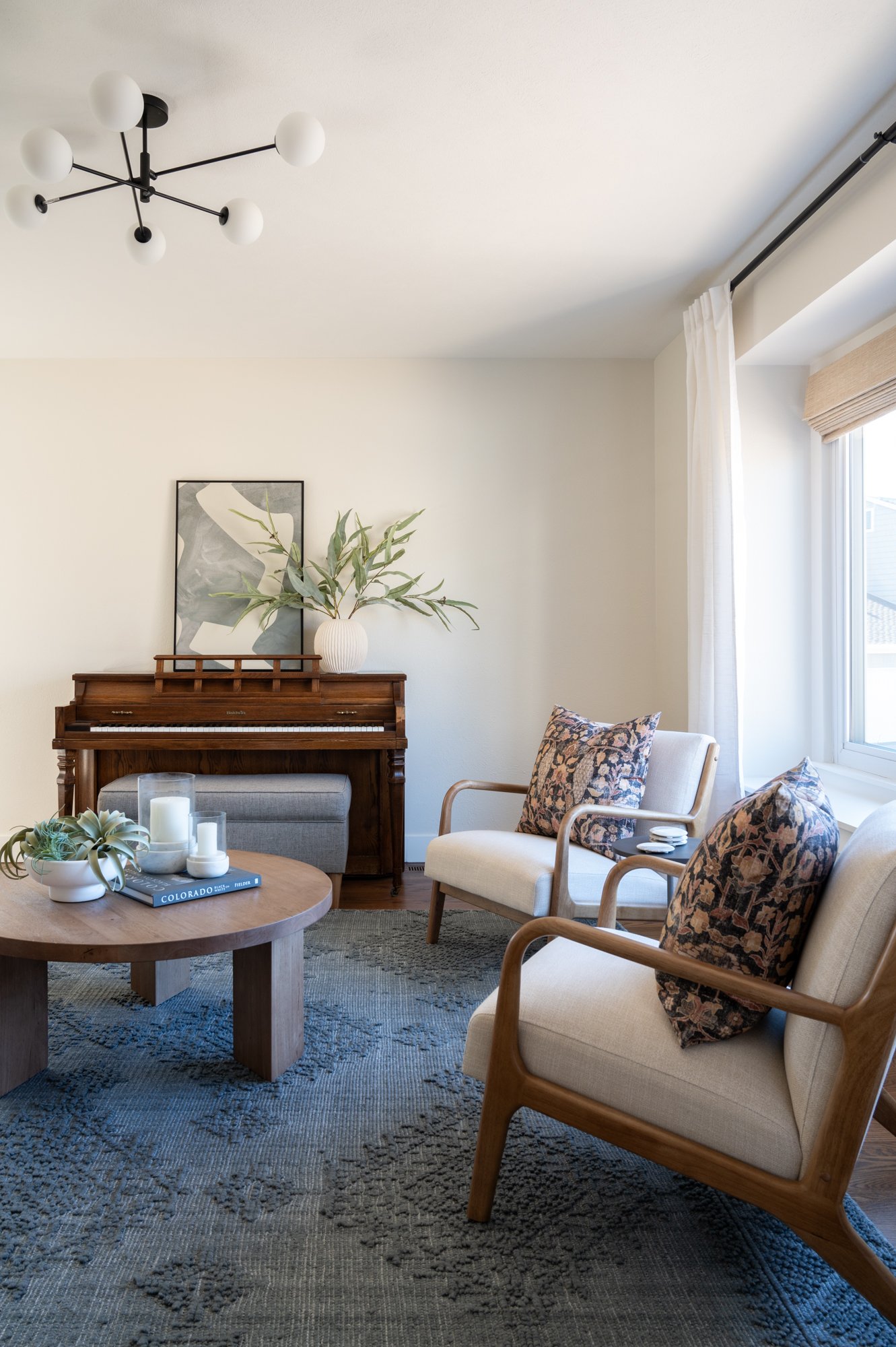
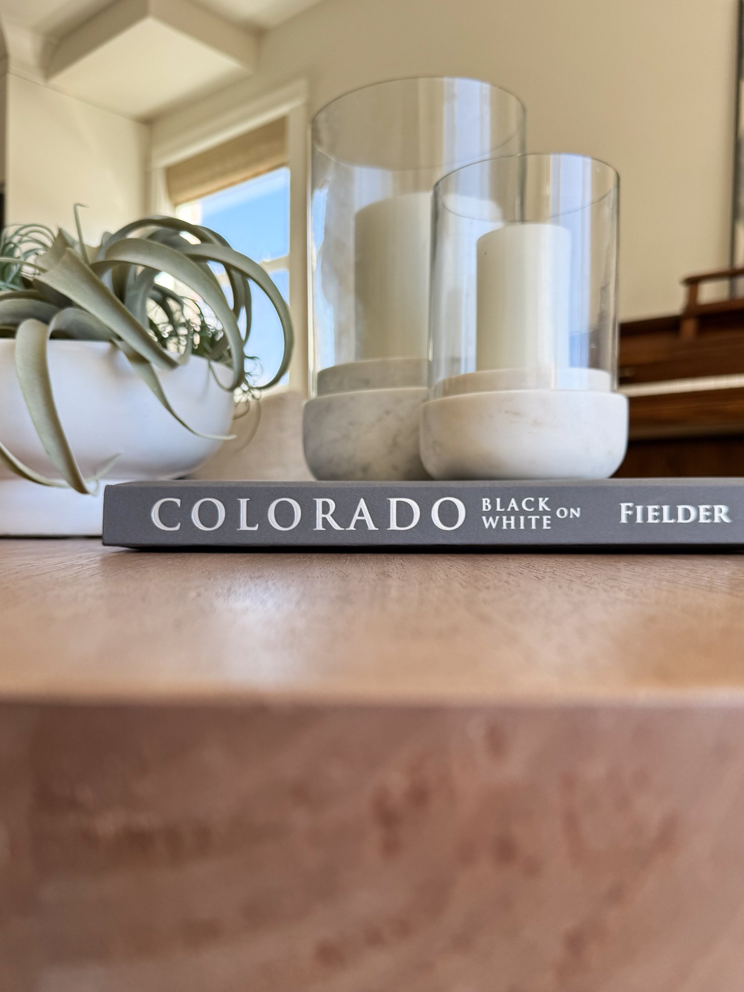
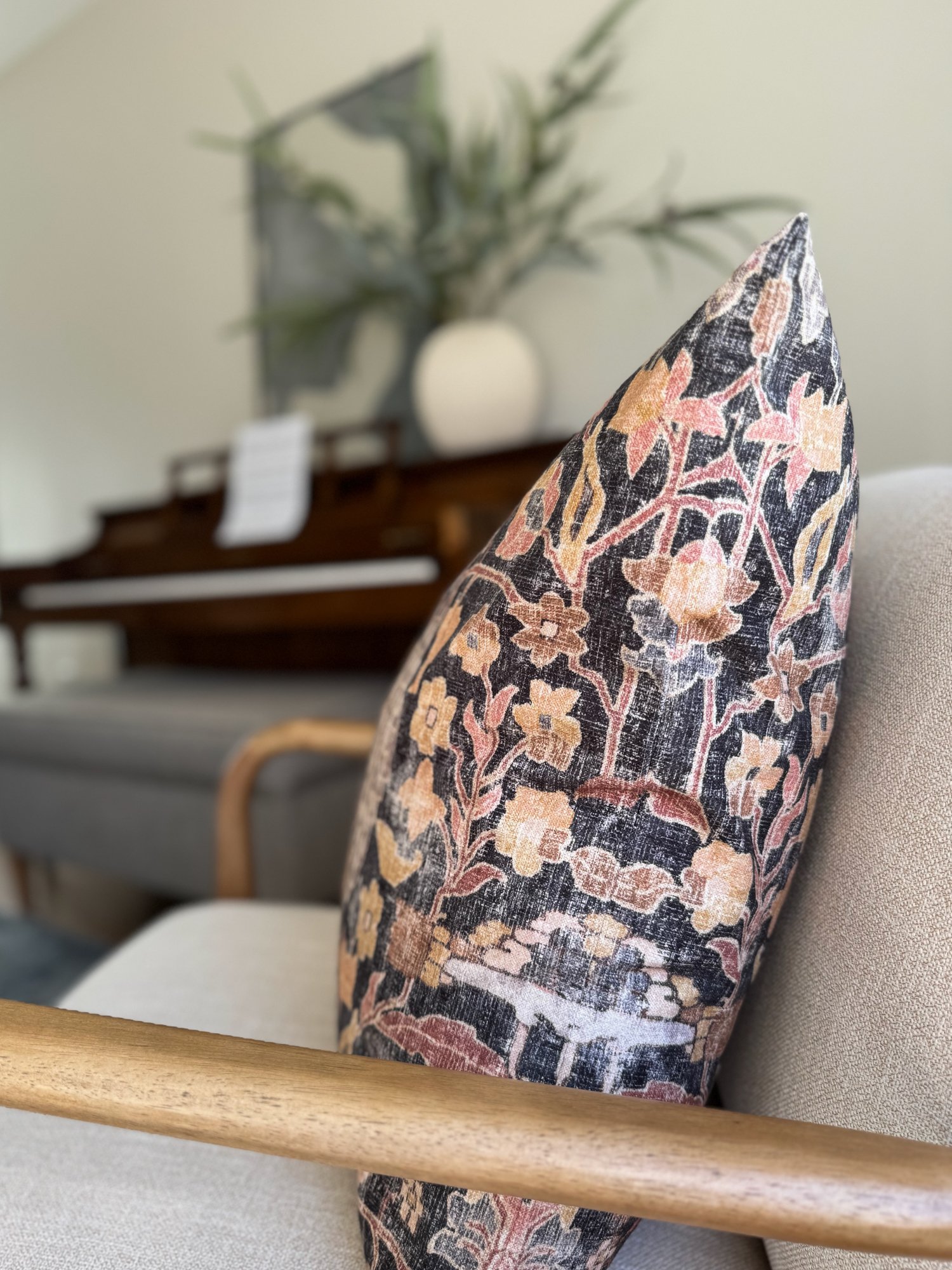
We actually made the front, formal living room of this home a bit smaller — taking some space from the kitchen and turning it into a more usable area for conversation and gathering. Our clients wanted to ensure their family piano, passed down through generations, was featured. We created a focal point around the piano in this space, and modernized it with art and accessories. The sofa was positioned opposite of the large picture window to make sure we didn’t lose that beautiful neighborhood view.
The Kitchen
fit for a family of five—
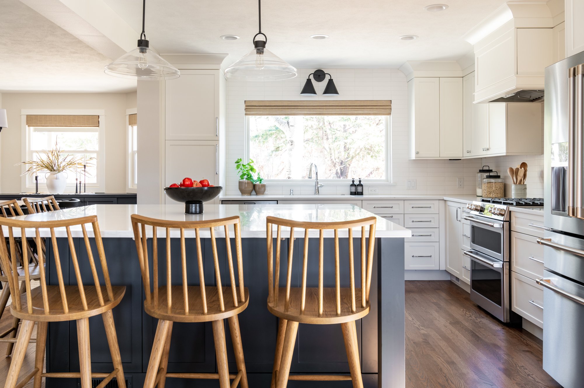
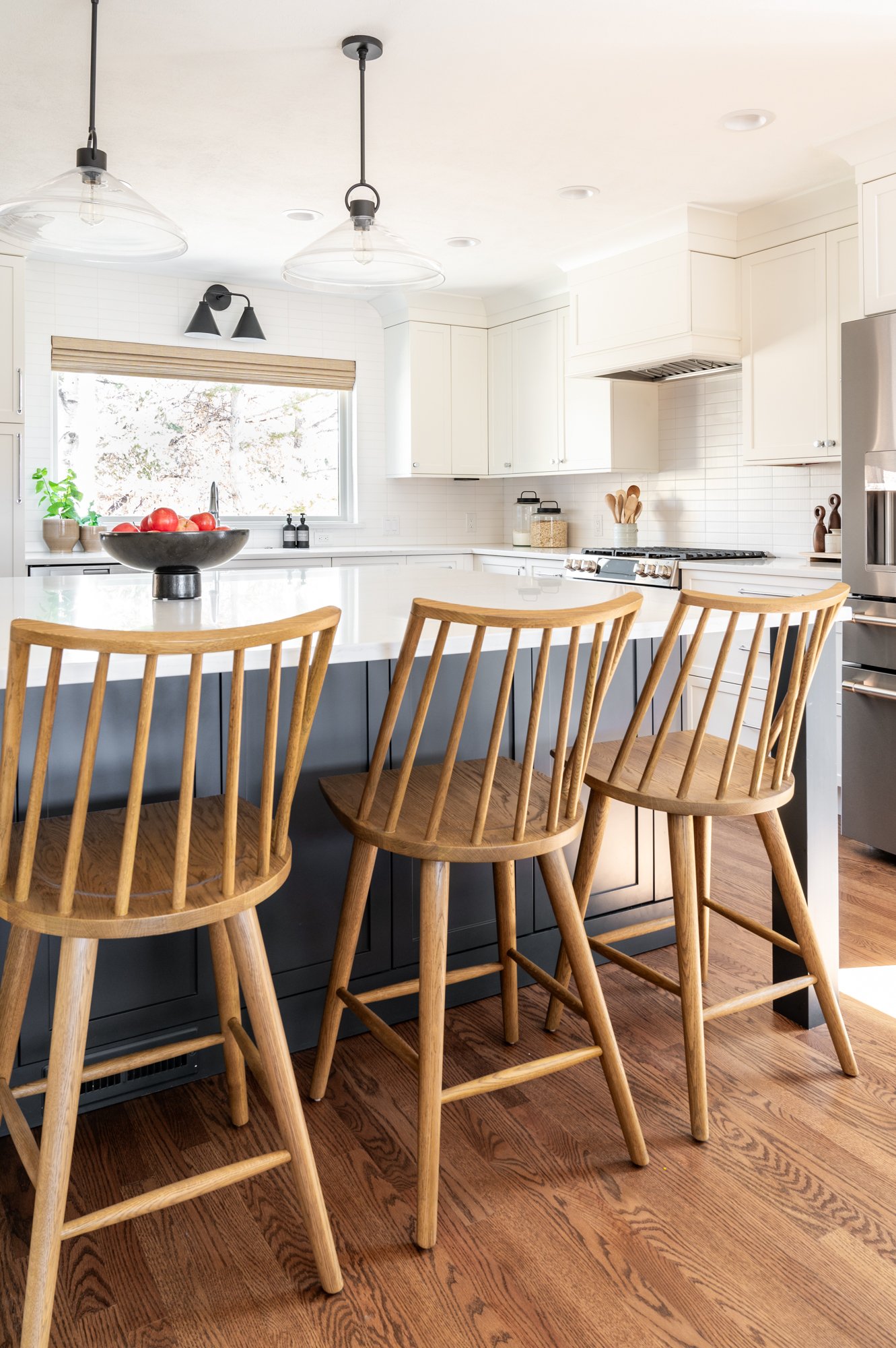
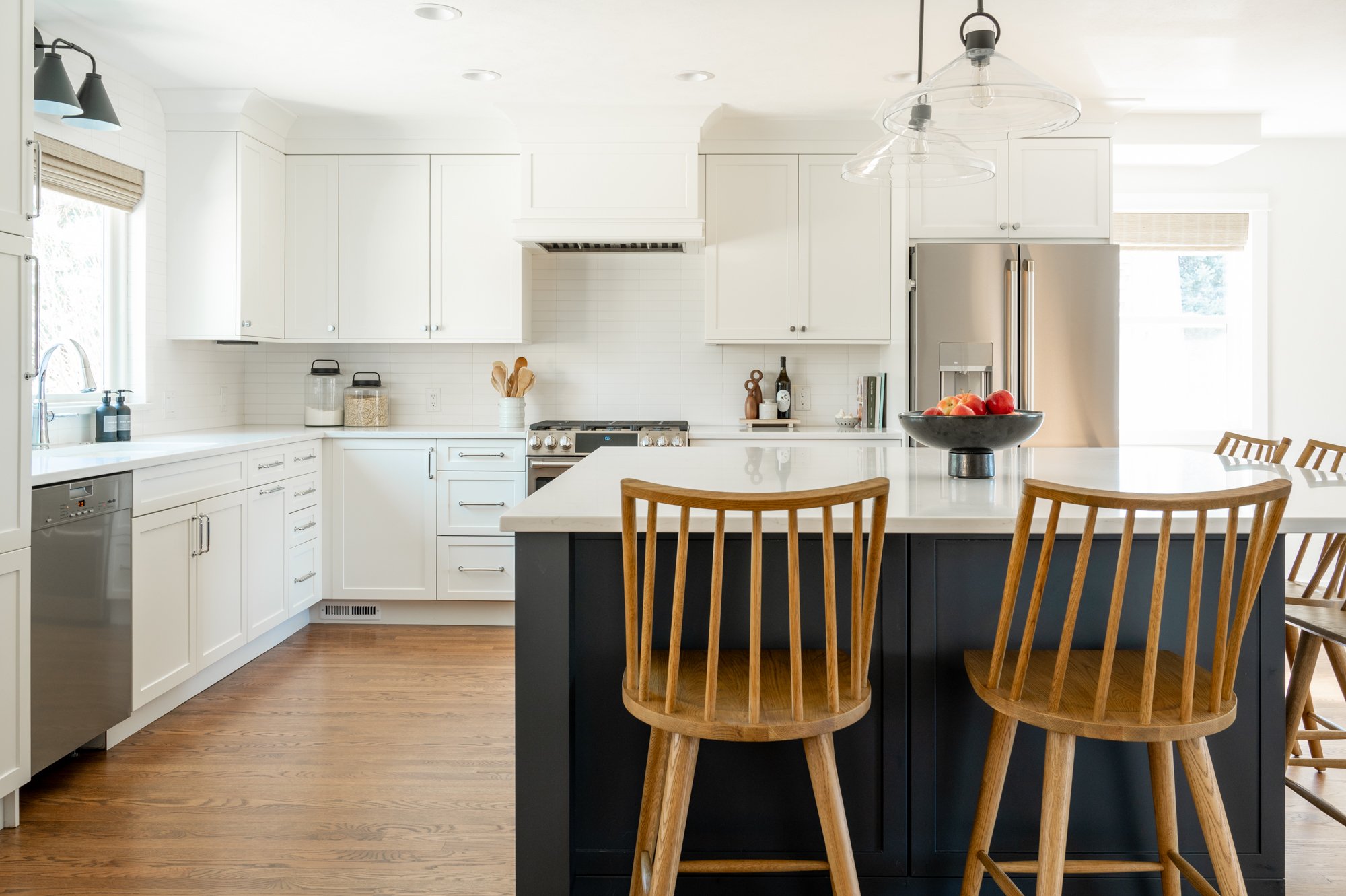
If we had to pick our three favorite things about this kitchen renovation, they would have to be (in no particular order)… Number one, the built-in microwave. This option frees up so much space and is so functional for kids and adults, too. Number two, the oversized island that turned out absolutely gorgeous. This oversized kitchen island makes the entire kitchen feel huge and so spacious. With our clients being a family of five, we had to make sure there was room for everyone as they use this area as an informal dining space. And last but not least, number 3, the chrome fixtures we selected for both plumbing and hardware throughout this kitchen remodel. The chrome finish really modernizes the space, and we love incorporating a design choice that we don’t always see as often in other homes.
Dining Room & Wet Bar
THE WET BAR—
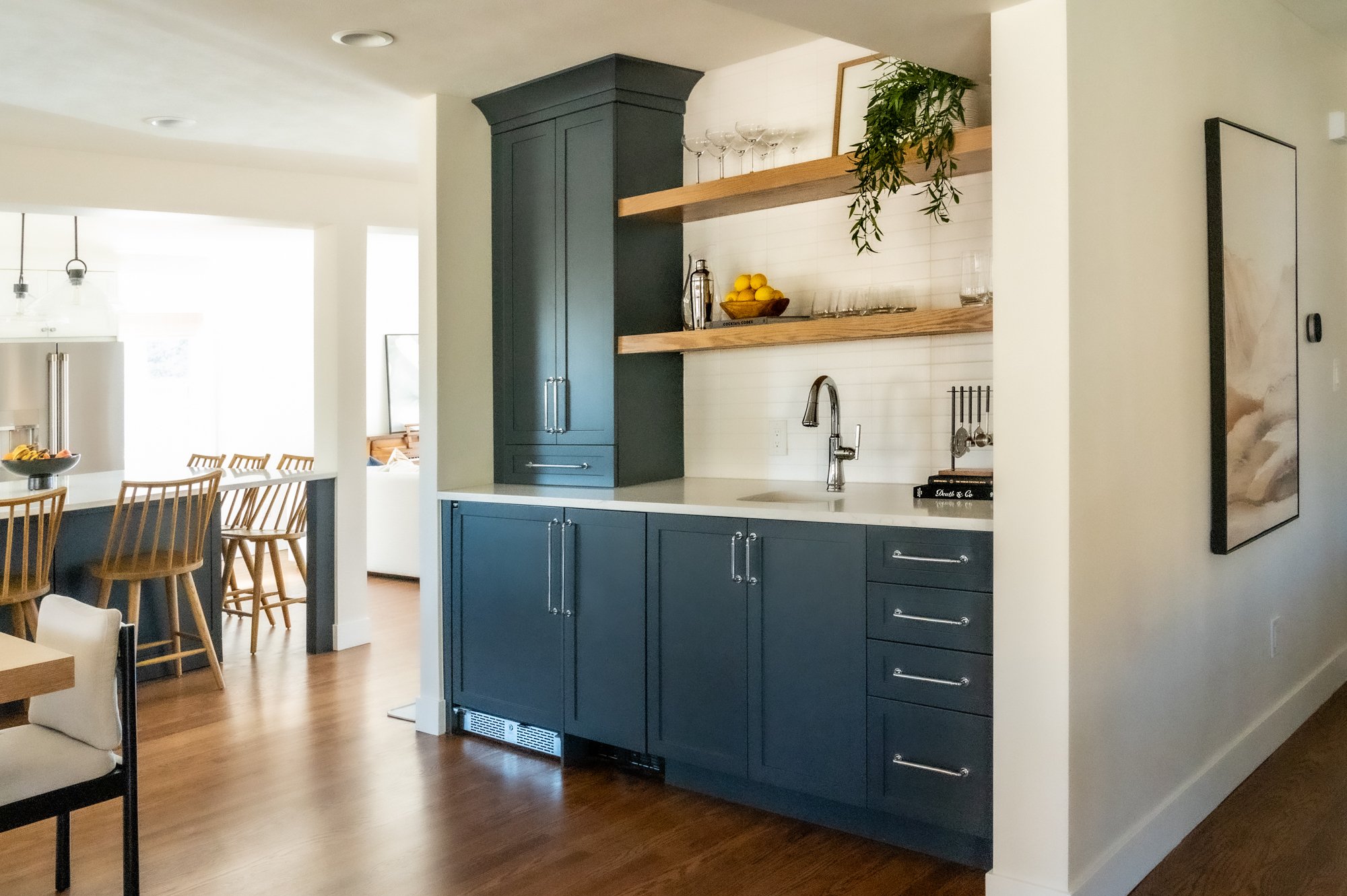
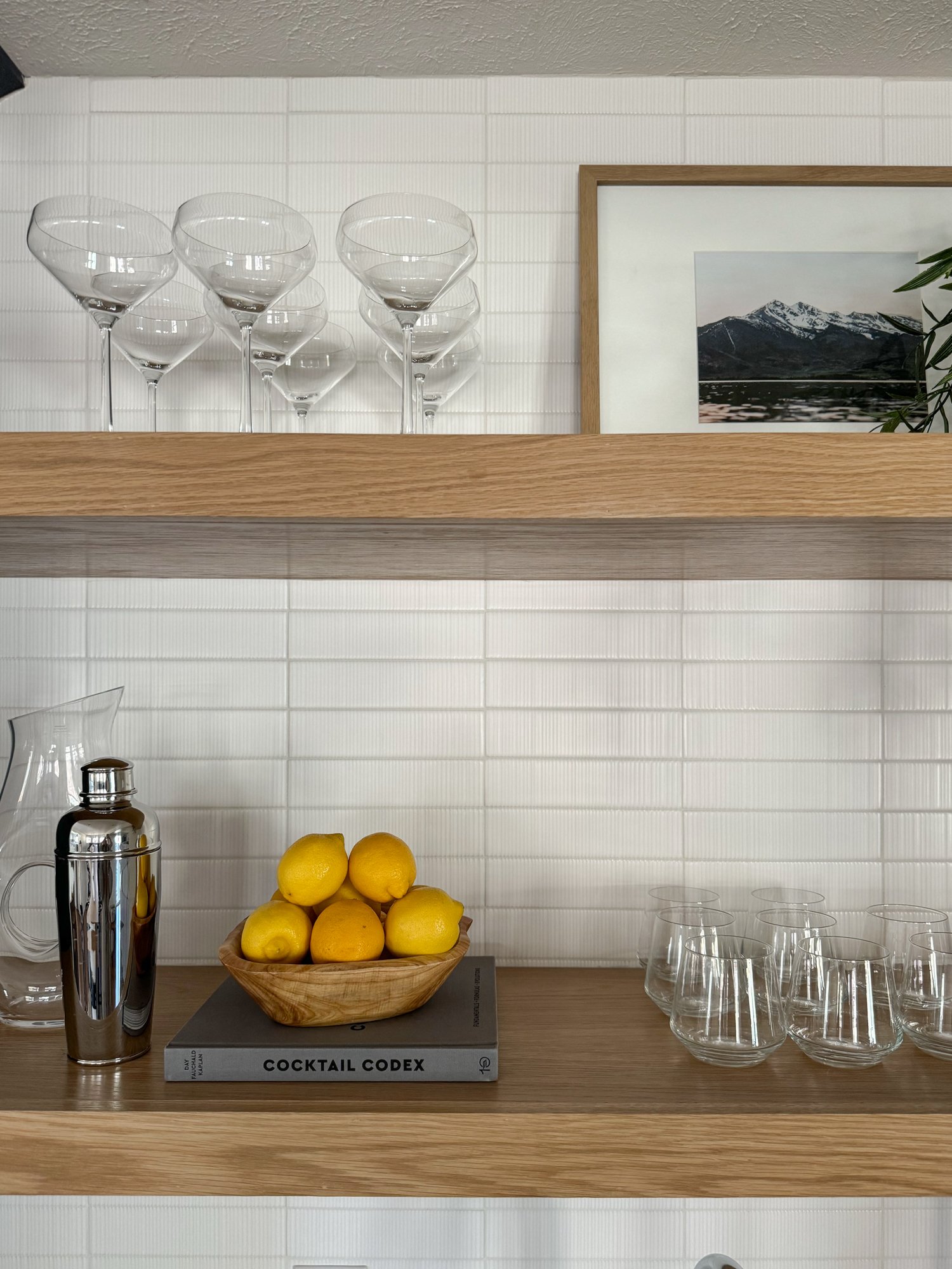
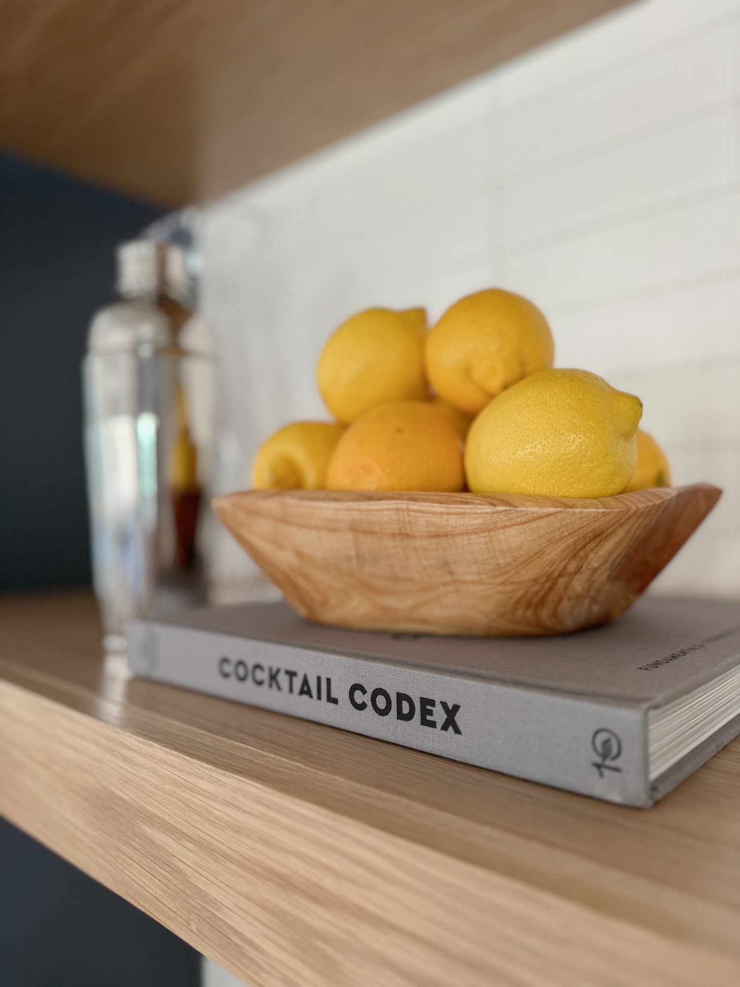
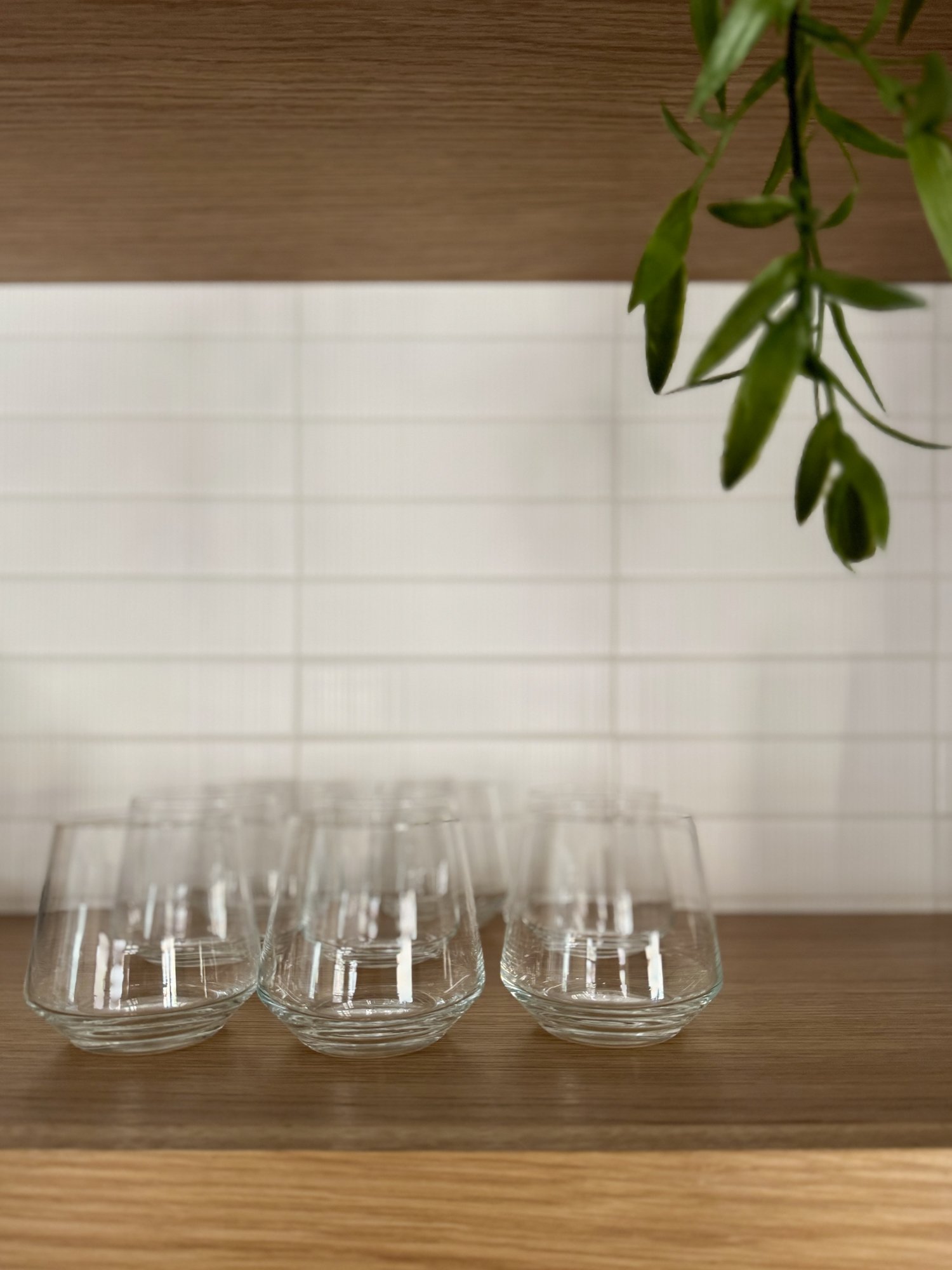
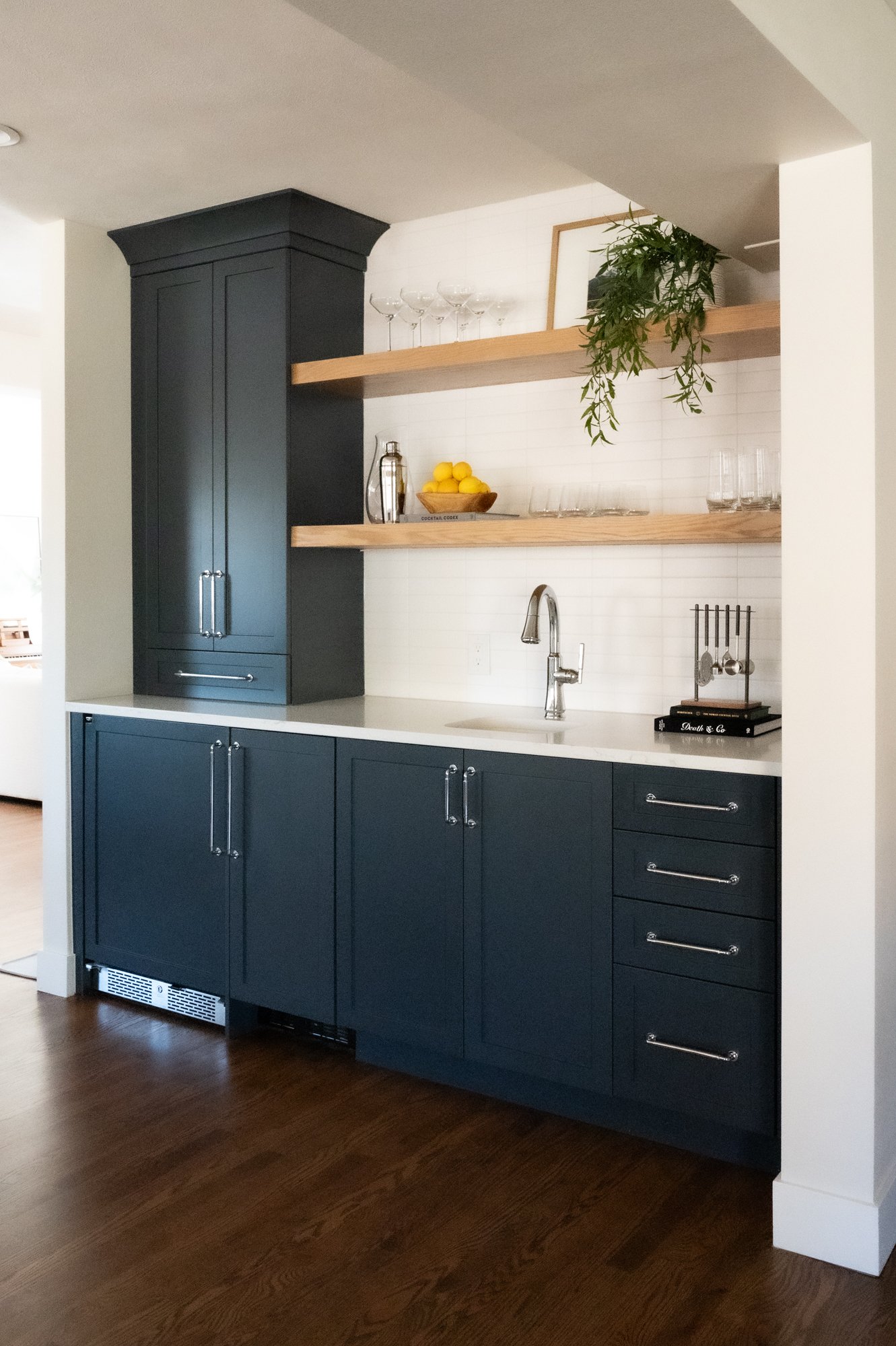
We have to talk about this wet bar! This space is well worth a quick tour to show off how gorgeous and functional it turned out. We selected stained white oak open shelving to match with the dining, kitchen and living areas, and styled the open shelves with pretty barware and accessories. This wet bar also features an ice maker and beverage fridge — both with panel fronts, so our clients don’t have to worry about how organized the fridge looks. We also added a bar sink for easy clean up post-dinner party. This is easily one of our favorite spaces of the home, and we just love how functional and beautiful it is!
THE DINING ROOM—
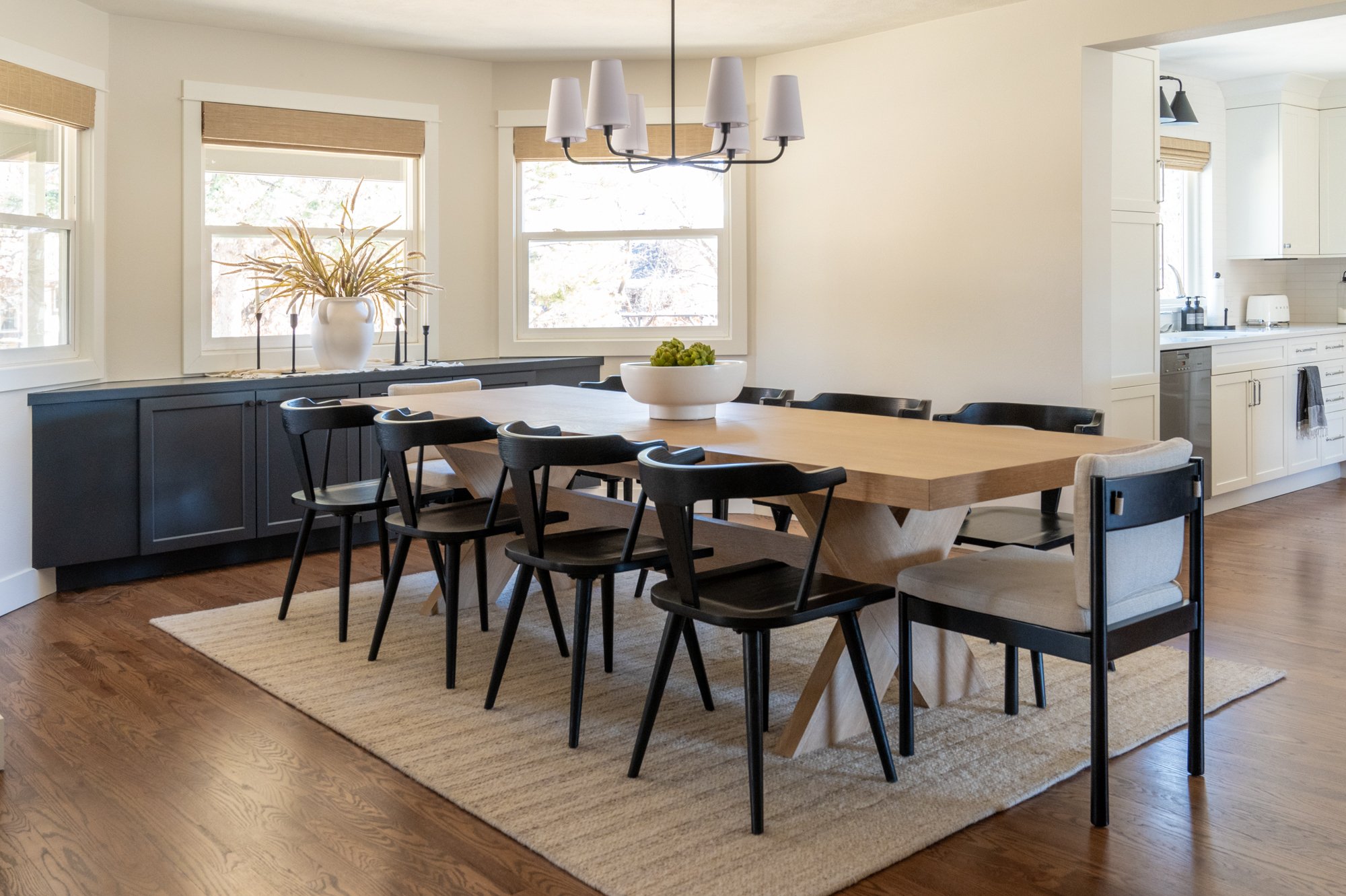
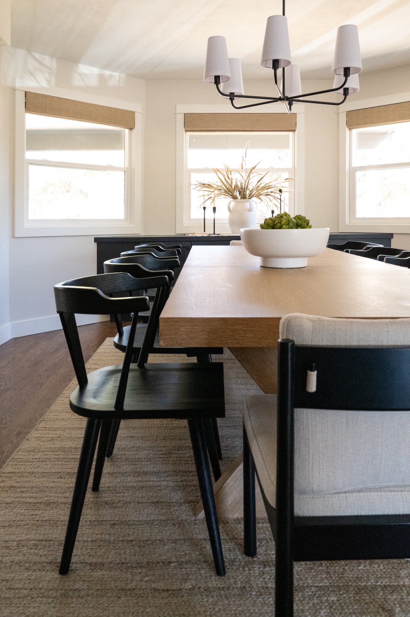
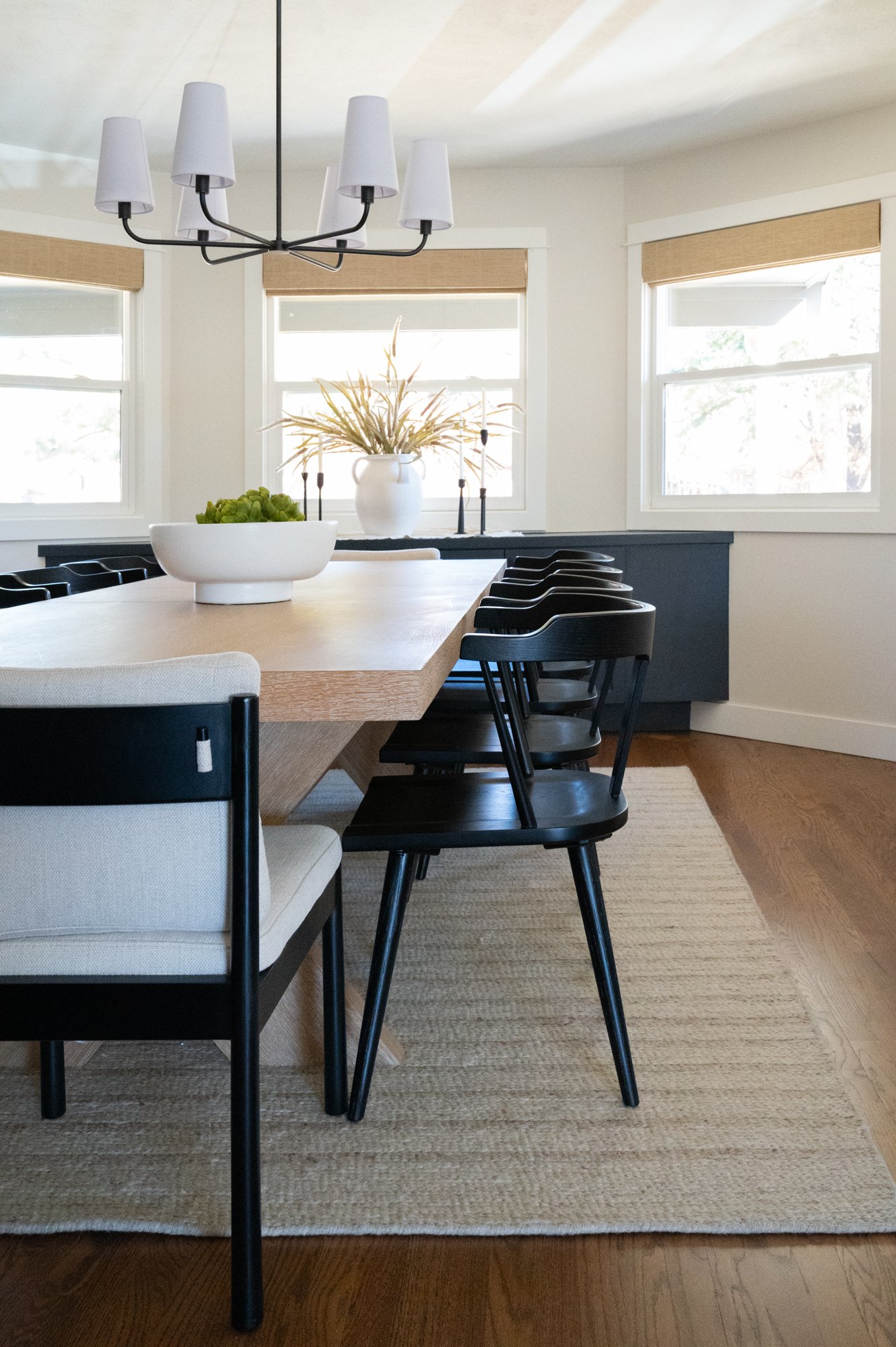
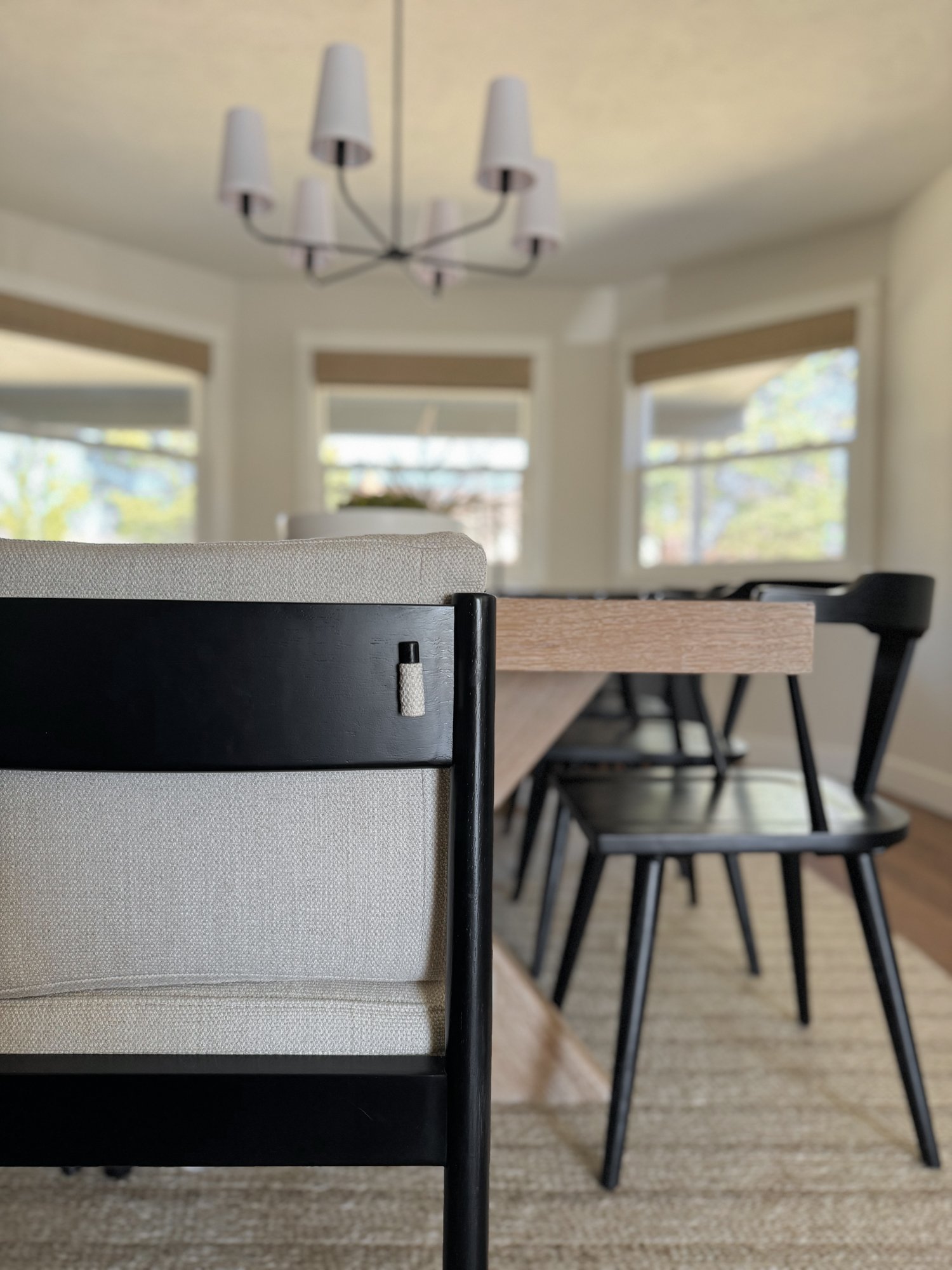
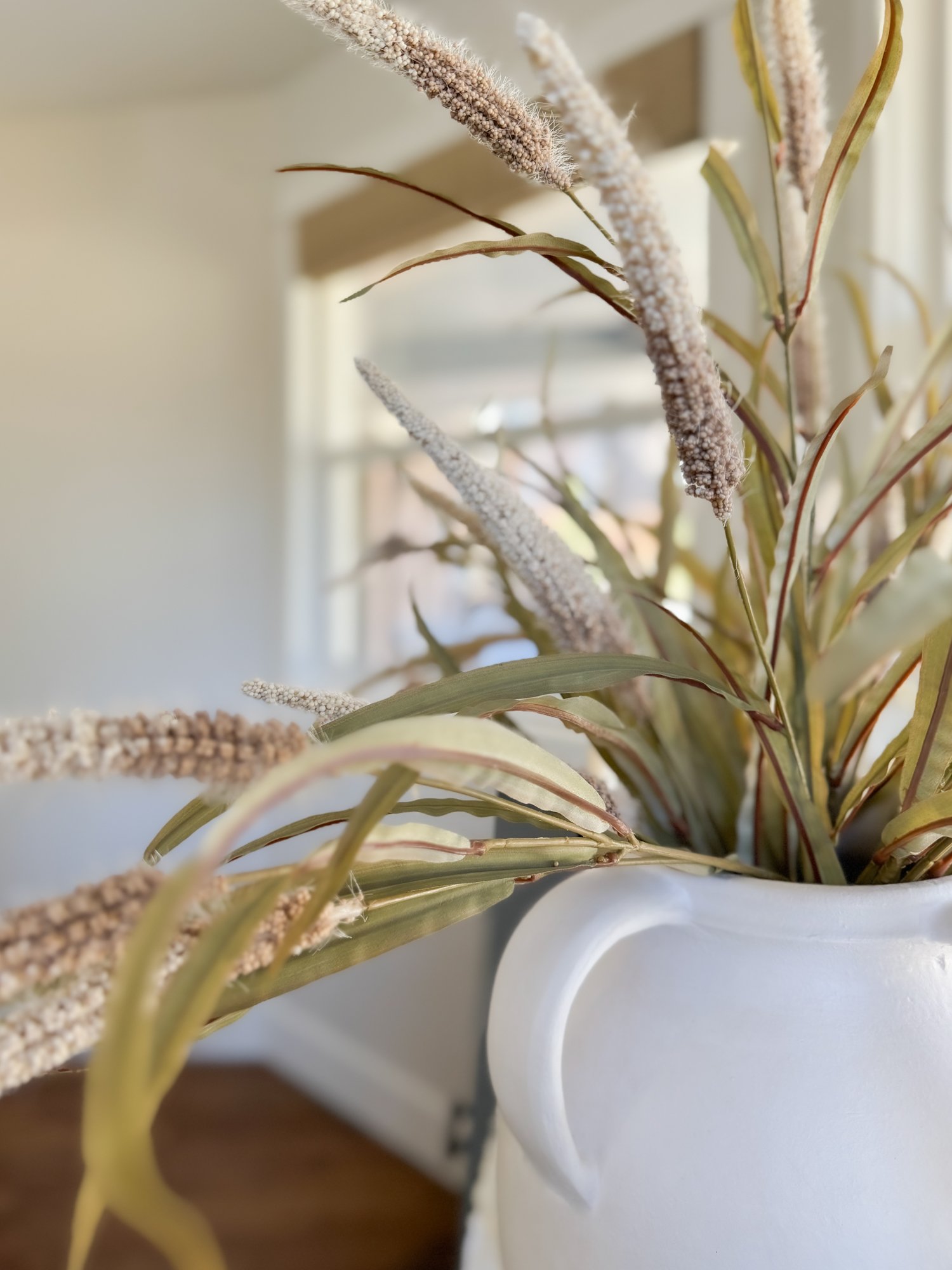
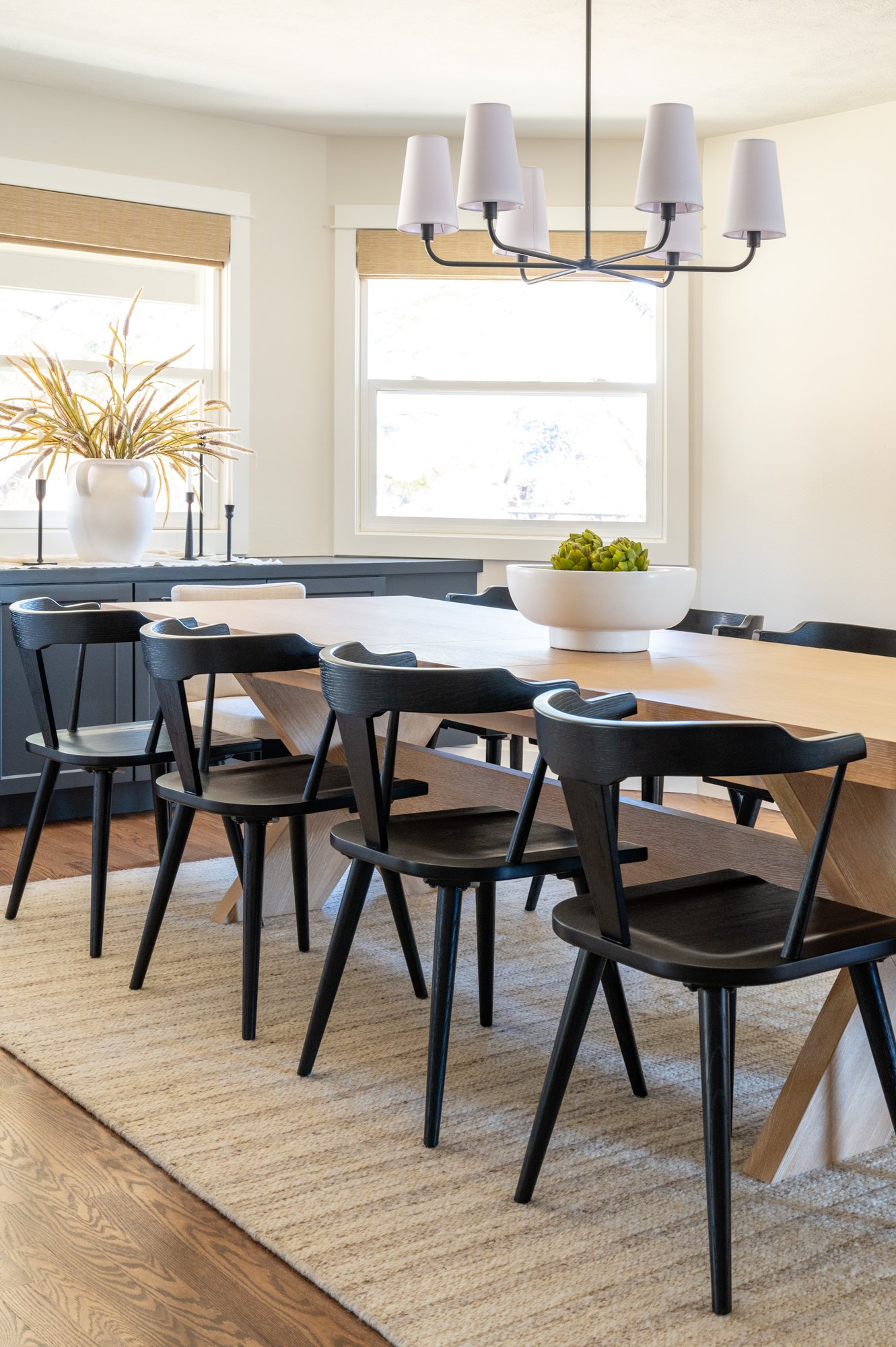
This dining area used to be the kitchen, so we reoriented the entire room and took down walls to open up the main floor. Now, fully renovated, this spacious dining area can comfortably seat 10 around the table. We also added a beautiful custom built-in storage unit to fill out the entire space along the windows, and we are super excited about how this turned out!
Family Room
A REIMAGINED ROOM—
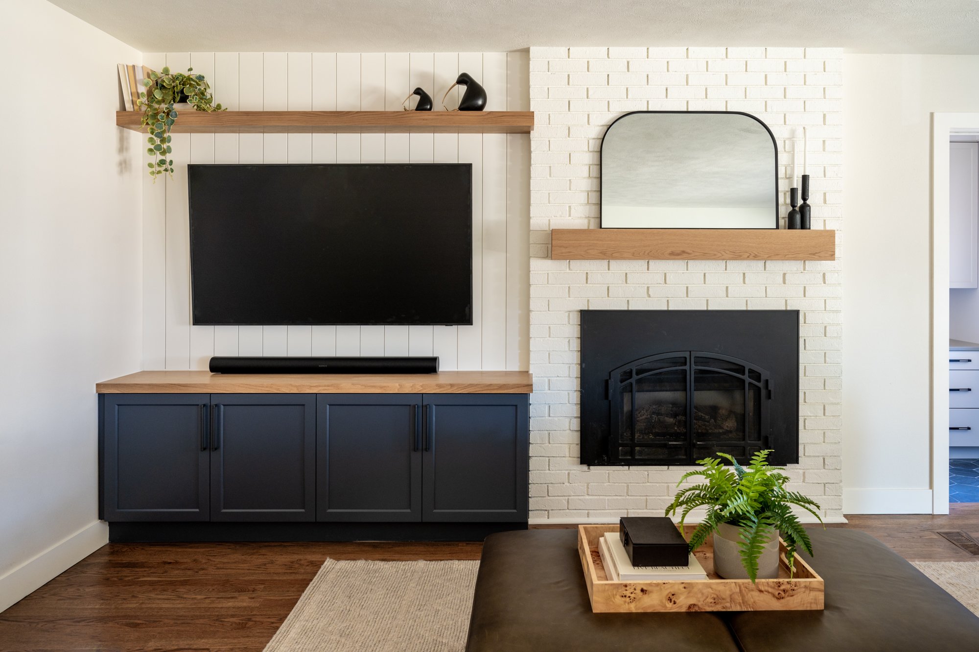
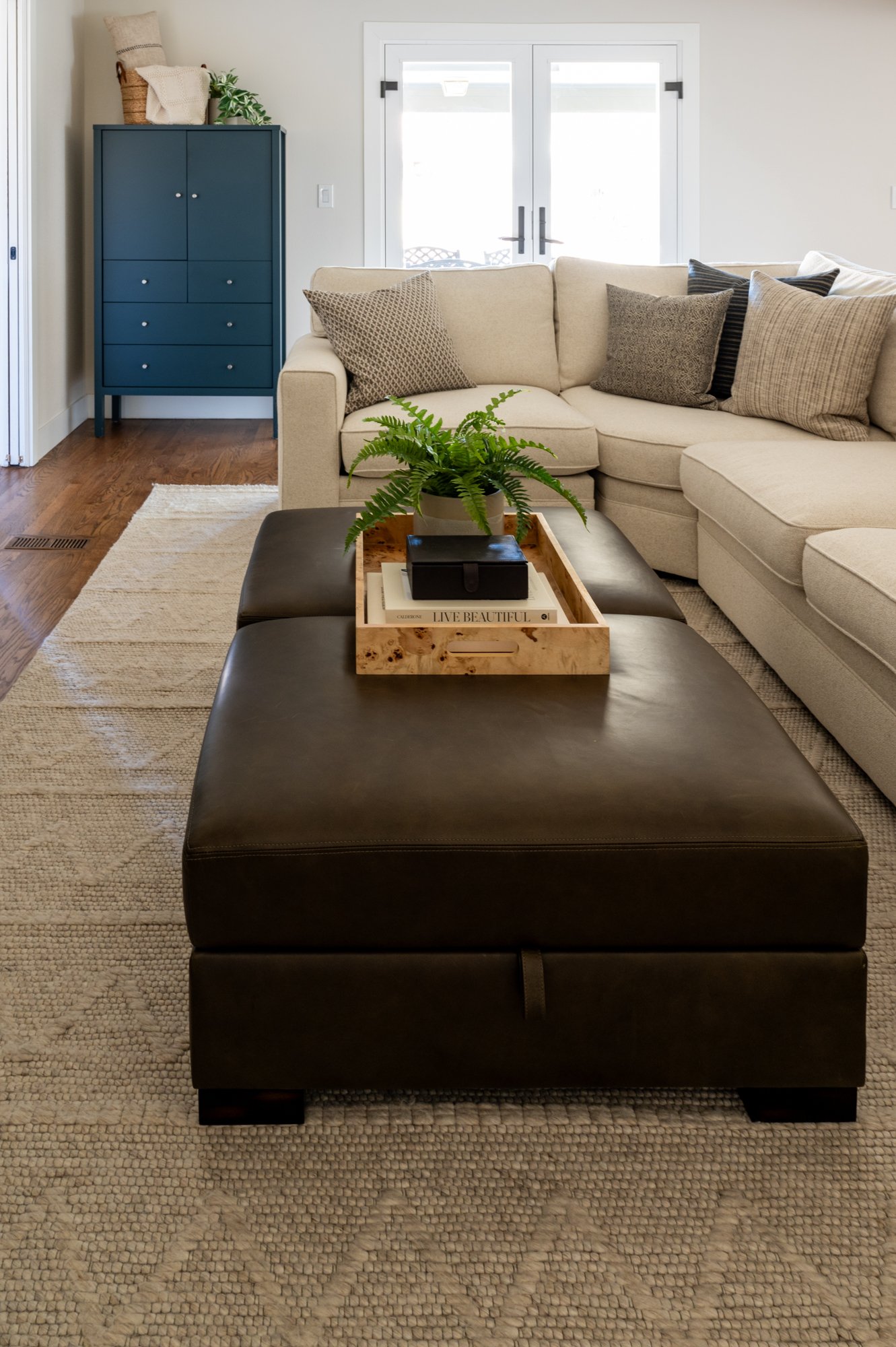
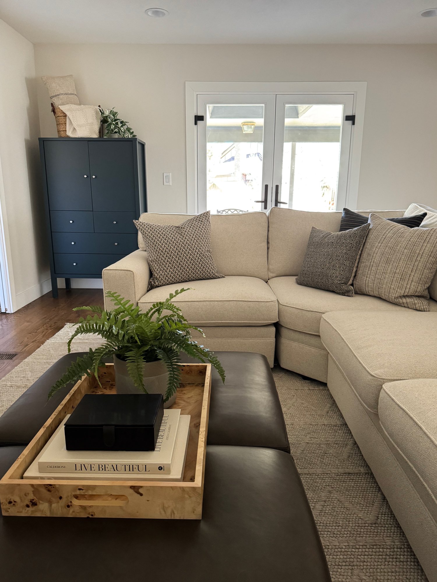
In the family living room of this home, we reoriented and reorganized the focal points to create one main feature wall. The fireplace was already there, but we wanted the TV to also be included along the same wall, so we brought in a mason to cut and refinish the brick, then added shiplap to the adjacent wall, and painted it all a fresh bright white. Now with the sofa across from one main focal point of the space, this room is much more usable and functional for the entire family.
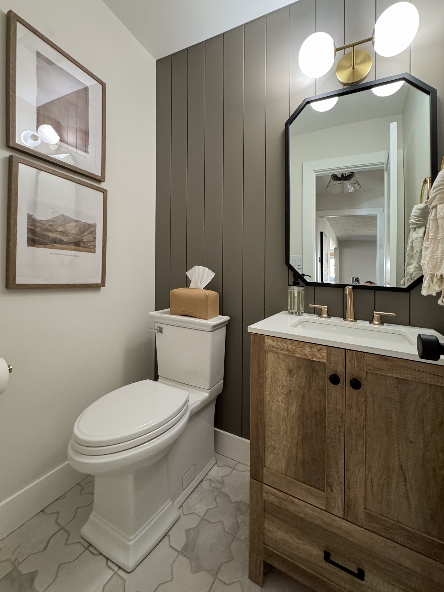
Primary, Kids, & Powder Bathrooms
The KIDS BATHROOM—
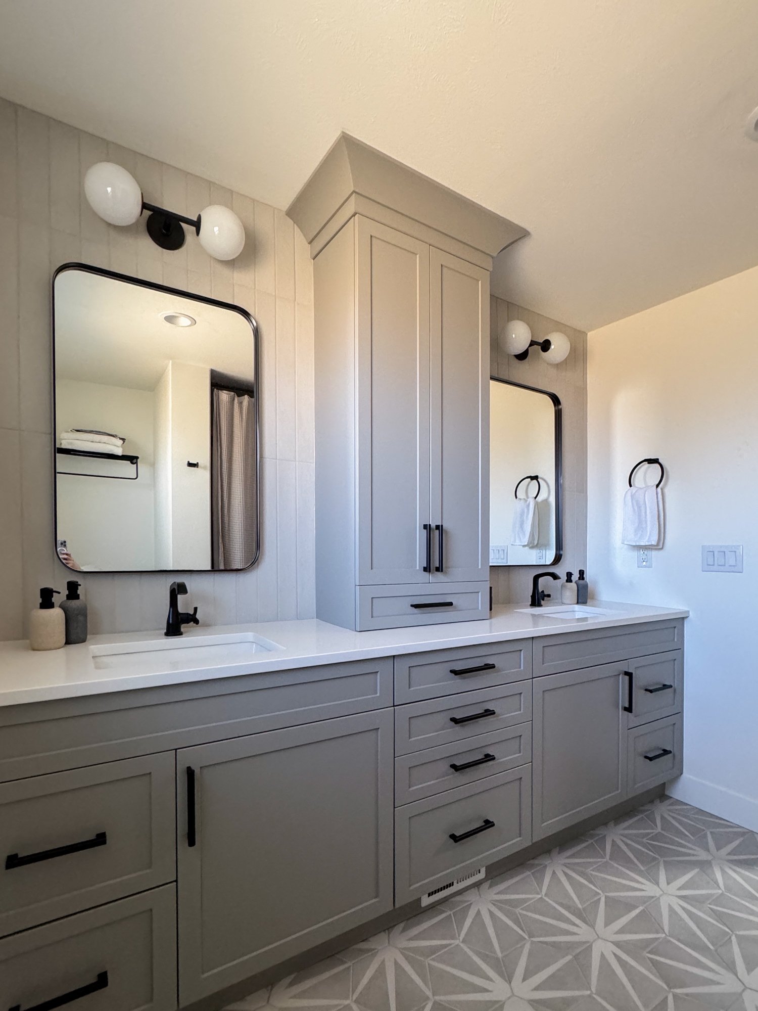
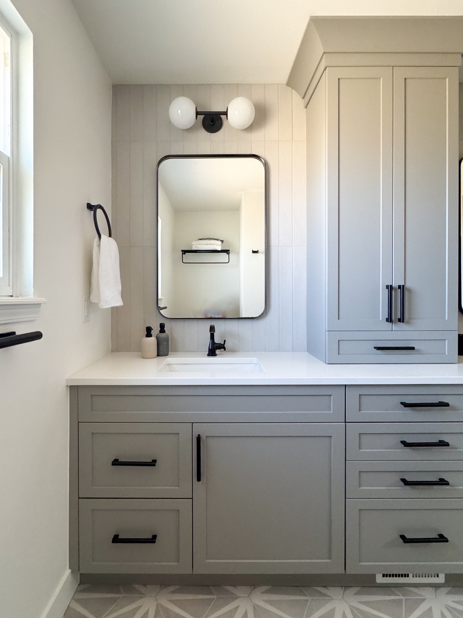
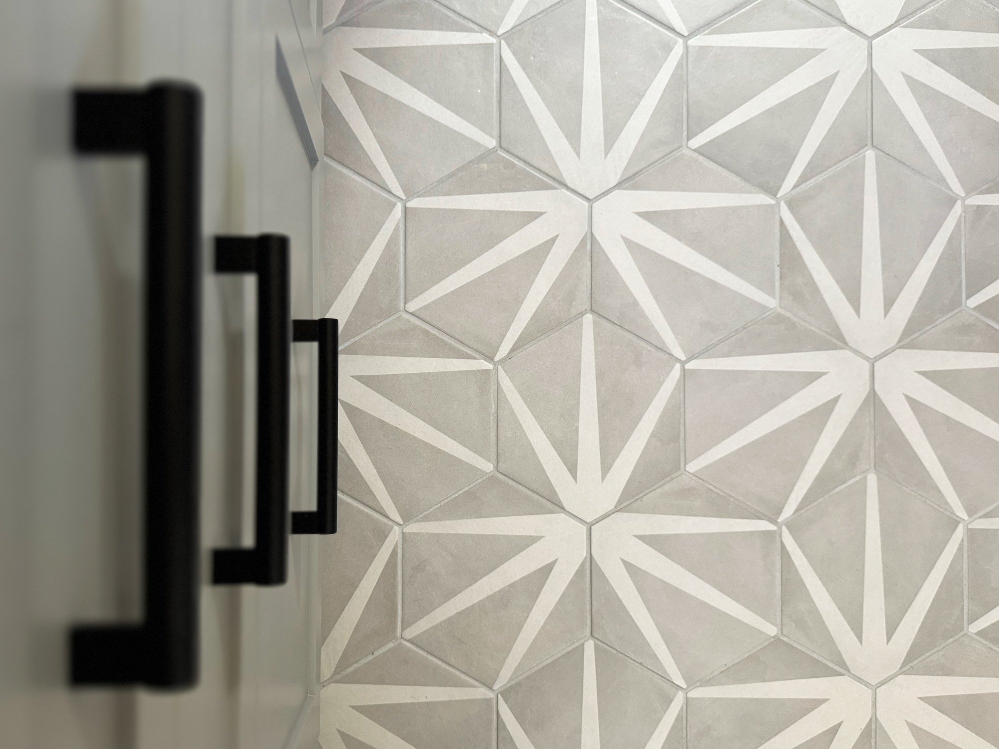
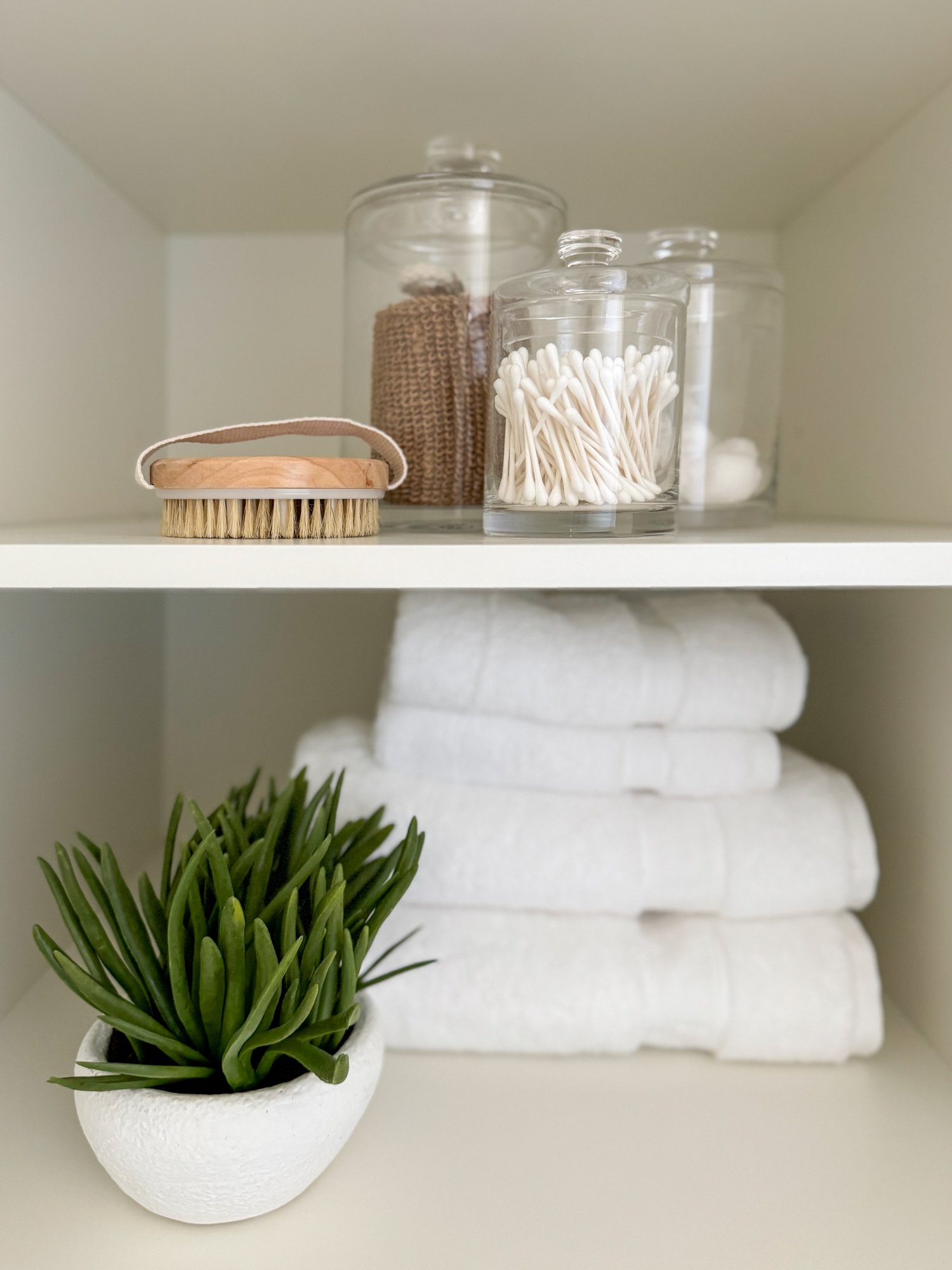
This bathroom was created with our clients’ three kiddos in mind, and one of our main goals was to really maximize storage space, while maintaining the double sinks. To do this we selected a full length vanity with lower cabinets as well as an additional tower of cabinets on top of the counter that also helps separate kids as they get ready! We also took the same tile used in the shower and placed it behind the mirrors in the space — this 24-inch long vertical tile goes all the way up to the ceiling. Finally, we had to have some fun with the floor and selected a playful pattern for this kids bathroom space.
The primary BATHROOM—
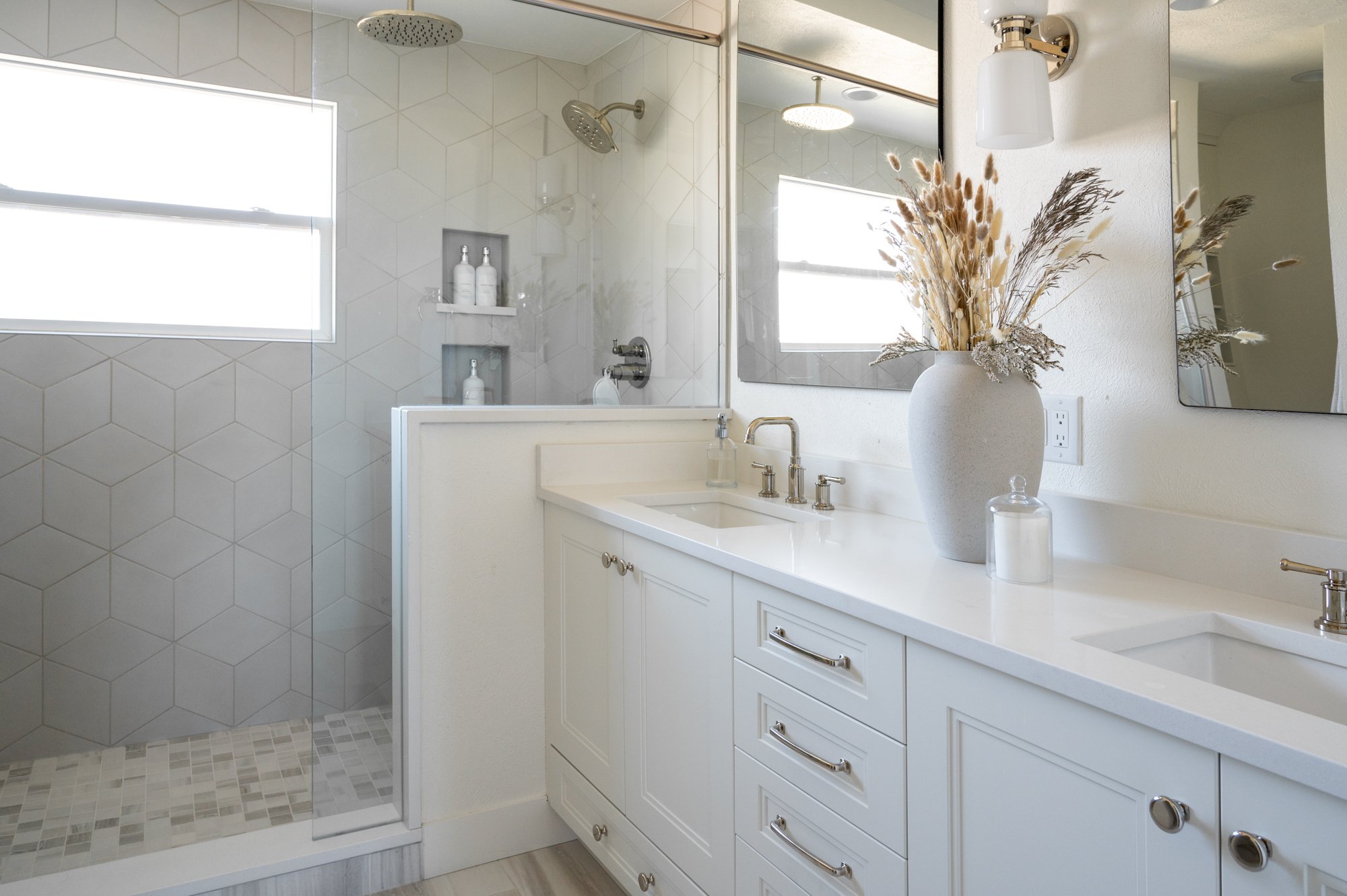
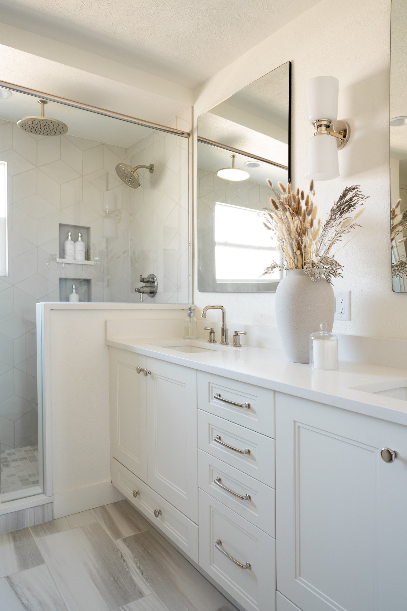
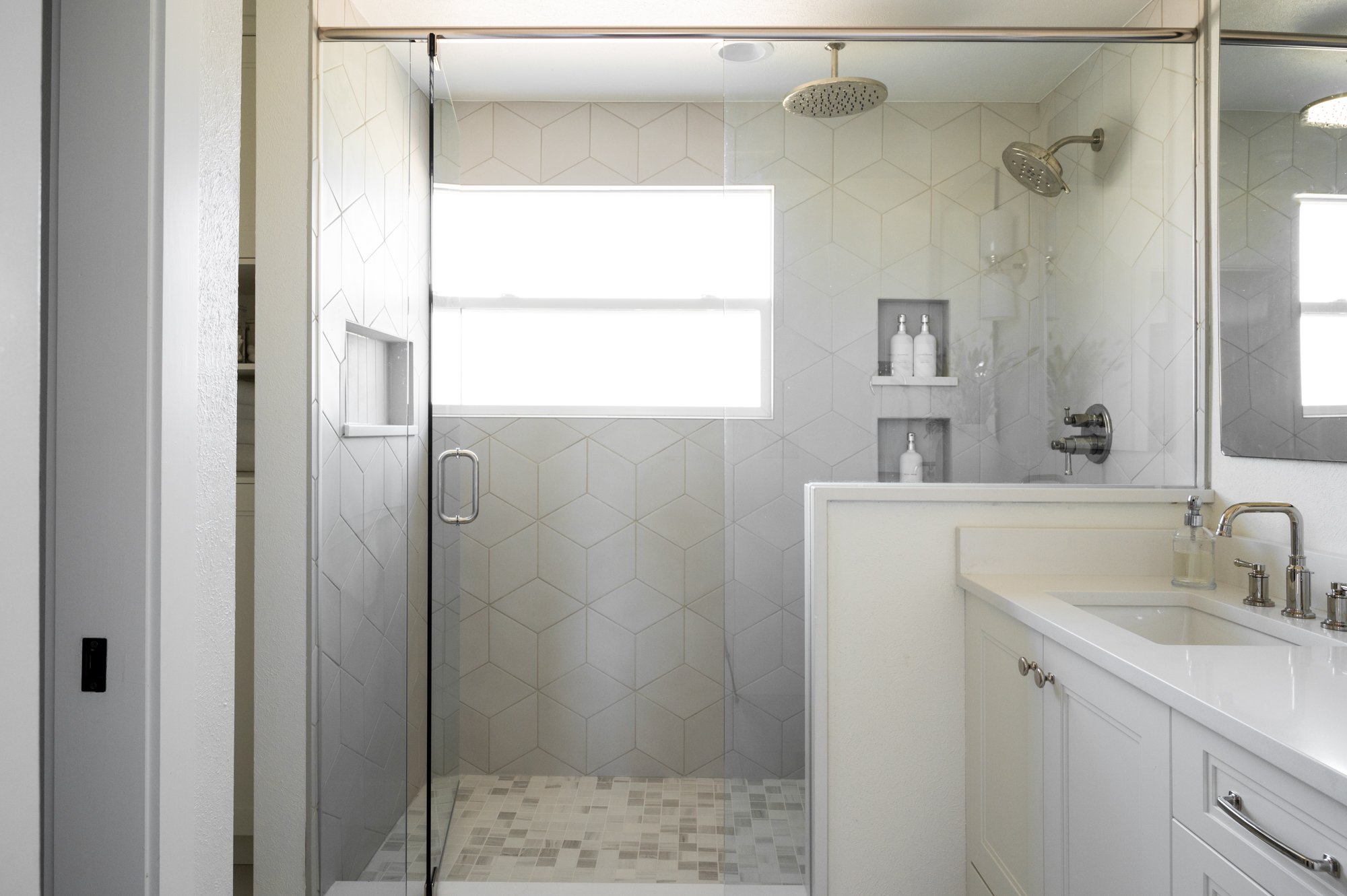
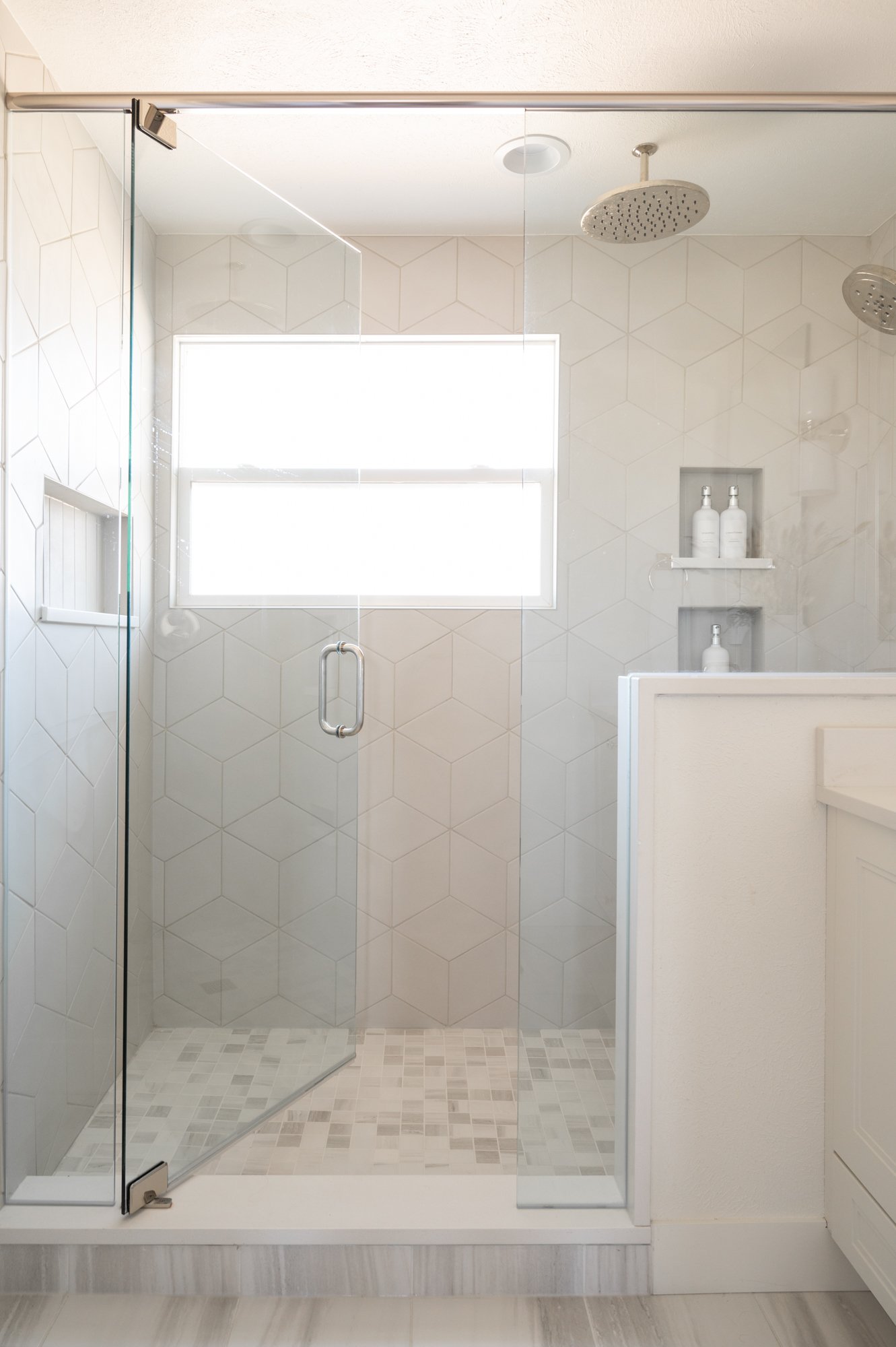
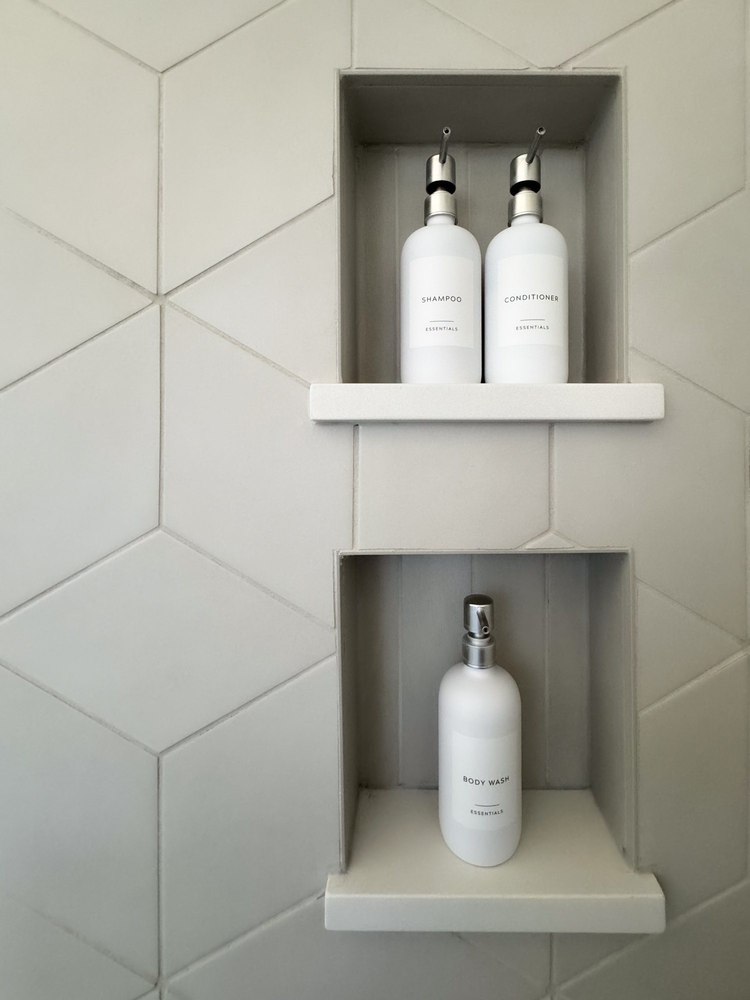
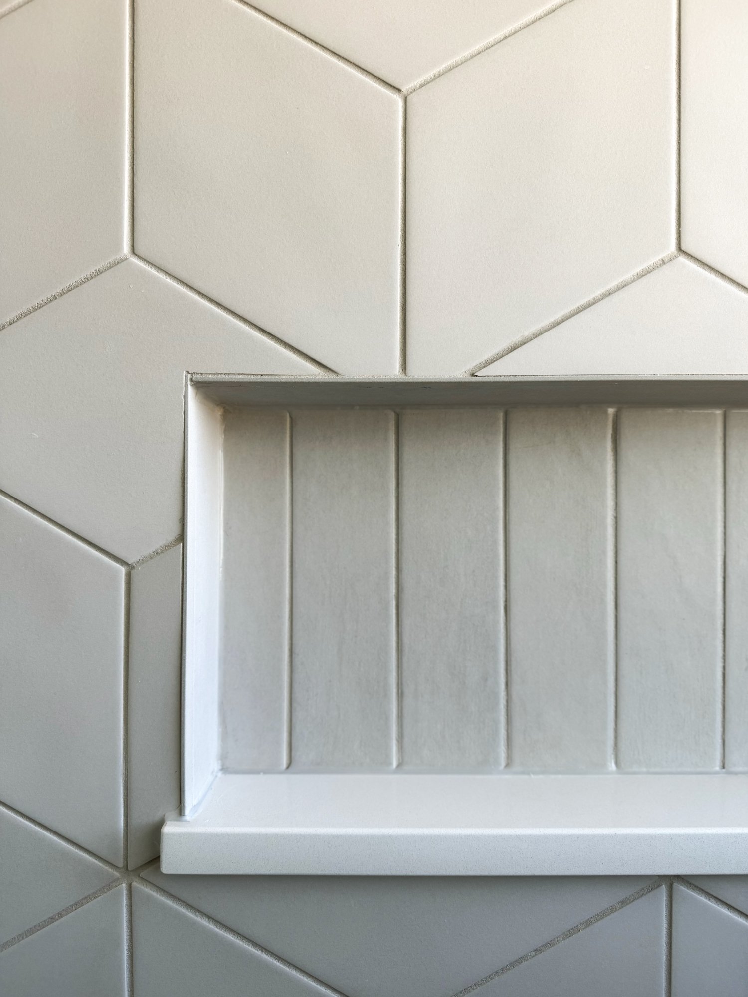
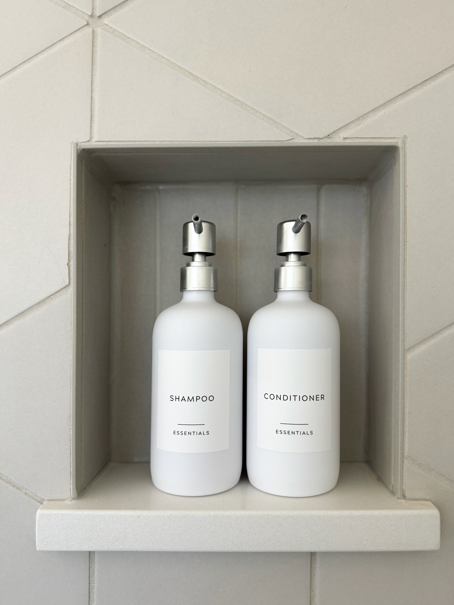
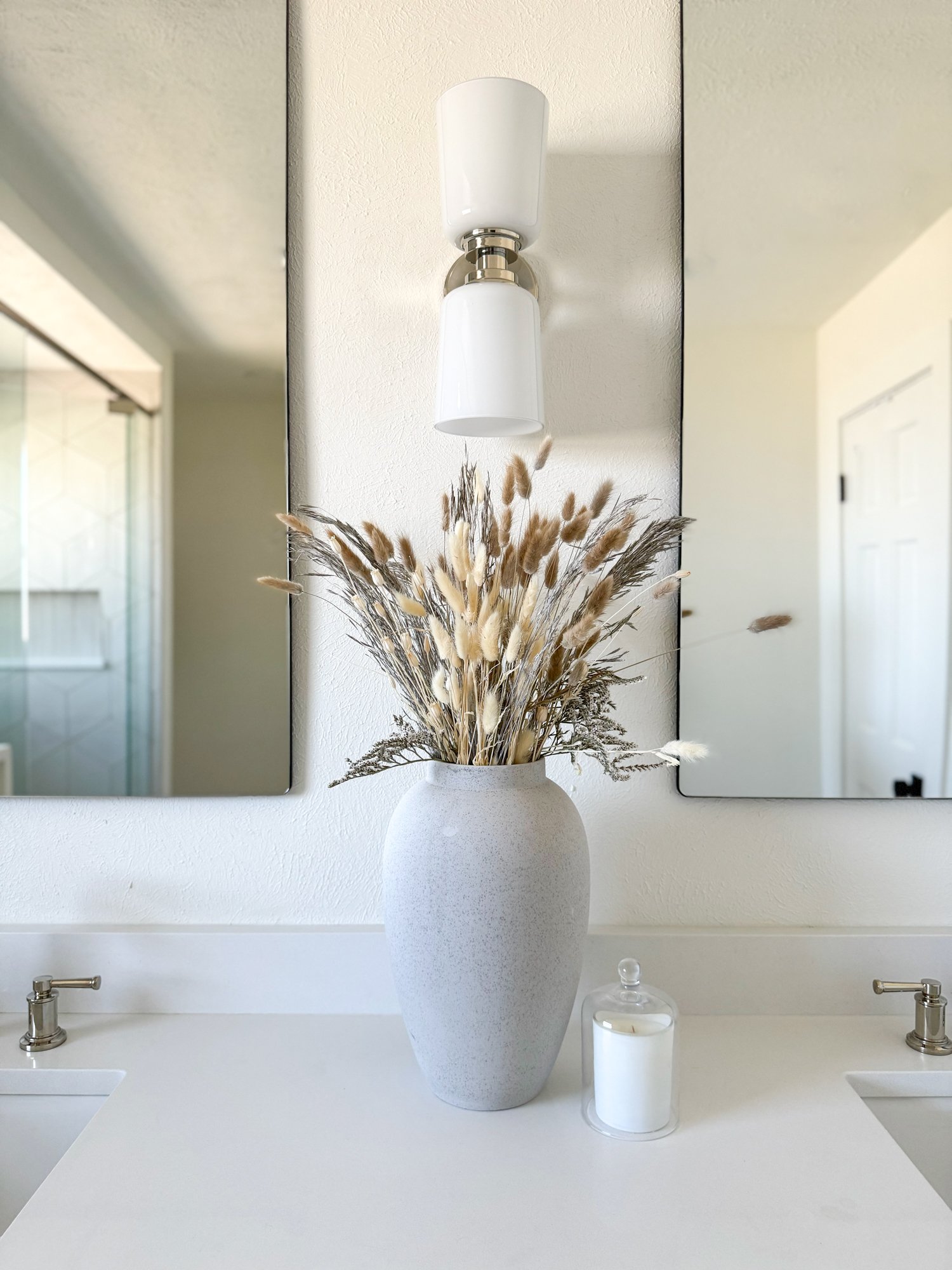
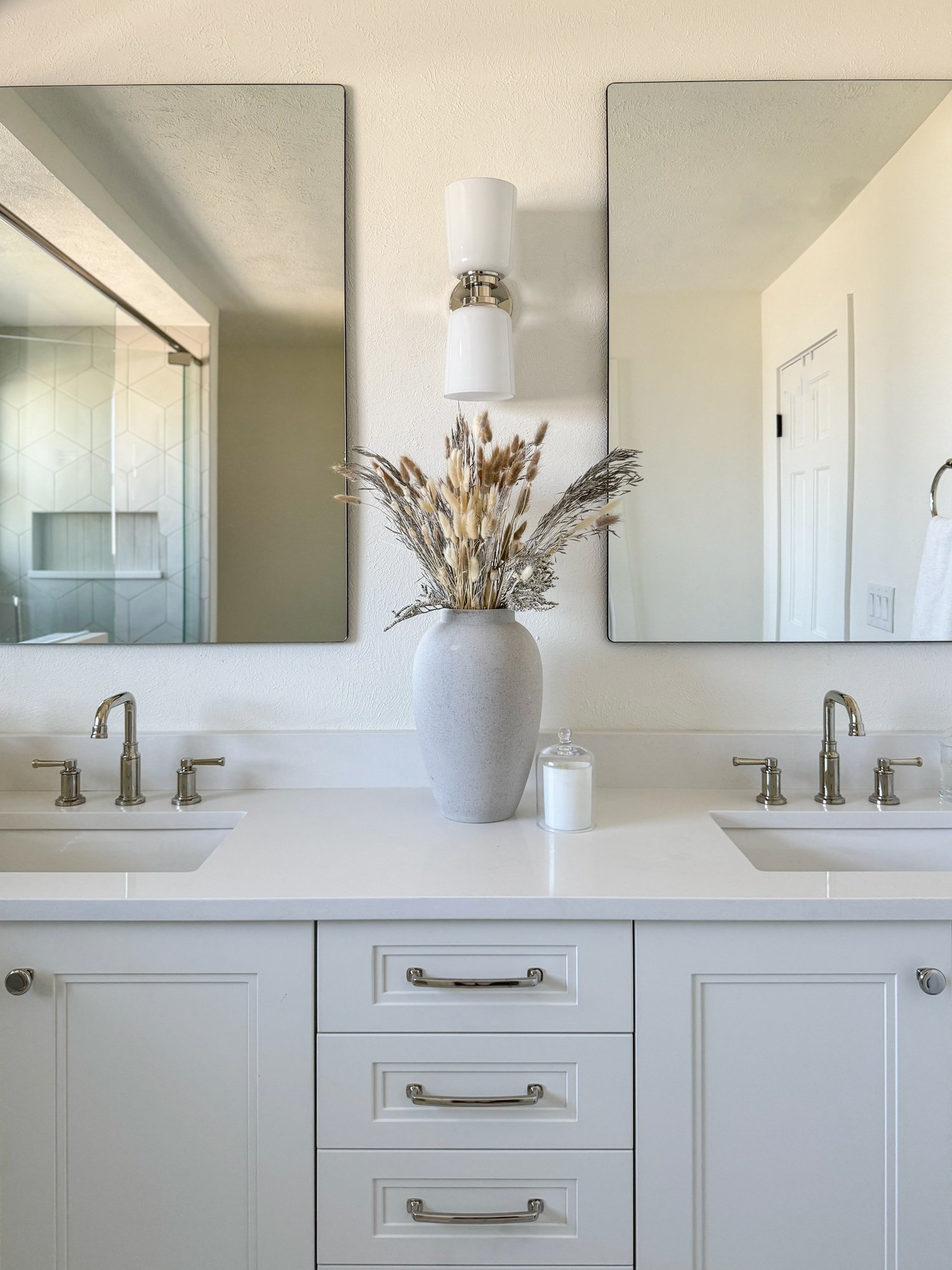
Our clients’ primary bathroom underwent a total transformation, as it was previously very dark and dated looking. First, we moved the shower and toilet, so that now the shower takes up the entire back wall, and the toilet is relocated to a water closet for additional privacy. Since this is the primary bathroom we really wanted it to feel elevated and classy, so we used lots of whites and incorporated some movement with tile choices, including this fun rhombus shape in the shower. We updated the double vanity, using a sconce between instead of above the mirrors for a little design interest — this can be a great way to create some separation of the vanity spaces as well as a pretty moment for flowers. Finally, the brushed nickel finishes throughout provided the perfect pop that dressed up this primary bathroom for our homeowners.
Laundry & Mudroom
THE BEFORE & AFTER SAYs IT ALL—
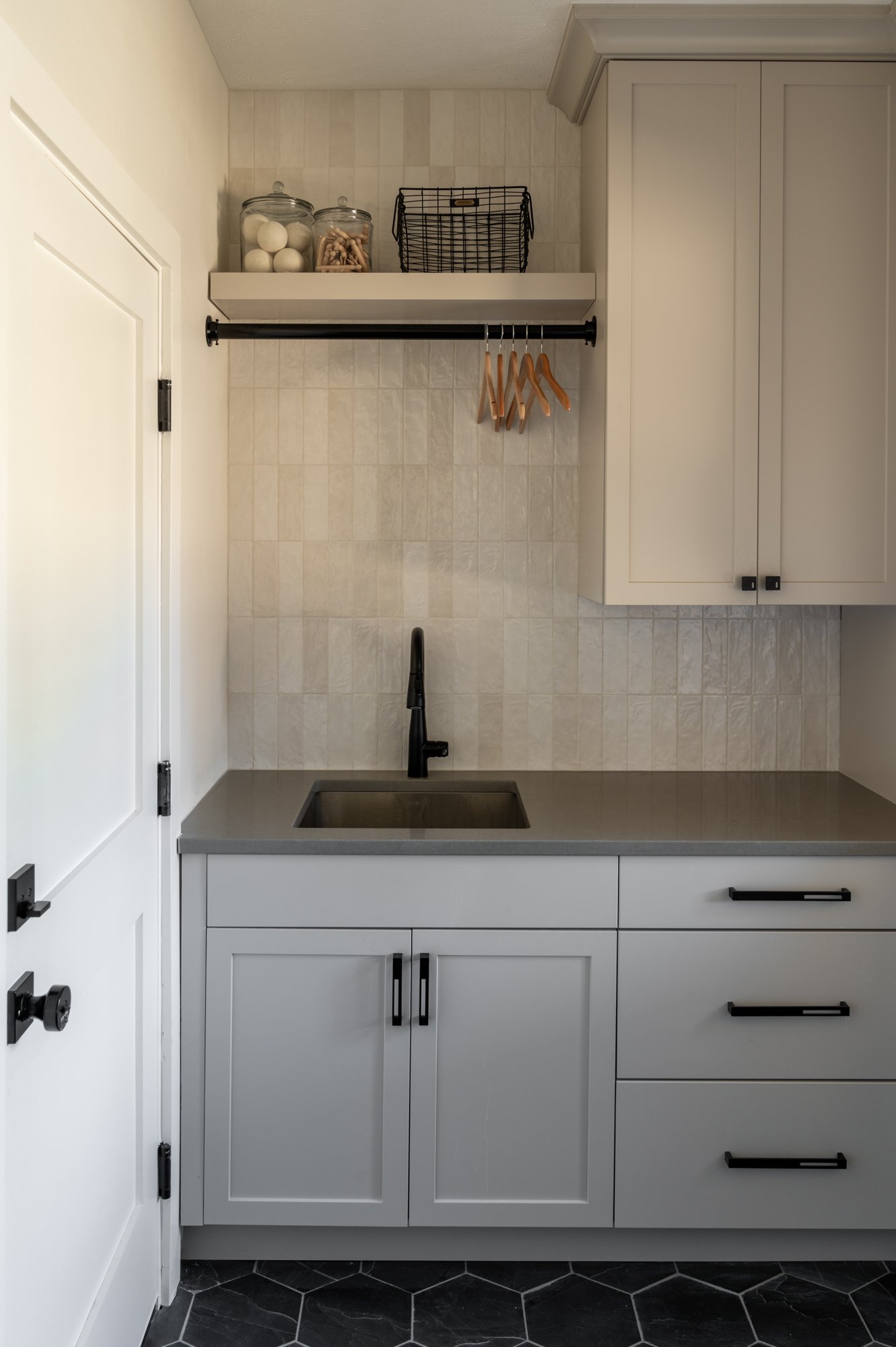
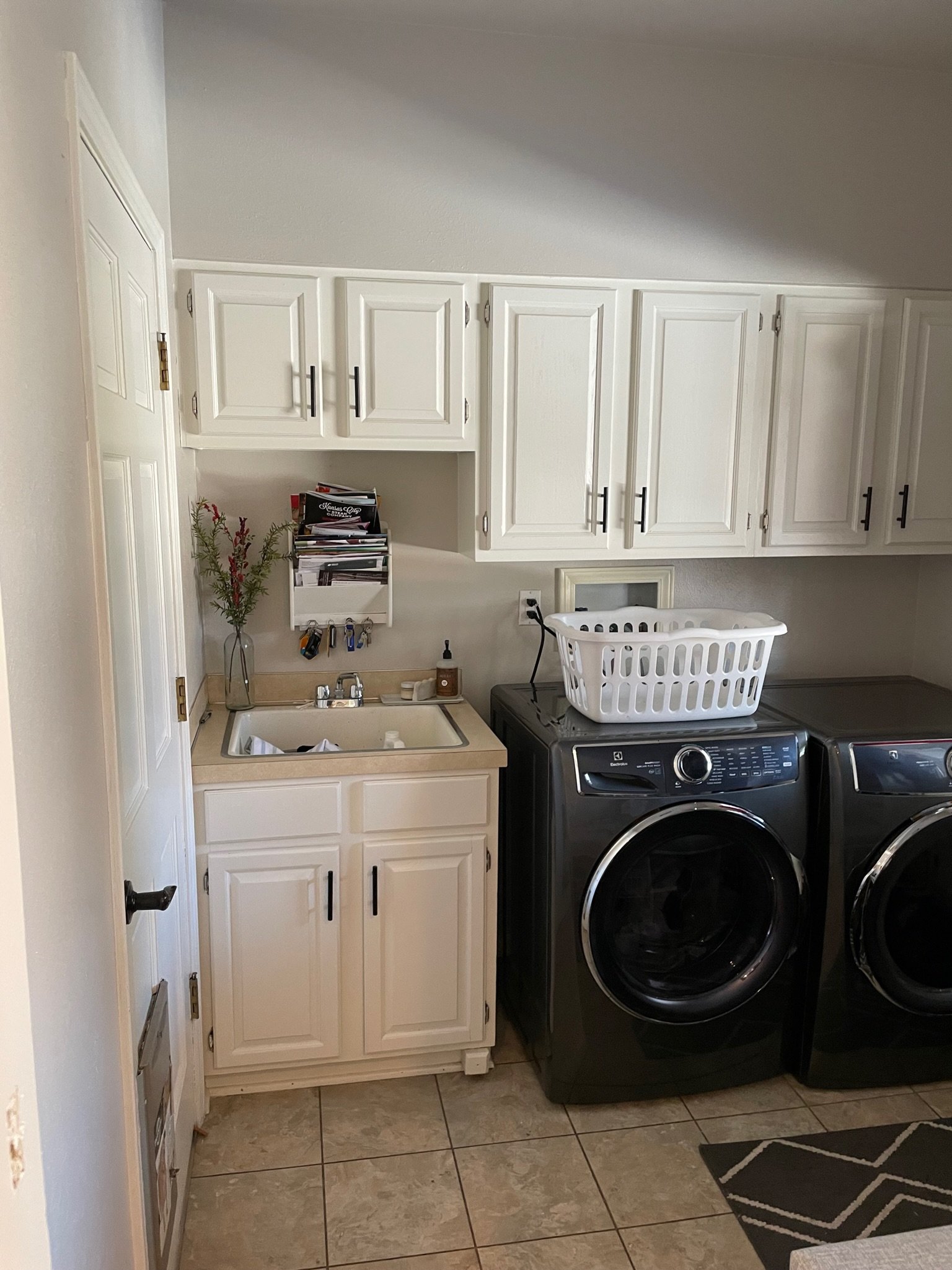
The before and after photo of this space is truly phenomenal. We started off by stacking the washer and dryer to create more countertop and upper cabinet storage space. This also allowed us to include a hanging rod for drying clothes above the sink, which got a major upgrade itself. We selected a natural slate floor in a pretty hexagon shaped tile. The opposite wall called for more closed mudroom storage to fit (read: hide) backpacks, coats, shoes and all the things for this family of five. We think beautiful and functional suits this space well!
Welcome home, Ball family!
If you’re looking for some help furnishing, remodeling or building from the ground up, we’d love to chat and see if our team is the right fit for your home project.
See more photos of this renovation project and its complete transformation — including more before and afters — in our portfolio.
Welcome to Basil + Tate, your full-service interior design team based in sunny Denver, Colorado. We describe our design aesthetic as light-and-bright, transitional, and modern. If you like clean lines mixed with earthy colors and textures, you’re in the right place! Looking for interior design services within the Denver, Colorado area? Let's get in touch.
