The Nyberg Project - Loft Reveal
Today I get to reveal something totally different than we’ve ever done - a loft! If you’ve been around these parts for any length of time, you may recognize this house. The Nyberg Project was one of my very first (and still one of my most favorite!) projects. We’ve been slowly working our way through their entire home over the past few years. The loft was one of the last spaces needing some love upstairs, and we finally tackled it.
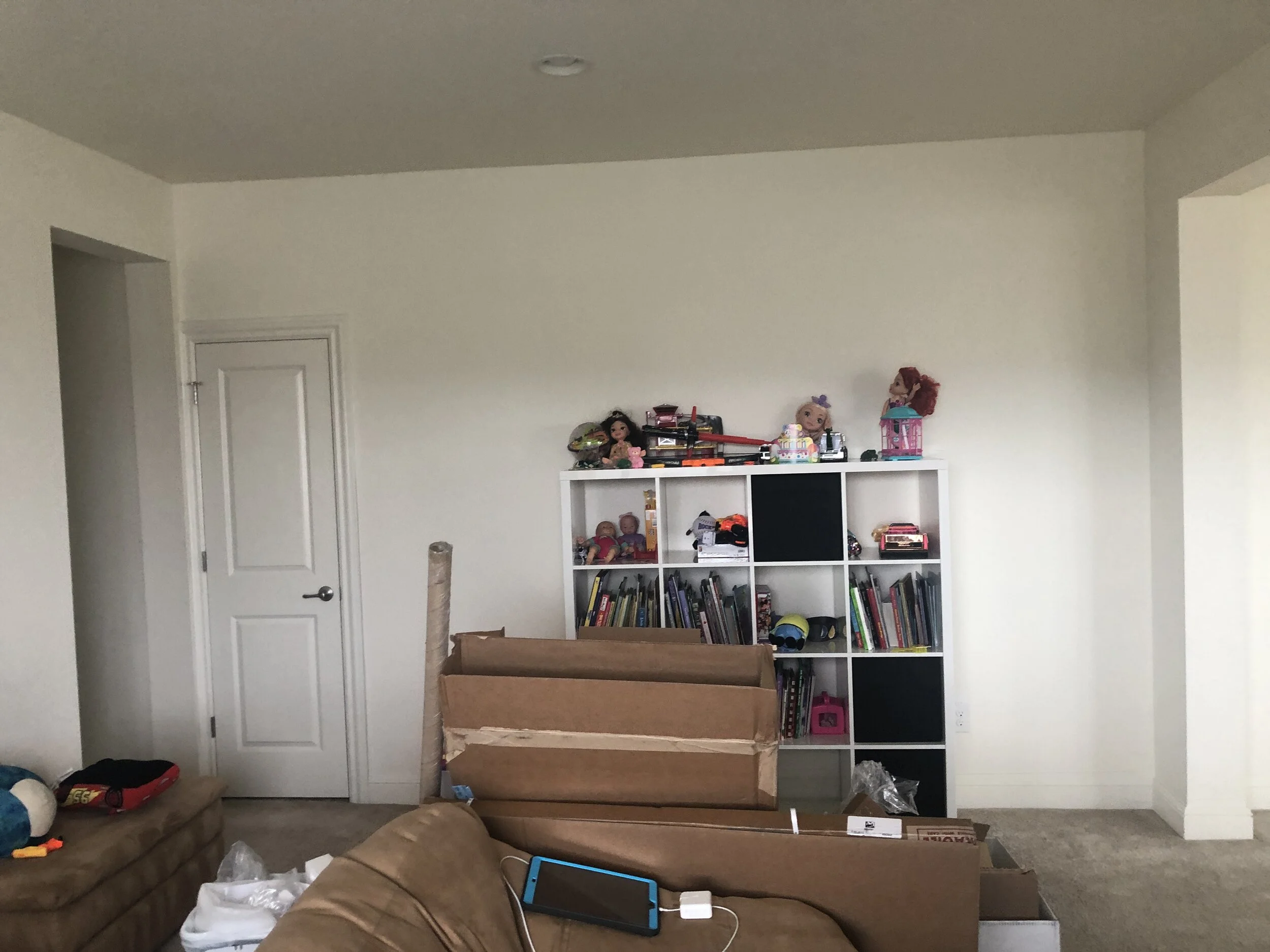
What started as a room with a TV became more of a gaming space as their kiddos got older… and now, if we’re being honest, it’s dad’s new gaming space/mini-man cave. We reoriented the room to capitalize on the big wall, mounted the TV, and added storage. We used white oak to add some warmth to the built-ins, and I’m totally loving that color combination.
The boldest move in this room may have been the paint. Not only did we go dark on the walls… we even painted the ceiling! This room gets a ton of natural sunlight, so we didn’t have to worry about it getting too dark. This helped make the entire wall of white + oak built-ins pop and completely defined this space at the top of their stairs.
We found some beautiful scenic art to contrast with the dark paint as well - a nod to their love of the mountains! I had promised their little guy a bean bag chair, so we found one that is super comfy but looks a little more sophisticated than others. The sofa with the chaise actually provides some extra storage underneath which helps to keep the area clear of ‘stuff’.
The room magically feels larger than it used to and gets even more playtime than before. I love it when thoughtful design makes a room even more functional than it previously was. Updating usable space can feel like adding square footage to your home without having to change the footprint!


